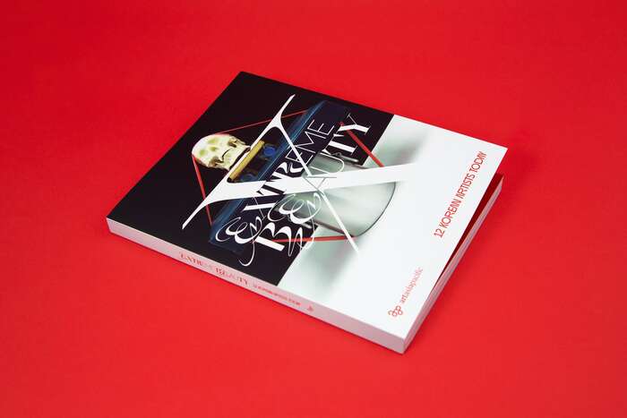
Extreme Beauty: 12 Korean Artists Today
Source: barnbrook.net ©ArtAsiaPacific and KAMS. License: All Rights Reserved.


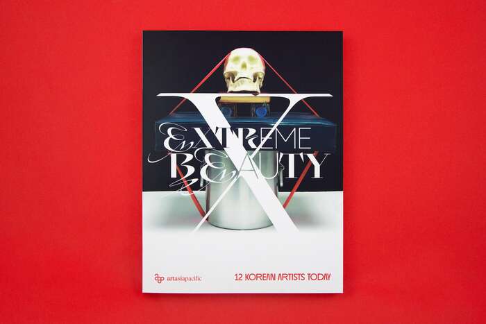
Published by ArtAsiaPacific and Korea Arts Management Service (KAMS), Extreme Beauty: 12 Korean Artists Today features the work of twelve contemporary Korean artists and their unique styles and approaches to making art. This volume is the first of a yearly series by the same publishers and to-date always designed by the creative studio Barnbrook: Accelerating Realities (2023), Contingent Worlds (2024), Hidden Realms (2025).
From Barnbrook studio's Instagram post:
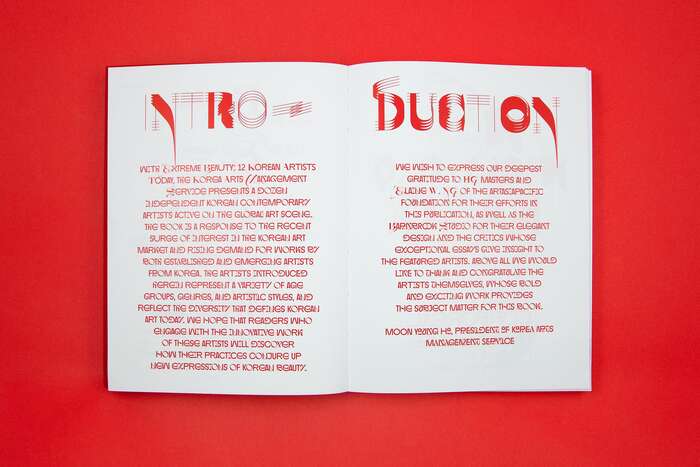
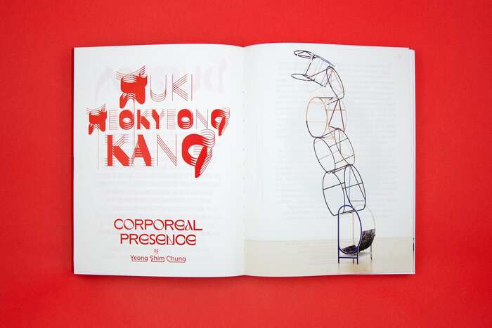
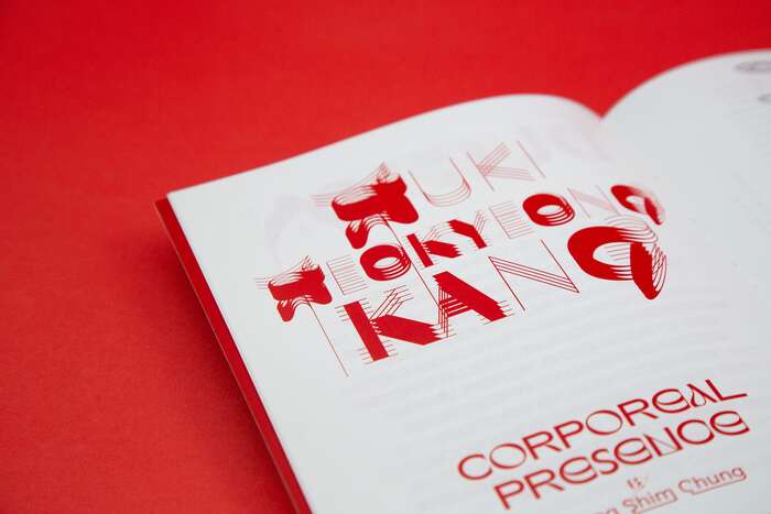
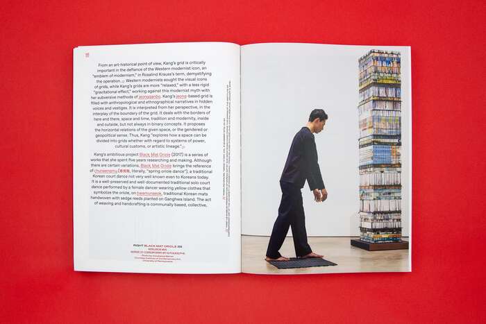
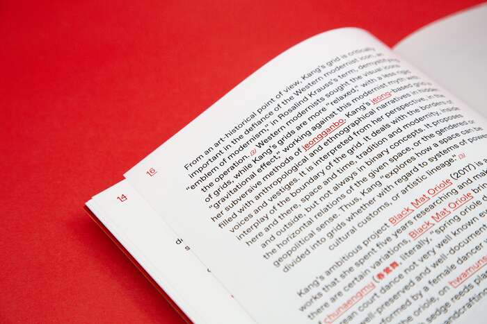
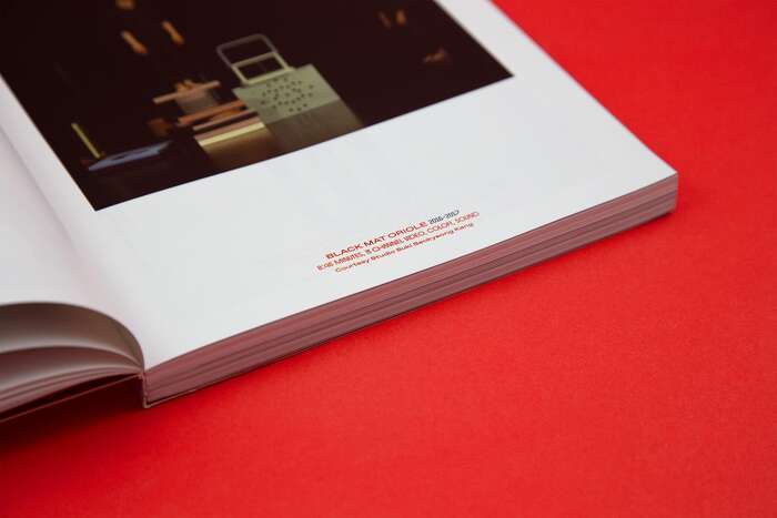
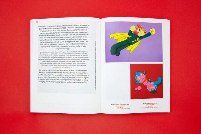
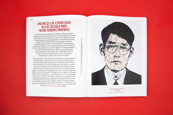
Our design approach experiments with an extremist typography style that aims to synthesize the new by crossbreeding legible and experimental fonts. This approach brings intensity to the design, particularly in the repeated words on the names of the featured artists, which benefits from the dynamism of brush stroke gestures. We balance this experimental typography with a clean and legible style for the body text, which includes generous space for featuring the work. We also highlight the work titles in the text using an inbuilt underline function of the font, which merges all descending characters to create unconventional letter shapes. Finally, we use red as a representative color for Korea, but also to evoke danger, courage, and passion in the design context.
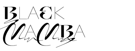
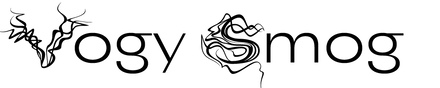
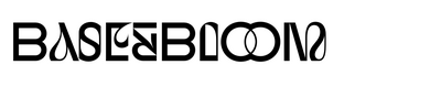
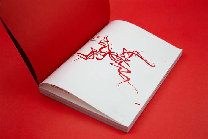
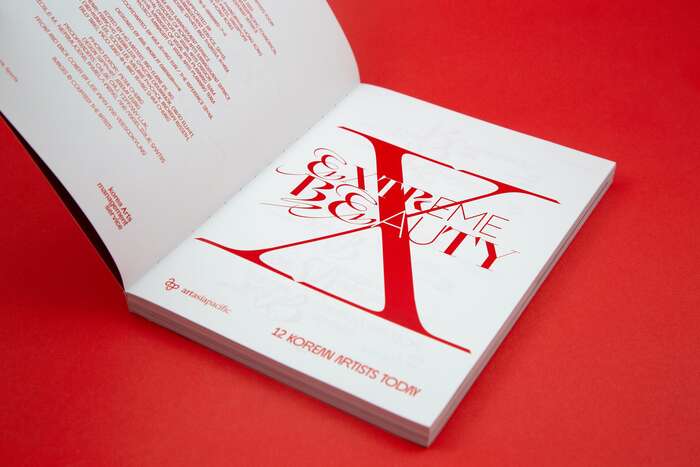
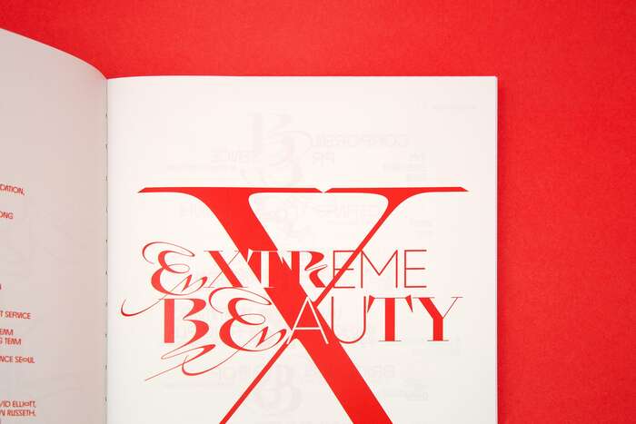
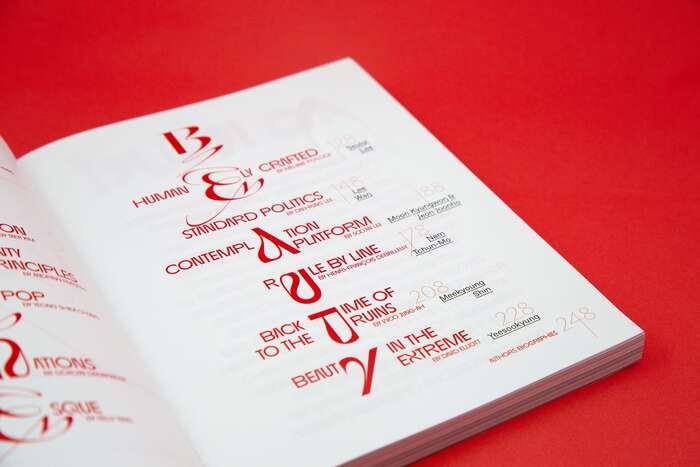
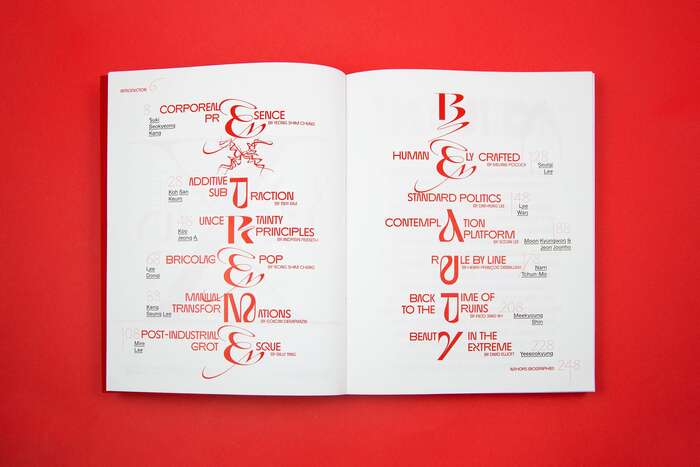
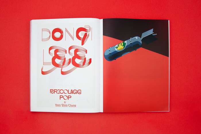
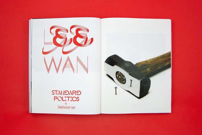
The book title is prominently featured at the center of the cover and set in Swiss Typefaces’ Black Mamba. The title showcases all the peculiar features of the typeface, from the arabesques, to the bold uppercase and light caps alternates in the lowercase slots. Black Mamba also appears throughout the interior, notably in the index and for the artists’ names, where it is applied with horizontal repetition to create a brushstroke-like effect. Accompanying Black Mamba in the titles is NaumType’s Base&Bloom, while Dinamo’s ABC Favorit is used for the body text. A special detail is the use of Swiss Typefaces’ Vogy Smog for the X on the page after the flyleaf, before the colophon and title page. The same glyph reappears in the index to vertically spell out the book title.
Other typefaces used in this volume for the multilingual parts are Source Han Sans and Cairo. The latter is not shown in the included images.
Source: barnbrook.net ©ArtAsiaPacific and KAMS. License: All Rights Reserved.
The ArtAsiaPacific logotype (not part of the book design) is set in Tiempos.
Source: barnbrook.net ©ArtAsiaPacific and KAMS. License: All Rights Reserved.
Source: barnbrook.net ©ArtAsiaPacific and KAMS. License: All Rights Reserved.
Source: barnbrook.net ©ArtAsiaPacific and KAMS. License: All Rights Reserved.
Source: barnbrook.net ©ArtAsiaPacific and KAMS. License: All Rights Reserved.
Source: barnbrook.net ©ArtAsiaPacific and KAMS. License: All Rights Reserved.
Source: barnbrook.net ©ArtAsiaPacific and KAMS. License: All Rights Reserved.
Source: barnbrook.net ©ArtAsiaPacific and KAMS. License: All Rights Reserved.
Source: barnbrook.net ©ArtAsiaPacific and KAMS. License: All Rights Reserved.
Source: barnbrook.net ©ArtAsiaPacific and KAMS. License: All Rights Reserved.
春莺舞 is set in Source Han Sans.
Source: barnbrook.net ©ArtAsiaPacific and KAMS. License: All Rights Reserved.
Source: barnbrook.net ©ArtAsiaPacific and KAMS. License: All Rights Reserved.
Source: barnbrook.net ©ArtAsiaPacific and KAMS. License: All Rights Reserved.
Source: barnbrook.net ©ArtAsiaPacific and KAMS. License: All Rights Reserved.
Source: barnbrook.net ©ArtAsiaPacific and KAMS. License: All Rights Reserved.
Source: barnbrook.net ©ArtAsiaPacific and KAMS. License: All Rights Reserved.
Source: barnbrook.net ©ArtAsiaPacific and KAMS. License: All Rights Reserved.
Source: barnbrook.net ©ArtAsiaPacific and KAMS. License: All Rights Reserved.
This post was originally published at Fonts In Use