Edwards White Architects
Source: www.daymark.co.nz Daymark Studio. License: All Rights Reserved.


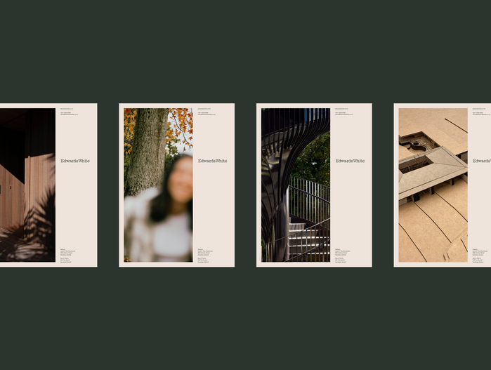
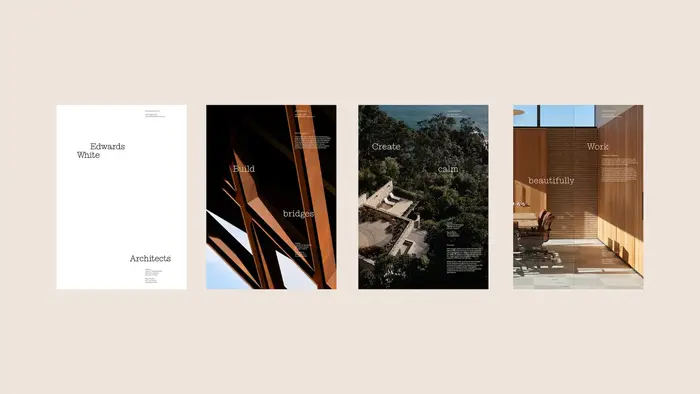
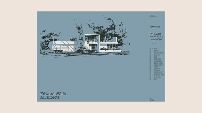
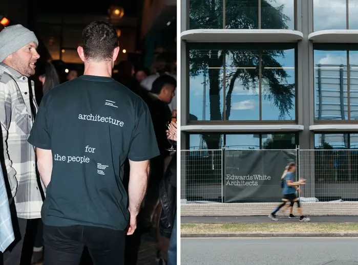
Edwards White Architects hired us to develop a brand identity that better reflected the way they think, design and work. Their practice is grounded in context, collaboration and careful execution, but this depth was not consistently expressed across their existing identity or digital presence. The project called for a clear brand foundation and a system that could scale across all touchpoints, with the website identified early on as one of the most important expressions of the new identity. The core idea underpinning the work was “people places.” This reflects a belief in architecture as more than the admiration of finished objects, focusing instead on how thoughtful design enriches everyday human experience. Our task was to translate this idea into a coherent identity and a digital platform that could communicate both the work and the thinking behind it.
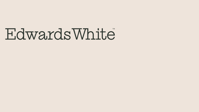
The identity is anchored by a refined wordmark set in Ionic No. 5 Light, supported by Basel Grotesk for long-form clarity and legibility. The typographic system balances precision with subtle expression, reflecting the studio’s architectural approach.
Source: www.daymark.co.nz Daymark Studio. License: All Rights Reserved.

Source: www.daymark.co.nz Daymark Studio. License: All Rights Reserved.
Source: www.daymark.co.nz Daymark Studio. License: All Rights Reserved.

Source: www.daymark.co.nz Daymark Studio. License: All Rights Reserved.
Source: www.daymark.co.nz Daymark Studio. License: All Rights Reserved.
Source: www.daymark.co.nz Daymark Studio. License: All Rights Reserved.
This post was originally published at Fonts In Use