Donald Judd: the minimalist who wasn’t
Source: www.xinyishao.com Xinyi Shao. License: All Rights Reserved.


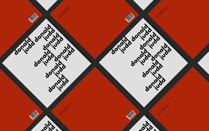
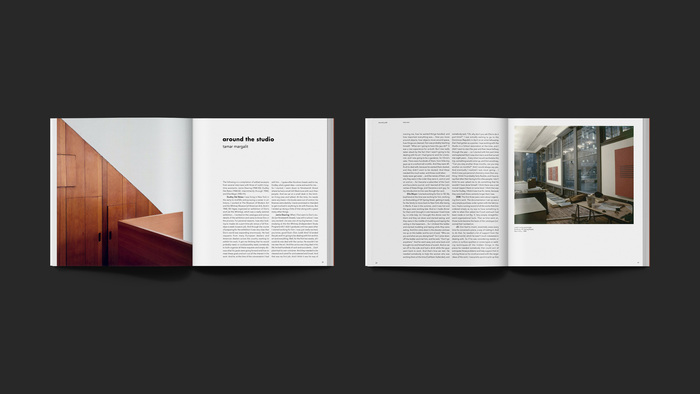
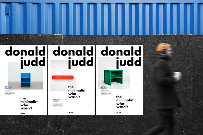
A student project designed at ArtCenter College of Design in Pasadena for Donald Judd’s exhibition at MoMA, including a (fictional) exhibition catalogue and posters. By capturing the internal rhymes of Judd’s name and forming typography as an image, a typographic identity was created.
Geometric shapes are a significant aspect of Judd’s works. Therefore, for this project, I chose Futura and Avenir, two geometric typefaces, as the primary and secondary typeface. To mimic the style of Judd’s artworks, I created two strong vertical alignments. Additionally, Judd’s name contains several alphabets with rounded shapes (e.g., a, d, o). Therefore, all lowercase letters were used to create repeated graphic interests and utilize the nature of these rounded shapes.
Supervised by Simon Johnston.

Source: www.xinyishao.com Xinyi Shao. License: All Rights Reserved.

Source: www.xinyishao.com Xinyi Shao. License: All Rights Reserved.

Source: www.xinyishao.com Xinyi Shao. License: All Rights Reserved.
Source: www.xinyishao.com Xinyi Shao. License: All Rights Reserved.
Source: www.xinyishao.com Xinyi Shao. License: All Rights Reserved.
This post was originally published at Fonts In Use