disruptiF – Feministisch bilden & beraten e.V.

Source: www.instagram.com Studiokwi. License: All Rights Reserved.


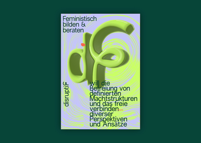
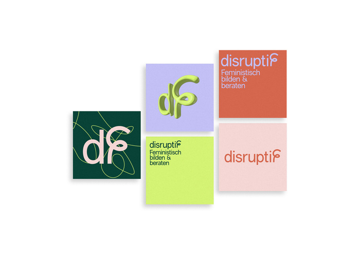
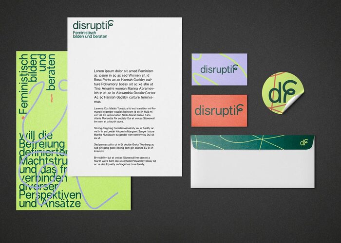
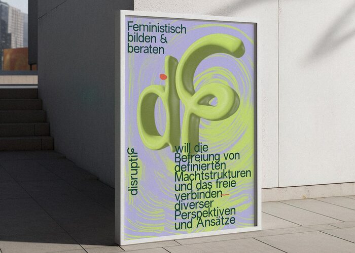
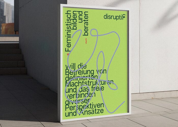
A super modern, colorful and powerful corporate identity for the newly founded feminist club. Various logo variants for different channels are designed by Studiokwi for disruptiF – Feministisch bilden & beraten e.V. (“disruptive – feminist education and counselling”) to represent their identity:
A loud design based on the philosophical concept of rhizomatics: a metaphor for a postmodern, post-structuralist model of knowledge organization and world description that replaces hierarchical structures. Centric. A root system without a main root. A system of reciprocal exchanges between equal communicators. Not self-contained and always in relation to others.
Set in a mix of Prune (Anna Sing, free for personal use) and Boris (Giulia Boggio, open source), the typefaces are paired with pastels, neon and 3D shapes.
Source: www.instagram.com Studiokwi. License: All Rights Reserved.

Source: www.instagram.com Studiokwi. License: All Rights Reserved.
Source: www.instagram.com Studiokwi. License: All Rights Reserved.
Source: www.instagram.com Studiokwi. License: All Rights Reserved.

Source: www.instagram.com Studiokwi. License: All Rights Reserved.
Source: www.instagram.com Studiokwi. License: All Rights Reserved.
Source: www.instagram.com Studiokwi. License: All Rights Reserved.
This post was originally published at Fonts In Use