Descent, Limbo & Loops: Inception in Type posters
Janire Sanz. License: All Rights Reserved.

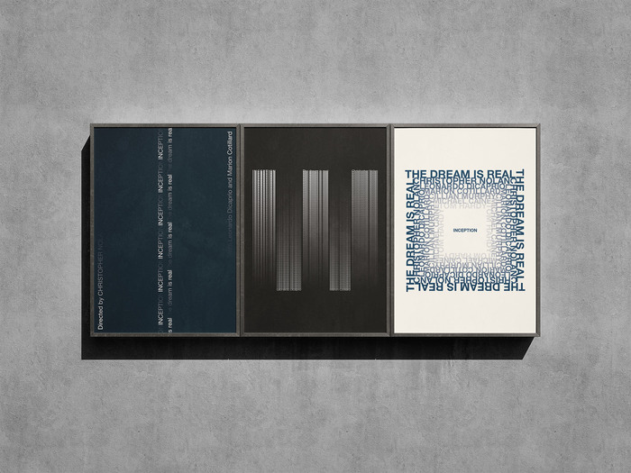
A series of three typographic posters inspired by Christopher Nolan’s film Inception. The project explores how Neue Helvetica—a neo-grotesque typeface renowned for its clarity, neutrality, and rational structure— can embody the blurred boundary between dream and reality. Chosen for its “invisible” qualities and Swiss design heritage, Helvetica becomes the architectural framework of these dreamscapes: stable, precise, yet concealed.
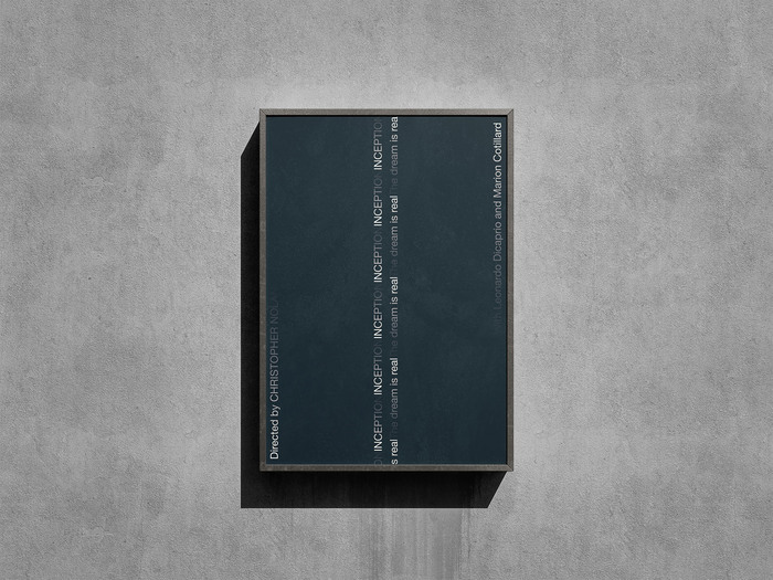
Descent and Ascent: Titles and slogans fragment and fade, suggesting the tension between the real and the imagined.
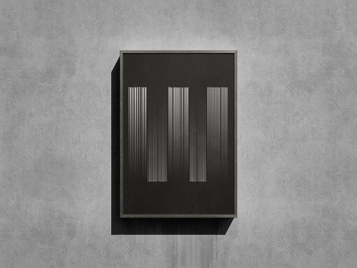
Limbo Effect: Repetition and layering of different Helvetica weights create instability and suspension, evoking the deepest dream level.
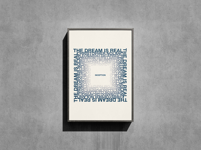
Infinite Loop: A closed composition of repeated text forms a tunnel-like structure, recalling the recursive, endless architectures in the film.
This work was created as part of the Typography course at LABASAD (Barcelona School of Arts & Design), under the guidance of professor Marc Salinas.
Janire Sanz. License: All Rights Reserved.
Janire Sanz. License: All Rights Reserved.
Janire Sanz. License: All Rights Reserved.
This post was originally published at Fonts In Use