Demonstra: pela poética def
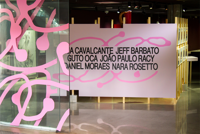
Photo: Marcelo Mudou. License: All Rights Reserved.
The visual identity for Demonstra: pela poética def, presented at the Fiesp Cultural Center, seeks to graphically translate a collective territory where artists with disabilities create from their own experiences, shifting the public’s gaze on body, normality, and aesthetics. The exhibition articulates multiple languages around aesthetic accessibility and proposes a constellation of poetics that question hegemonic models of representation and belonging.
The main objective was to develop a visual system capable of expressing the corporeality, sensoriality, and symbolic power present in the exhibition, avoiding normative codes associated with disability. To this end, the identity was structured based on three creative principles – exceptionality, sensoriality, and organicity – that guided typographic, chromatic, and compositional decisions.
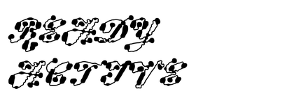
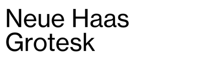
Through the use of the Ready Active typeface by Plain Form, the words are composed in distorted figures, creating graphic motifs of low legibility of which the understanding is not immediately grasped. This “universal inaccessibility” initially provokes by suggesting placing the non-disabled reader in the place where the person with a disability would be. The shapes of the letters forming the word “Demonstra” were also used as graphic elements on the vinyl decals over the glass doors. All exhibitions texts and artwork captions were composed in Neue Haas Grotesk.
The palette, which blends vibrant tones with dense colors, intensifies the sensory experience, transforming each piece into an expression that complements the poetics conveyed by the works.
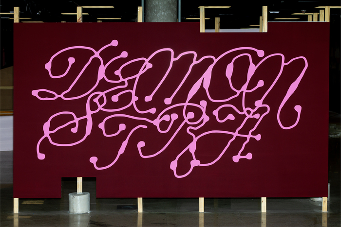
Photo: Marcelo Mudou. License: All Rights Reserved.
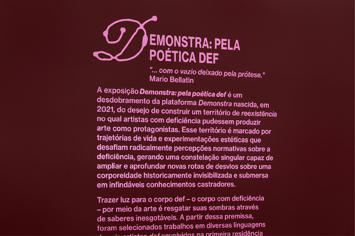
Photo: Marcelo Mudou. License: All Rights Reserved.
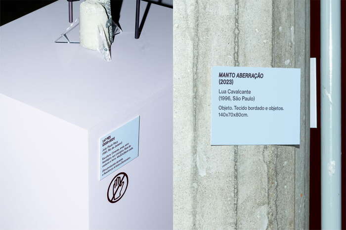
Photo: Marcelo Mudou. License: All Rights Reserved.
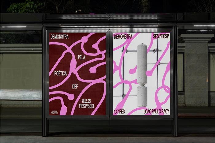
Photo: Marcelo Mudou. License: All Rights Reserved.
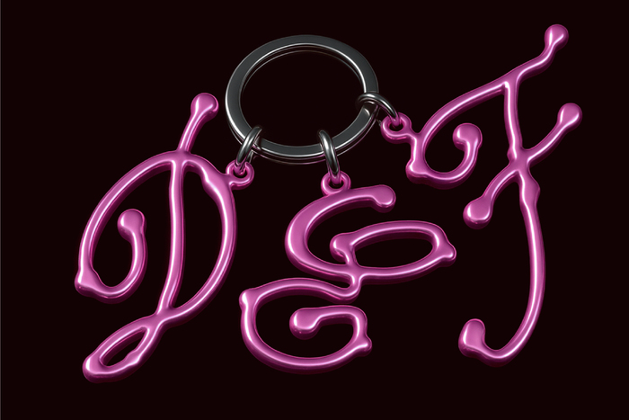
Photo: Marcelo Mudou. License: All Rights Reserved.
This post was originally published at Fonts In Use