Verkehrsbuch deutscher Eisenbahnen


Source: www.flickr.com Uploaded to Flickr by mikeyashworth and tagged with “mikado”. License: All Rights Reserved.
Vol. 2, Ostdeutschland (“Eastern Germany”)
One of a series of six charming small format booklets issued by the Königlich Preußische Eisenbahndirektion (“Royal Prussian Railway Directorate”) in Altona, Hamburg, and describing the Allgemeine Verkehrs-Mitteilungen und Sehenswürdigkeiten – general railway travel information and sights in the relevant areas of Germany. The organisation of railways in Germany prior to 1918 was somewhat complex but many railway companies were, effectively, nationalised as part of the Preußische Staatseisenbahnen (“Prussian State Railways”) and these booklets all show, in various forms, the Adler or Royal Eagle symbol of the railways as well as the “winged wheel” symbol that was much favoured by various continental railway adminstrations.
The booklets all contain the information that large numbers of visitors were now visiting Germany, many brought by the various steamship lines including Hamburg–Amerika (HAPAG) and the Norddeutscher Lloyd, and given the booklets were issued by the Altona-Hamburg office of the railways one suspects that copies were probably available on board the vessels to be given as publicity to passengers. The booklets were also available by post from the Altona offices. They are not dated but volume one has a manuscript date of ca.1905–07 and given the style this feels correct.
Although each booklet follows the same format each design is subtly different; all are in a loose “Arts & Crafts” style that would morph in Germany into the Werkbund movement and in France to an Art Nouveau style. This includes elements of the cover design, framing and lettering as well as aspects of the editorial text. The booklets contain detachable postcards for mailing and are each printed by a printer in the relevant area of Germany covered by the particular guide.
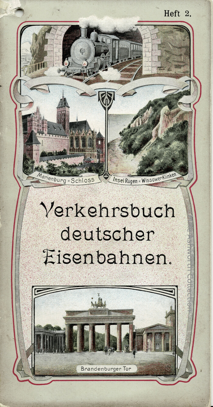
Volume 2 is for Berlin and Eastern Germany covering areas of Prussia and Saxony. The front cover shows Schloss Marienburg (Lower Saxony), the now lost Wissower Klinken cliff formations on Rügen, and the Brandenburger Tor in Berlin. There are outline maps of the railways in the area covered by the guide as well as of the suburban lines in Berlin. Mention is made of the newly opened first stages of the Berlin Hochbahn (now U-Bahn) and the back cover has a very Imperial series of symbols for the State Railways.
While Vols. 1 and 4 (below) have custom lettering for the title, the cover for Volume 2 (above) is typographic: the featured typeface is the wide style of Mikado as cast by the Flinsch foundry in Frankfurt. “Heft 2” is in a German version of Antique No. 8.
License: All Rights Reserved.
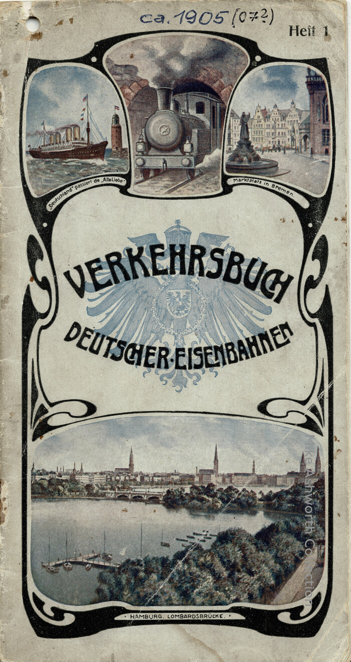
Vol. 1, Norddeutschland (“Northern Germany”). The front cover shows the Lombardsbrücke in Hamburg, the Marktplatz in Bremen, and the steamship Deutschland passing the Alte Liebe lighthouse at Cuxhaven.
License: All Rights Reserved.
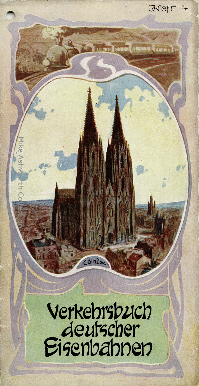
Vol. 4, Nordwestdeutschland (“North West Germany”) and the areas through which the spine formed by the River Rhine runs. The cover, along with a steam locomotive and train, is in a rather high ‘Art Nouveau’ style including the lettering, and depicts the famous Kölner Dom.
License: All Rights Reserved.
The title page to Vol. 1 features a winged wheel and text set in Berthold’s Secession (1901).
This post was originally published at Fonts In Use