Demokratie, heast!

MOOI Design. License: All Rights Reserved.


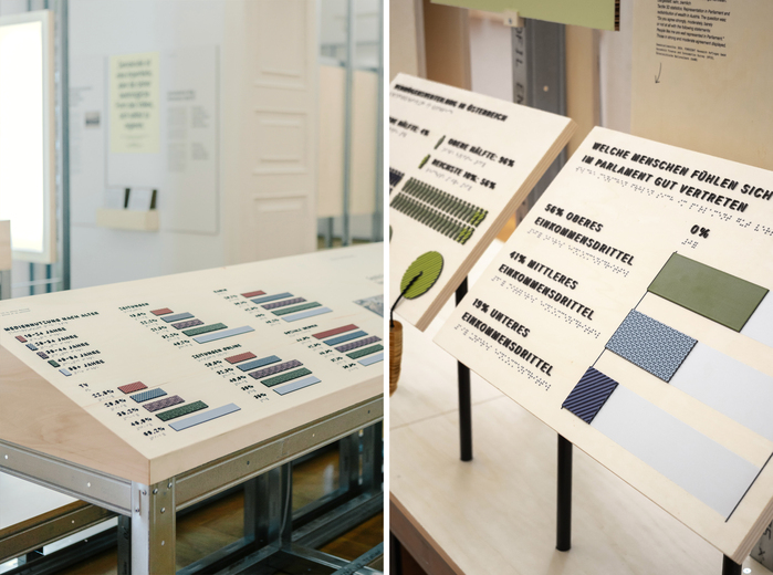
Demokratie, heast! (heast is a Viennese call to listen, speak up, and question) is not an exhibition that claims to have all the answers – it creates space for questions. Developed by Graz Museum and designed by MOOI Design, the scenography moves between polling station and agora, built from lightweight materials and open structures, visitors are invited to participate, co-create, and reflect. A balance board at the entrance becomes the physical metaphor: democracy is fragile. It requires balance, attention – and people who care.
The exhibition architecture reflects this processual nature: unfinished, fragmentary, and adaptable – resembling a construction site. Drywall profiles, plywood and cardboard create a flexible framework that remains visibly in progress – both structurally and conceptually. At the heart of this concept lies a visual language that mirrors this openness: structured, yet flexible. Neutral, yet expressive.
The typographic foundation is set by Suisse Int’l – used in Medium, Medium Italic, Regular Italic and Mono cuts. This neo-grotesque typeface by Swiss Typefaces draws from classics like Univers and Helvetica, combining timeless formality with high legibility. Its geometric clarity ensures readability across scales and media, while its typographic range allows for nuanced emphasis and tone. A standout feature of the design is the subtle manipulation of the typeface in key headlines and questions. By stretching the x-height, a sense of distortion is introduced – a visual metaphor for the ever-evolving, adaptable nature of democracy itself. This intervention adds dynamism, amplifies meaning, and makes room for ambiguity and debate.
In contrast, Mynerve by Carolina Short adds a human touch. This informal, handwritten font – licensed under the Open Font License 1.1 – is used for instructions and visitor prompts. It emphasizes the personal dimension of democratic processes: participation is not only structural, but individual. Mynerve softens the system, breaks the grid, and brings a conversational tone into the spatial narrative.
Together, both typefaces create a dialogue: between formality and informality, between system and spontaneity. Just like democracy – structured, yet never complete.

MOOI Design. License: All Rights Reserved.

MOOI Design. License: All Rights Reserved.

MOOI Design. License: All Rights Reserved.
MOOI Design. License: All Rights Reserved.

MOOI Design. License: All Rights Reserved.

Source: mooi-design.com MOOI Design. License: All Rights Reserved.

Source: mooi-design.com MOOI Design. License: All Rights Reserved.

MOOI Design. License: All Rights Reserved.
This post was originally published at Fonts In Use