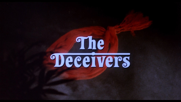
The Deceivers title sequence
Source: annyas.com License: All Rights Reserved.
From Wikipedia:
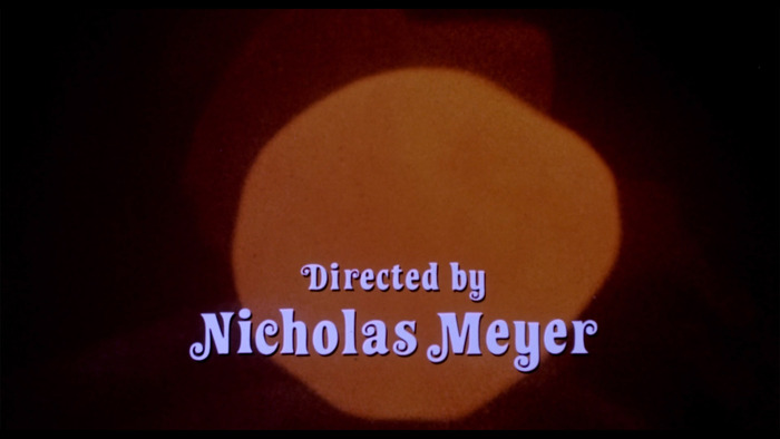
The Deceivers is a 1988 adventure film directed by Nicholas Meyer, starring Pierce Brosnan, Shashi Kapoor and Saeed Jaffrey. The film is based on the 1952 John Masters novel of the same name regarding the murderous Thuggee of India.
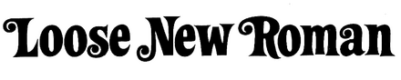
Maurice Binder – best known for creating the gun-barrel sequence of the first Bond film, Dr. No – designed the opening titles. For the typography, he used Loose New Roman. I’ve always understood the first part of its name to refer to the typeface’s casualness, using an adjective that better works for mimicking “Times New Roman” than “Casual New Roman” would do. Binder gave it a second meaning by opening up the spacing.
The historical drama is set in India. Binder hinted at this fact by adding a horizontal bar above the second word in the title, referencing the head line or śirorekhā that’s so characteristic for the Indic Devanagari script. It’s a quick and easy way to communicate “India” to a Western audience … but maybe it’s a little too easy, and not culturally sensitive. This question aside, the execution isn’t convincing on a formal level: the bar looks slapped on and doesn’t blend in with the ductus of Loose New Roman. Furthermore, the Latin lowercase letters aren’t connected to the head line. This way, the treatment has more in common with the Ferrari wordmark than with actual Indic writing.
Source: annyas.com License: All Rights Reserved.
Source: annyas.com License: All Rights Reserved.
Source: annyas.com License: All Rights Reserved.
This post was originally published at Fonts In Use