De Val van Thomas G. by Nelleke Noordervliet
License: All Rights Reserved.
3D mock up by DPS. Artwork Tessa van der Waals

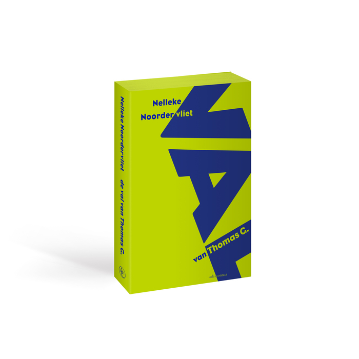
De Val van Thomas G. (“The Fall of Thomas G.”) by Nelleke Noordervliet is a novel about freedom of speech, social media, racism, parenting, old age, marriage and love.
The positioning of the big, bleeding type in capitals represents an actual VAL (fall, descent or trap). The parts that literary fall off are to be found on the innerside of the cover.
The blue and green are Pantone colors printed in two hits in order to intensify their brightness on the uncoated textured paper. The color on the block was meant to emphasize the three-dimensionality of the book but unfortunately could not be realized.
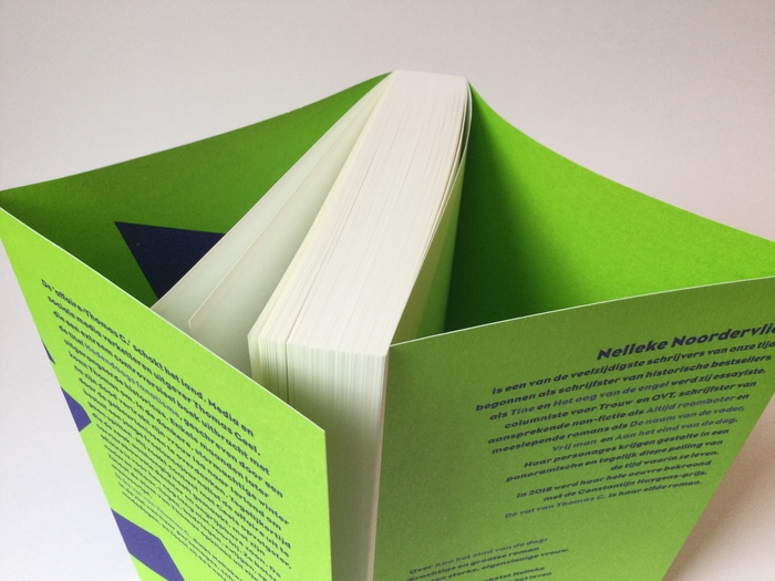
Photo: Tessa van der Waals. License: All Rights Reserved.
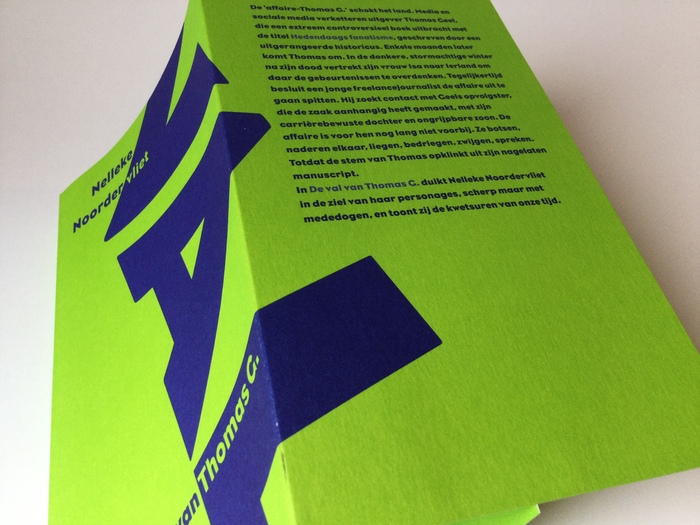
Photo: Tessa van der Waals. License: All Rights Reserved.
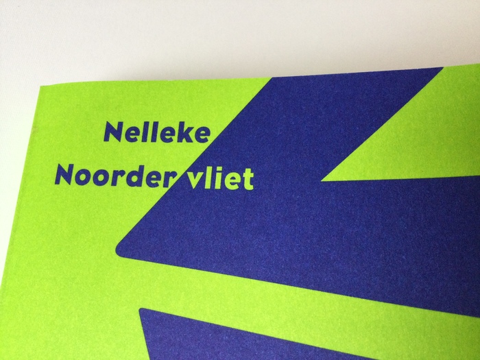
Photo: Tessa van der Waals. License: All Rights Reserved.
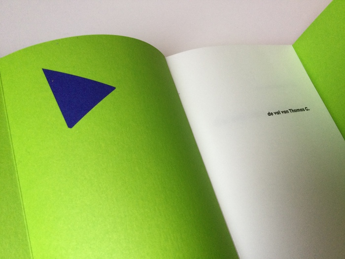
Photo: Tessa van der Waals. License: All Rights Reserved.
Part of capital V falling down on innerside cover next to titlepage. Typography innerwork by Suzan Beijer
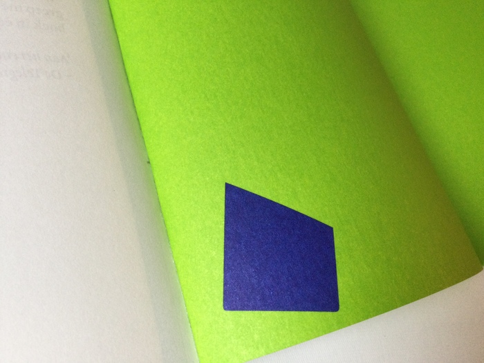
Photo: Tessa van der Waals. License: All Rights Reserved.
Part of fallen capital L on innerside cover next to last page
Photo: Tessa van der Waals. License: All Rights Reserved.
This post was originally published at Fonts In Use