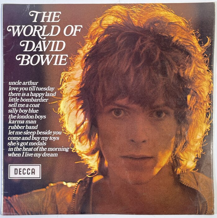
David Bowie – The World of David Bowie album art

Source: www.tradera.com Hakan2020. License: All Rights Reserved.
Cover of the April 1973 reissue with a photo by Ian Dickson. [More info on Discogs]

A choice selection from Bowie’s 1960s output for Decca opportunistically repackaged to capitalise on “Ziggymania”. At a budget price, this LP would prove to be an initiatory purchase for many a young Bowie fan.
Bookman Swash was used consistently throughout the original run of Decca’s “The World of …” series. Accessible, due to price, and prolific, it can be said that the font enjoys an iconic stature among members of a certain generation. See “Quality Street” by World of Twist for perhaps the most notable homage.
The “World of …” imprint has been periodically revived, for CD releases in the 1990s and for the label’s 90th anniversary in 2019 – where, disastrously, Bookman Swash was forsaken). A World of Morrissey compilation was released in 1995 – in reference to the Decca series – but the gesture was blunted by a failure to utilise Bookman Swash.
The identity of the lettering in the Decca logo, with its distinctive rounded A, and very 1930s look, has so far eluded me - Modernized Alt. Gothic is close, but the A for example has longer stems.
Source: bid.omegaauctions.co.uk License: All Rights Reserved.
The original release from 6 March 1970 also had typography in Bookman Swash. The photo is by David Bebbington. [More info on Discogs]
This post was originally published at Fonts In Use