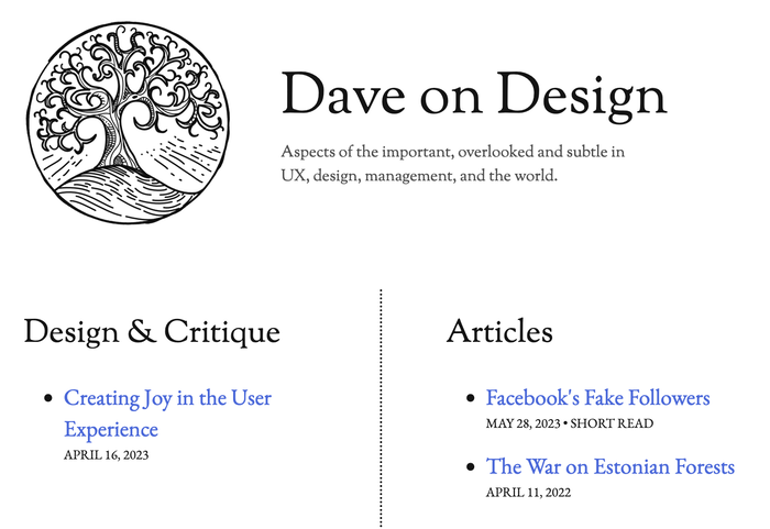
Dave on Design
Published September 15, 2023
By FontsInUse
Contributed by David Millington

Source: daveon.design License: All Rights Reserved.


Source: daveon.design License: All Rights Reserved.
This post was originally published at Fonts In Use

Source: daveon.design License: All Rights Reserved.


Dave on Design is intended to give a pure reading experience somewhat like the ‘reader mode’ in browsers, with a focus on typography inspired by pre-WW2 print. Some complex CSS allows mimicking early 20th century style sentence spacing. Following the design theme, the logo is also an old print-style engraving.
EB Garamond is a natural choice for the main text, and Sorts Mill Goudy for the slightly old-fashioned but elegant headings that lean into the century-old aesthetic.

Source: daveon.design License: All Rights Reserved.
Spirax is used for the drop caps.
This post was originally published at Fonts In Use
Read full story.
WRITTEN BY
FontsInUse
An independent archive of typography.