Dancing on the Grave of a Son of a Bitch by Diane Wakoski (Black Sparrow Press, first edition)
Source: www.abebooks.com Inanna Rare Books. License: All Rights Reserved.
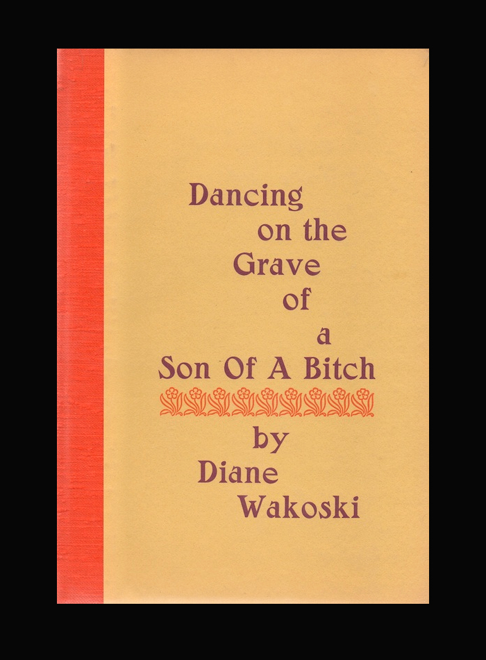
Cover of the original hardcover edition


The cover of the original 1973 edition of Diane Wakoski’s Dancing on the Grave of a Son of a Bitch uses Salem, set stacked and staggered, with the author’s name separated from the title by a row of floral ornaments.
Salem was introduced by the Keystone Type Foundry in Philadelphia in 1901 and advertised as “a witchey typeface” (cf. the Salem witch trials). It came accompanied by topical ornaments.
See also the contribution by Joshua Bodwell about the new expanded edition published by Black Sparrow Press in 2022.

Photo: Florian Hardwig. License: CC BY-NC-SA.
Zangezi is a contemporary reinterpretation of Salem, started by Daria Cohen in 2018. This animation shows the book title in Salem compared to a resetting in Zangezi’s Regular style. Zangezi is less bold and a good deal narrower than the original. See also the different treatment of details like the counter in D or the terminal of r.
Incidentally, if you plan to dance on a grave typographically, you can do so for free: Daria’s EULA waves the licensing fee for any designs related to death.
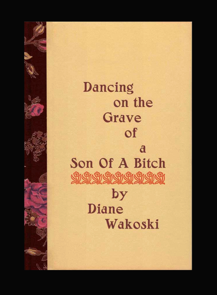
Source: www.abebooks.com Captain Ahab’s Rare Books (edited). License: All Rights Reserved.
“Deluxe Issue, one of five copies specially bound and designated for author, publisher, and a few individuals within the inner circle of the press, this one marked ‘Binder’s Copy’ and is signed by the author on the colophon.” This copy is for sale from Captain Ahab’s Rare Books.

Source: archive.org Internet Archive. License: All Rights Reserved.
Second printing, 1974. The title page has the book’s title in all caps. The secondary typefaces are Monotype Bodoni (left) and Bulmer (right).
This post was originally published at Fonts In Use