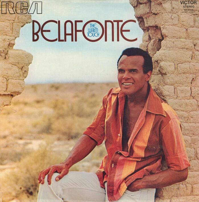
Harry Belafonte – The Warm Touch album art
Source: archive.org Internet Archive. License: All Rights Reserved.


Harry Belafonte’s 1971 album The Warm Touch was produced in New York, but the cover typeface probably came from across the pond: Queen was shown by London-based Photoscript as an “Exclusive Royalty” face in a 1970 catalog. I haven’t found out the designer and a definitive release date.
With its monolinear strokes and the wide circular glyphs for C E O Q, Queen is stylistically related to another all-caps sans with Art Deco characteristics from around the same time: ITC Busorama, issued in 1970. The “uncial” E is particularly similar. Unlike Busorama, Queen exhibits minuscule forms for M and N. With its mix of wide and narrow glyphs, it also has features in common with Organda (VGC, 1972). The uncredited sleeve designer utilized Queen’s wide round O to place the album title inside the counter.

Photo: Florian Hardwig. License: CC BY-NC-SA.
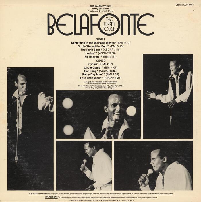
Queen as shown in a Typeshop specimen from around 1977. The glyph repertoire is caps-only, with an alternate form for G.
Source: archive.org Internet Archive. License: All Rights Reserved.
Back cover of an American pressing (LSP-4481)
Source: archive.org Internet Archive. License: All Rights Reserved.
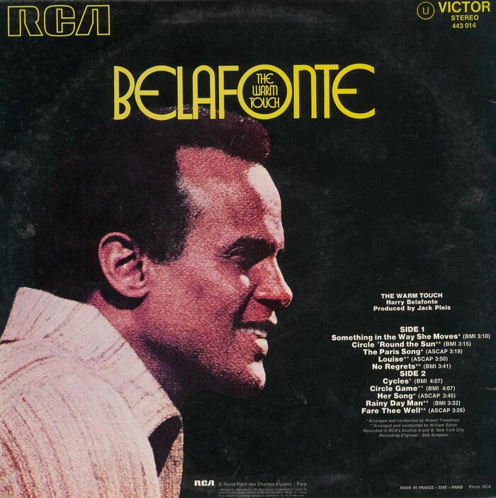
Back cover of a French pressing (443 014)
This post was originally published at Fonts In Use