Crooked in the Car Seat by Brian Lynch (Duras Press)

Source: clarelynchdesign.myportfolio.com License: All Rights Reserved.
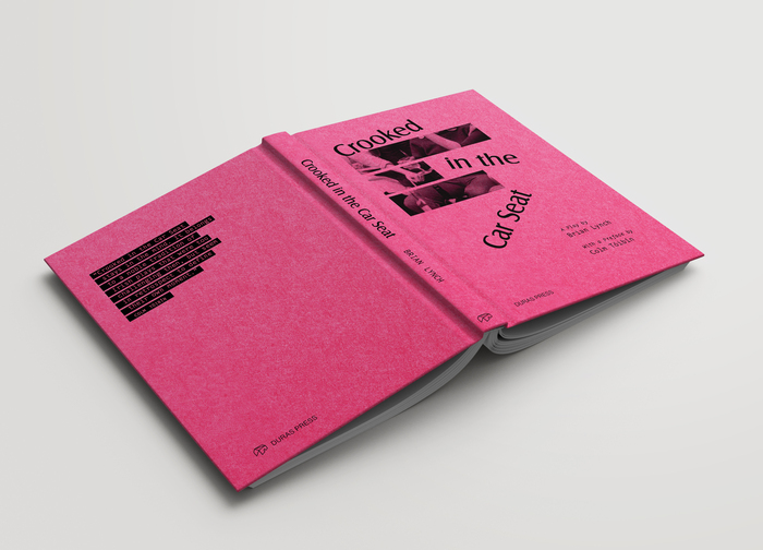
Front cover and spine


A limited edition hardback for the 2023 publication of Crooked in the Car Seat, a playscript that was written and staged in 1970s Ireland. The book was published by Duras Press and contains an introduction by the playwright Brian Lynch and a preface by the author Colm Tóibín. The cover was printed in single colour on Colourplan Hot Pink.
The title is a reference to a scene in the play in which a character drunkenly mishears the words of Van Morrison’s “Cyprus Avenue” – And I’m conquered in a car set, And I’m staring straight at you. The song is about attraction and unattainable love and these themes are reflected throughout the play.
The three bars that reveal the photo on the cover are representative of the original lyrics that are misheard:
Conquered
in a
Car Seat
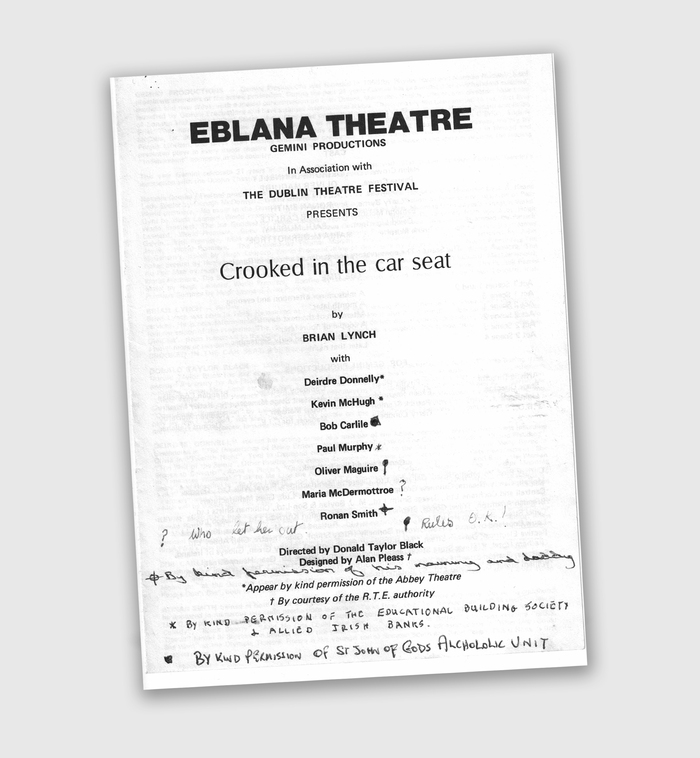
The typeface Castle was chosen for the title as it was a good representation of humanist sans serifs of the time. The cut used was produced by URW in 1985, but is a close match for the original version produced in the 1960s. A similar typeface was used on the programme for the 1979 production that was staged as part of the Dublin Theatre Festival that year (see an image of the original programme at the end of this post).
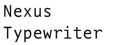
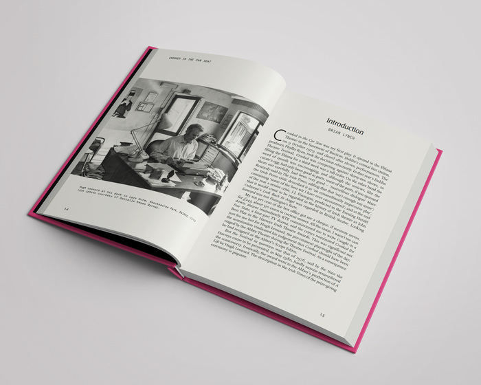
The main interior pages are typeset in Scala and Scala Sans by Susan Waine of Ashfield Press, later including Castle for section headings. Nexus Typewriter (designed by Martin Majoor) was chosen as the secondary typeface on the cover and then carried through on several interior styles (subheads, running heads and captions).
A monospaced typeface that emulated a typewriter-style seemed the natural choice for reproducing a playscript that would have been originally created on a manual typewriter. Luckily, in this context, Nexus works well with Scala (also designed by Majoor).
Source: clarelynchdesign.myportfolio.com License: All Rights Reserved.
Flat open cover
Source: clarelynchdesign.myportfolio.com License: All Rights Reserved.
Interior spread
Source: clarelynchdesign.myportfolio.com License: All Rights Reserved.
Original programme for the 1979 production that was staged as part of the Dublin Theatre Festival. The fonts in use are Helvetica Bold, the Selectric version of Univers, and what looks like a phototype version of Optima for the title.
This post was originally published at Fonts In Use