Butcher & Barlow
Published July 27, 2023
By FontsInUse
Contributed by Rick Raby
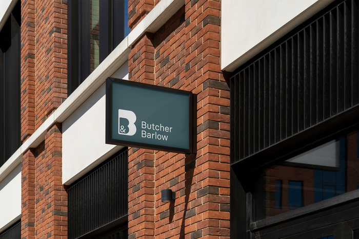
Source: themodernworld.co.uk Photo: Rick Raby. The Modern World. License: All Rights Reserved.

Source: themodernworld.co.uk License: All Rights Reserved.
Source: themodernworld.co.uk License: All Rights Reserved.

Source: themodernworld.co.uk License: All Rights Reserved.

Source: themodernworld.co.uk License: All Rights Reserved.
This post was originally published at Fonts In Use
Source: themodernworld.co.uk Photo: Rick Raby. The Modern World. License: All Rights Reserved.
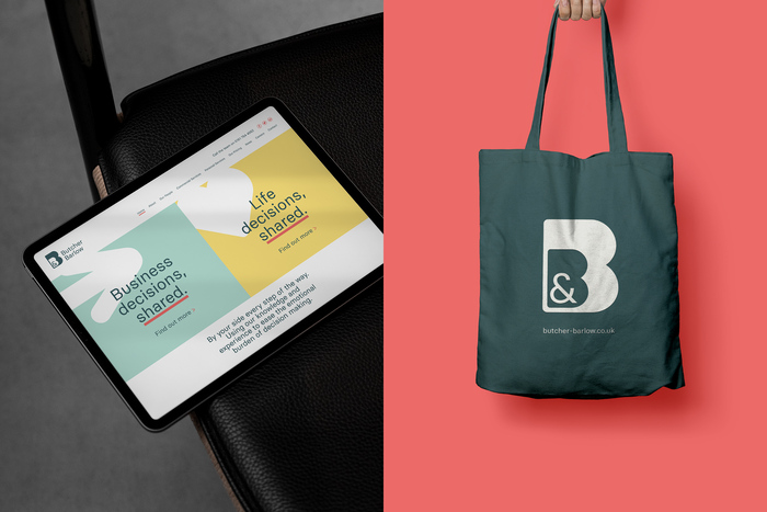
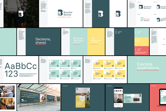
Basier by Atipo is used across the whole identity of Butcher & Barlow.
Butcher & Barlow is a law firm with the weight of 135 years of history on its shoulders, and all the corporate stereotypes that come with it. But as generational change happened internally to promote younger and more entrepreneurial partners, the firm needed to reflect that externally. That meant a modern identity that echoed the more relatable and personable direction the firm wanted to head in. The symbol, featuring an outer protective B enclosing an inner B, symbolised trust and reassurance.
Source: themodernworld.co.uk License: All Rights Reserved.
Source: themodernworld.co.uk License: All Rights Reserved.
Source: themodernworld.co.uk License: All Rights Reserved.
Source: themodernworld.co.uk License: All Rights Reserved.
This post was originally published at Fonts In Use
Read full story.
WRITTEN BY
FontsInUse
An independent archive of typography.
More from FontsInUse