Connaître Paris est votre rêve, RATP leaflet
Source: www.flickr.com Uploaded to Flickr by mikeyashworth and tagged with “paris” and “gillsans”. License: All Rights Reserved.


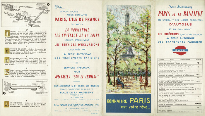
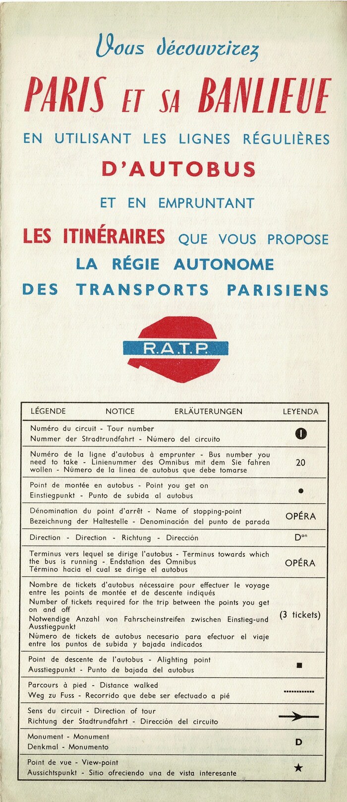
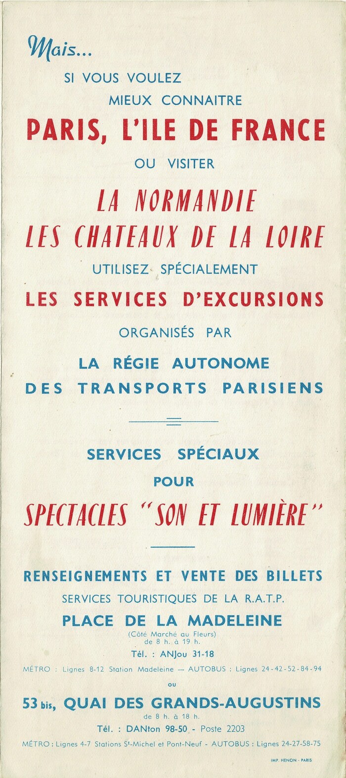
It is always lovely to see an RATP leaflet with the familiar artwork by Georges Redon who was one of their most prolific illustrators of the post-WW2 period. This is entitled Connaître Paris est votre rêve or “Knowing Paris is your dream” and describes a series of ‘tours’ available by using regular Paris daytime bus services as well as an advertisement for the excursion tours operated.
While the title on the front panel with Redon’s illustration of the Eiffel Tower uses lettering, most other text in this leaflet is typeset. Of the three typefaces in use, two are by the local Fonderie Typographique Française, or FTF for short, which operated at 4 Rue Napoléon-Chaix in the 15th arrondissement at the time.
The compressed oblique sans-serif caps with contrast are from the medium (demi-gras) weight of Enric Crous-Vidal’s Paris (1953). The pen script is Clipper (1952), designed by Louis Ferrand. All other text is set in various weights and widths of Monotype’s Gill Sans. It’s the version featuring alternates for M a g t u and other characters, bringing the design closer to Futura.
Printed by Imprimerie Hénon.
Source: www.flickr.com Uploaded to Flickr by mikeyashworth. License: All Rights Reserved.
Detail
Source: www.flickr.com Uploaded to Flickr by mikeyashworth. License: All Rights Reserved.
Detail
This post was originally published at Fonts In Use