Come and Trip It album art
Source: archive.org Internet Archive. License: All Rights Reserved.


Before Crayonette, there was Crayon. This unusually detailed display italic has most of the characteristics also found in Henry Brehmer’s 1889 design: horizontal contrast, bell bottoms, decorative tendrils, and descending capitals. Crayon was drawn by Herman Ihlenburg. The assignor to the MacKellar, Smiths & Jordan Company of Philadelphia filed a patent November 6, 1885, which was granted February 9, 1886. It’s distinguished from its follower by open letterforms with horizontal shading and even more ornamented capitals.
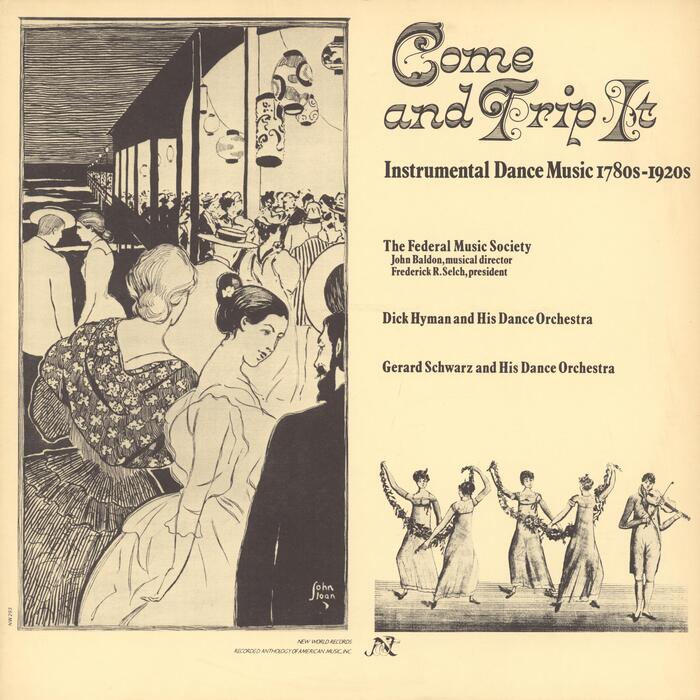
Around 1970, VGC issued a phototype adaptation as part of their T.J. Lyons Antique Type Collection. This font was used in Elaine Sherer Cox’s cover design for Come and Trip It: Instrumental Dance Music 1780s–1920s, an album recorded by members of the Federal Music Society, Dick Hyman and His Dance Orchestra, as well as Gerard Schwarz and His Dance Orchestra, and released by New World Records. Crayon is used with tighter linespacing than what was possible in metal type. The secondary typeface is Plantin Bold Condensed, and the illustration on the left is by John Sloan (1871–1951).
This post was originally published at Fonts In Use