CLEAR Hair Care Campaigns in China
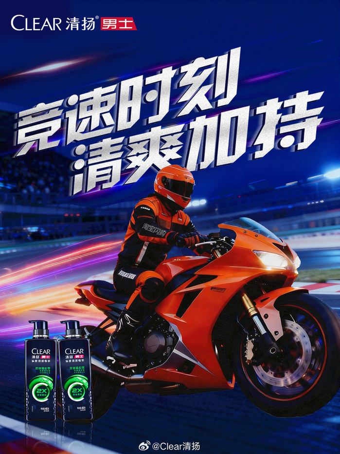
License: All Rights Reserved.
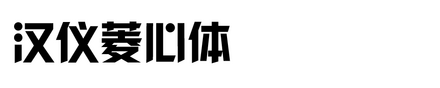
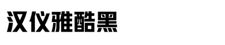
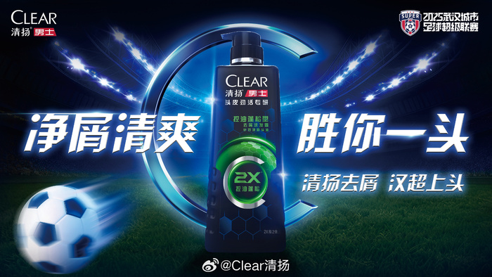
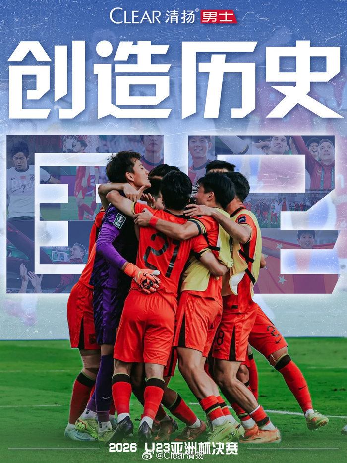
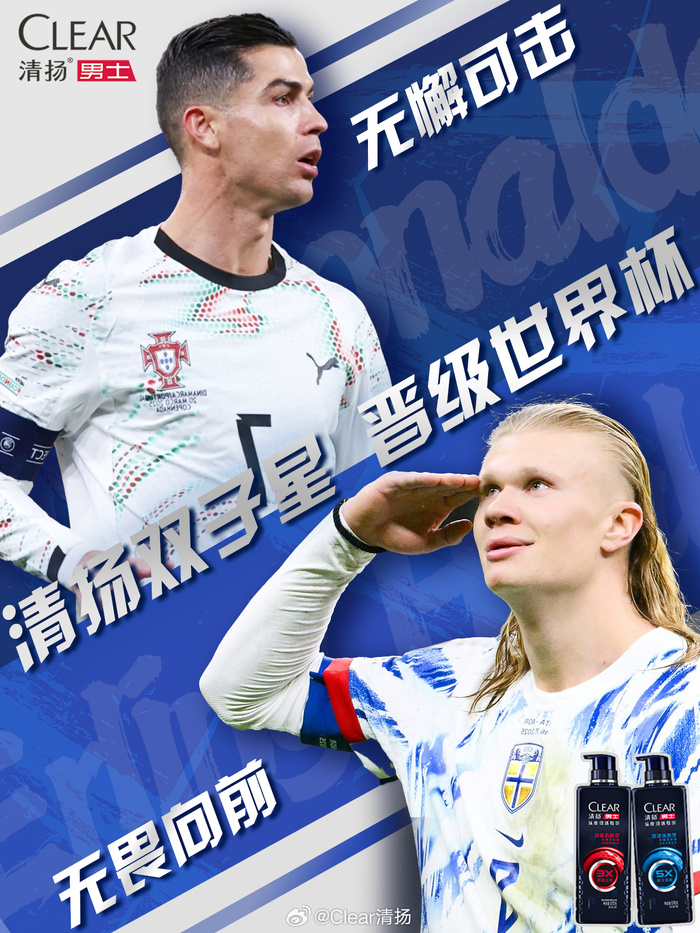
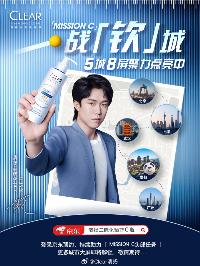
CLEAR used HY Lingxin and HY YaKuHei in Chinese personal care campaigns. CLEAR’s visual communication often needs to express freshness, confidence, and strong product performance. HY Lingxin brings a crisp geometric feeling. It works well when the brand wants the Chinese headline to feel modern, clean, and energetic. The typeface can match high contrast images and help the message feel sharp.
HY YaKuHei adds a stronger display impact. It is useful for promotional moments where the campaign needs a heavier voice and clearer emphasis. Together, the two fonts give CLEAR flexibility in different media, from digital posters to sales promotion materials. HY Lingxin can support a stylish and fresh tone, while HY YaKuHei can make the message more powerful and direct. This combination helps CLEAR balance beauty, confidence, and product strength in Chinese typography.
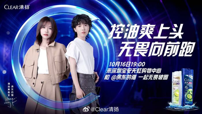
License: All Rights Reserved.
License: All Rights Reserved.
License: All Rights Reserved.
License: All Rights Reserved.
License: All Rights Reserved.
This post was originally published at Fonts In Use