Chilli Beans eyewear

Source: dan-hahn.com License: All Rights Reserved.


Founded in 1996, Chilli Beans grew to become Latin America's biggest sunglasses producer. With more than 700 franchises, mostly based in Brazil, the brand is now present throughout Latin America and beyond, in countries such as Mexico, Colombia, Peru, Bolivia, the USA, and the UAE.
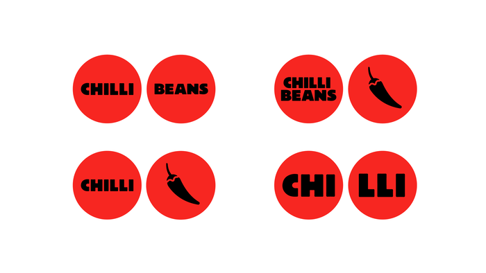
In 2020, the company went through a rebranding, coordinated by AlmapBBDO. In the process, their ‘chili pepper’ symbol was subtly redrawn, and separated from their wordmark. The typography in their logo went from a bold lowercase italic sans to a slightly altered version of Graúna, set in all caps.
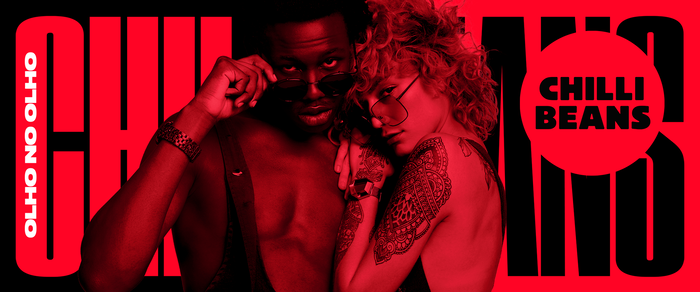
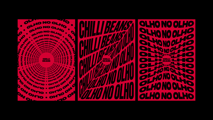
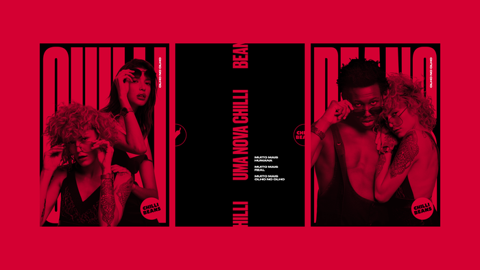
The most predominant typeface in their redesign is Druk, used in both the Wide and Condensed versions, and starring in their first post-rebrand campaign titled Olho no Olho (“Eye to Eye”), as well as in other places, such as their Instagram account and the website.
Creative direction: Marcus Sulzbacher
Logo: Dandara Hahn
Design direction: Dandara Hahn, Paulo Altieri, Johann Vernizzi
Art direction: Dandara Hahn, Paulo Altieri, Johann Vernizzi
Rebrand agency: AlmapBBDO, EnergyBBDO
Campaign Olho no Olho: Enzo Giacomin (Agency: Purple Cow)
Animations: Sailor Studio
Source: dan-hahn.com License: All Rights Reserved.
Source: www.behance.net License: All Rights Reserved.
Source: www.behance.net License: All Rights Reserved.
Source: www.behance.net License: All Rights Reserved.
This post was originally published at Fonts In Use