Good Pud packaging
Published March 7, 2023
By FontsInUse
Contributed by Amanda DeVries
Source: www.goodpud.ca License: All Rights Reserved.
Source: www.goodpud.ca License: All Rights Reserved.

Photo: Amanda DeVries. License: All Rights Reserved.

Photo: Amanda DeVries. License: All Rights Reserved.

Photo: Amanda DeVries. License: All Rights Reserved.
This post was originally published at Fonts In Use
Source: www.goodpud.ca License: All Rights Reserved.
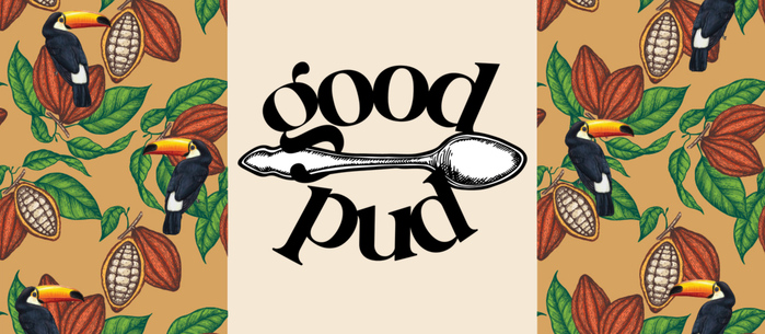
These tiny “pots de creme” by Good Pud are an absolute dream, and needed the premium look to go with it. But we also wanted to strike a good balance between a premium look but also not to take ourselves too seriously.
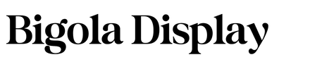
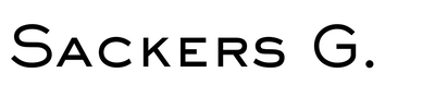
Knowing that the products would eventually go beyond chocolate (but would always be some sort of pudding style), a spoon was the choice for a graphic mark. The elegant but still chunky Bigola was used for the main visual identity and is balanced by the understated Sackers Gothic.
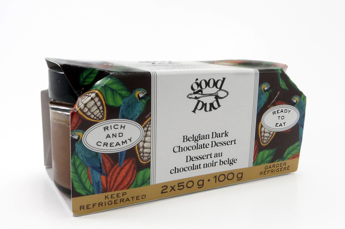
The packaging design balanced the premium logomark with whimsical graphics and happy colours.
Source: www.goodpud.ca License: All Rights Reserved.
Photo: Amanda DeVries. License: All Rights Reserved.
Belgian Dark Chocolate Dessert Packaging
Photo: Amanda DeVries. License: All Rights Reserved.
Salted Caramel & Belgian Dark Chocolate Dessert Packaging
Photo: Amanda DeVries. License: All Rights Reserved.
Belgian Milk Chocolate Dessert Packaging
This post was originally published at Fonts In Use
Read full story.
WRITTEN BY
FontsInUse
An independent archive of typography.