Chicken & Egg Films
Source: www.pentagram.com License: All Rights Reserved.


Chicken and Egg Films is a non-profit organization based in New York City. It was founded in 2005 by prize-winning documentary filmmakers Julie Parker Benello, Wendy Ettinger, and Judith Helfand with the aim of promoting women in this area of the industry. To this day, Chicken and Egg has provided over 14 Million US-Dollars in grants to over 500 filmmakers, both in the States and abroad.
In 2024 the organization underwent a renewal. On the programmatic side, funding and mentorship was extended to other groups underrepresented in documentary filmmaking, namely LGBTIQ+ and gender-expansive people. On the design side, Chicken and Egg was provided with the new visual identity shown in this post. It is the work of Pentagram’s London branch.
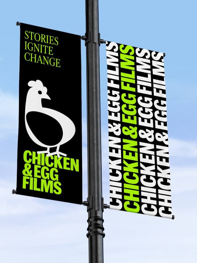
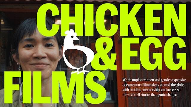
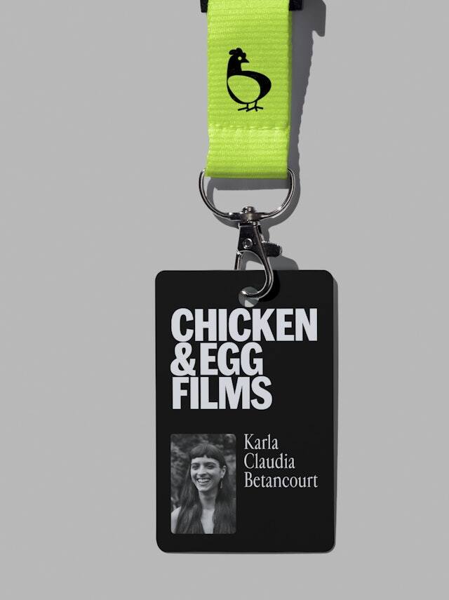
The centerpiece of the design is the pictorial logo of a hen with a counter shape in form of an egg, which leaves the question open what to look at first. The principal colors used are black, white, and a fluorescent, greenish yellow. The additional secondary color palette shows bright, friendly tones akin to the rainbow flag without mimicking it. On top of that comes a selection of two typefaces of distinct quality: Marr Sans and Cardinal Fruit.
Marr Sans Condensed Bold was chosen as top-level headline font with all-caps typesetting. The Marr Sans family was designed by Paul Barnes and Dave Foster on the basis of Scottish metal types from the 1870s, and released by Commercial Type in 2014. The typeface to accompany it is Cardinal Fruit, a seriffed roman of very narrow proportions. Cardinal Fruit is a variant of the larger Cardinal family designed by Jean-Baptiste Levée from Production Type. Apart from some references to the Garamond and the Granjon romans, the major inspiration for its design lies in the tight typesetting of 1980s photo journalism.
Source: www.pentagram.com Pentagram. License: All Rights Reserved.

Source: chickeneggfilms.org License: All Rights Reserved.

Source: chickeneggfilms.org License: All Rights Reserved.

Source: chickeneggfilms.org License: All Rights Reserved.

Source: chickeneggfilms.org License: All Rights Reserved.
Source: chickeneggfilms.org License: All Rights Reserved.
Source: www.pentagram.com License: All Rights Reserved.
This post was originally published at Fonts In Use