Chandan Kolaparthi portfolio website
Published February 6, 2024
By FontsInUse
Contributed by chandan kolaparthi
Source: thisischandan.com Photo: chandan kolaparthi. License: All Rights Reserved.


Source: thisischandan.com Photo: chandan kolaparthi. License: All Rights Reserved.
Source: thisischandan.com Photo: chandan kolaparthi. License: All Rights Reserved.
Source: thisischandan.com Photo: chandan kolaparthi. License: All Rights Reserved.
This post was originally published at Fonts In Use
Source: thisischandan.com Photo: chandan kolaparthi. License: All Rights Reserved.
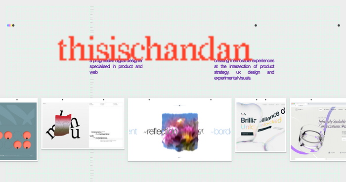
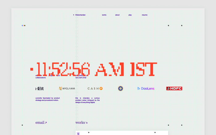
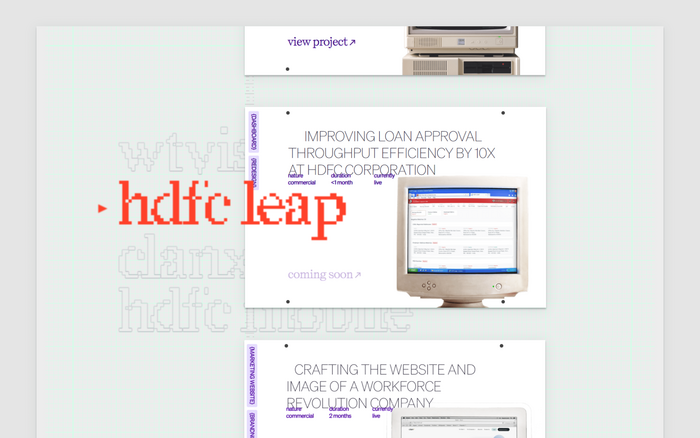
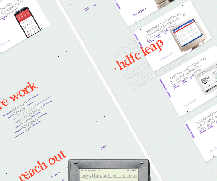
In a world full of large grotesk fonts and blocky layouts, my portfolio website aims to offer an unconventional mix of fonts that invoke a strong sense of emotion. Throwing out the prejudice of ugly and beautiful allows the artistic combo of typefaces to shine through, complimenting the retro aesthetic.
This website aims to give an impression of “familiar yet not at the same time”, thanks to the nostalgic mockups combined with MCKL’s innovative degradation concept of their Redaction. An unexpected pairing of fonts is attained by adding Söhne from Klim Type Foundry and Self Modern from Bretagne. The typesetting – a mix of all lowercase and all caps – ensures a refreshing impression.
Source: thisischandan.com Photo: chandan kolaparthi. License: All Rights Reserved.
Source: thisischandan.com Photo: chandan kolaparthi. License: All Rights Reserved.
Source: thisischandan.com Photo: chandan kolaparthi. License: All Rights Reserved.
This post was originally published at Fonts In Use
Read full story.
WRITTEN BY
FontsInUse
An independent archive of typography.