Centre Cerise identity and website
Source: www.centrecerise.com License: All Rights Reserved.
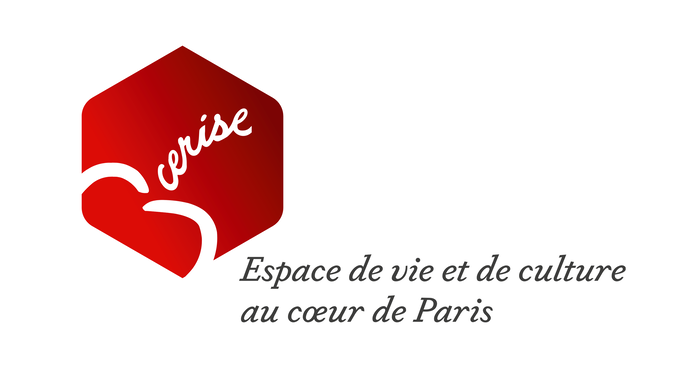
Logo with Dapifer Italic


Dapifer is the main typeface used for the identity and website of Cerise.
Cerise is the French word for “cherry”. It’s also the abbreviated name of a neighborhood association in Paris’s 1st arrondissement: C.E.R.I.S.E. stands for Carrefour Echanges Rencontre Insertion Saint-Eustache, which can be translated to “junction, exchange, encounter, integration [in the parish of] Saint-Eustache”. Since 1999, it runs a sociocultural center that hosts various cultural events and activities and offers support to those in need.
In 2019, the center’s visual identity was overhauled. The red hexagonal logo holds a stylized cherry with the name shown as the curved stem, in custom script lettering. Below, the claim (“a living and cultural space in the heart of Paris”) is set in Dapifer’s lively italic.
Text and headlines on the website are set in various weights and styles of both Dapifer and Dapifer Stencil. Darden Studio’s unbracketed old-style serif is supported by Anivers, a sans by Jos Buivenga, for menus and information boxes. This typographic mix is enriched by changing display typefaces.
Source: www.centrecerise.com License: All Rights Reserved.
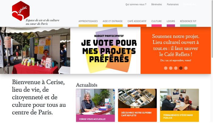
Homepage with a welcome message in Dapifer Stencil. One of the slides features Bungee by DJR.
Source: www.centrecerise.com License: All Rights Reserved.
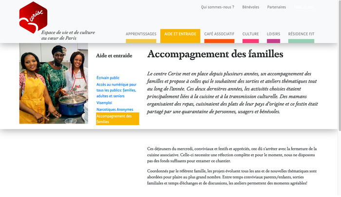
Page about “help and mutual aid”, with Dapifer Stencil Bold for the headline, Dapifer Italic for the lede, and upright Dapifer for the small text.
Source: www.centrecerise.com License: All Rights Reserved.
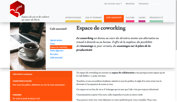
Anivers is used for the main and subordinate menus as well as for the practical info.
Source: www.centrecerise.com License: All Rights Reserved.
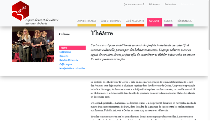
The menu uses color-coded tabs for the six categories of the website – culture is pink and includes information about theater, exhibitions, concerts, and more.
Source: www.centrecerise.com License: All Rights Reserved.
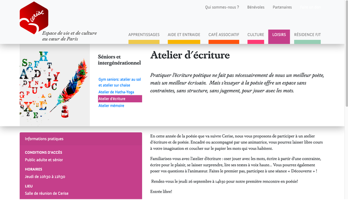
The leisure activities also include a writing workshop.
Source: www.centrecerise.com License: All Rights Reserved.
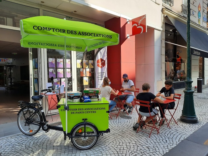
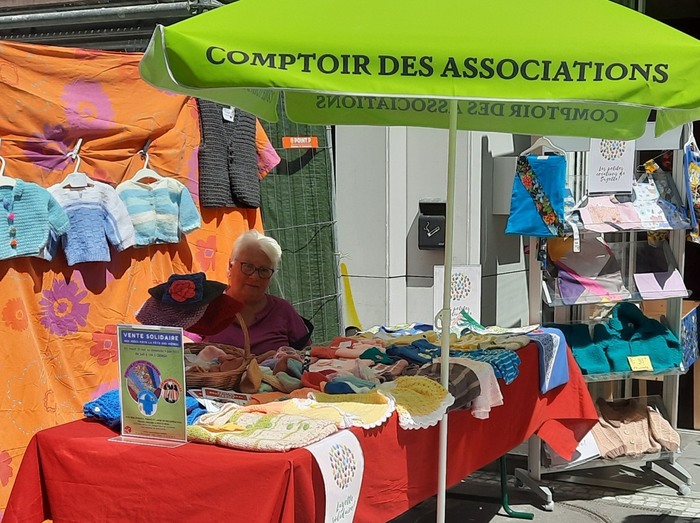
Dapifer in all caps for the umbrella and cargo trike of the Comptoir des Associations, as well as for the white banner in the background
Source: www.facebook.com License: All Rights Reserved.
At the neighborhood fleamarket in front of the Centre Cerise on 46 rue Montorgueil
This post was originally published at Fonts In Use