Carnegie Hall

Source: www.instagram.com License: All Rights Reserved.


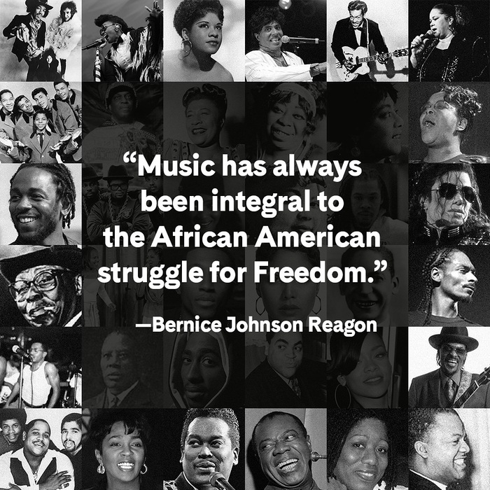
World-famous concert venue Carnegie Hall, located in Manhattan, New York City, got a rebrand in 2021, after more than two years of (pandemic-interrupted) work by Champions Design and their own in-house team. Champions wrote this about the logo/wordmark, which was made with support from Frere-Jones Type:
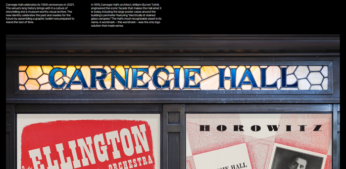
In 1919, Carnegie Hall’s architect, William Burnet Tuthill, engineered the iconic facade that makes the Hall what it is today, including the large poster cases around the building’s perimeter featuring “electrically lit stained glass canopies.” The Hall’s most recognizable asset is its name. A wordmark – this wordmark – was the only logo solution that made sense.
The typography combines Typofonderie’s Fournier revival PS Fournier with the sans-serif Cádiz by Luzi Type. Champions comments on the pairing:
Fournier is a classic serif typeface that delivers what people expect from Carnegie Hall. In contrast, Cadiz is simple and modern, but shares a handful of similarities with Fournier, such as the “W.” The combination of these two typefaces in the wide variety of weights available supports the diversity of programming put forth by the Hall. Together they can talk about classical music, jazz, hip hop, music education, and social impact programs, and all that the Hall presents.

Source: www.instagram.com License: All Rights Reserved.

Source: www.instagram.com License: All Rights Reserved.

License: All Rights Reserved.
Homepage with logo and menu

Source: www.carnegiehall.org License: All Rights Reserved.
Website detail

Source: www.instagram.com License: All Rights Reserved.

Source: www.instagram.com License: All Rights Reserved.
Source: www.instagram.com License: All Rights Reserved.
Source: www.championsdesign.com License: All Rights Reserved.
Carnegie Hall's new wordmark
Source: www.championsdesign.com License: All Rights Reserved.
The lettering the wordmark is based on
This post was originally published at Fonts In Use