CaféCité

Maxim Usik. License: All Rights Reserved.


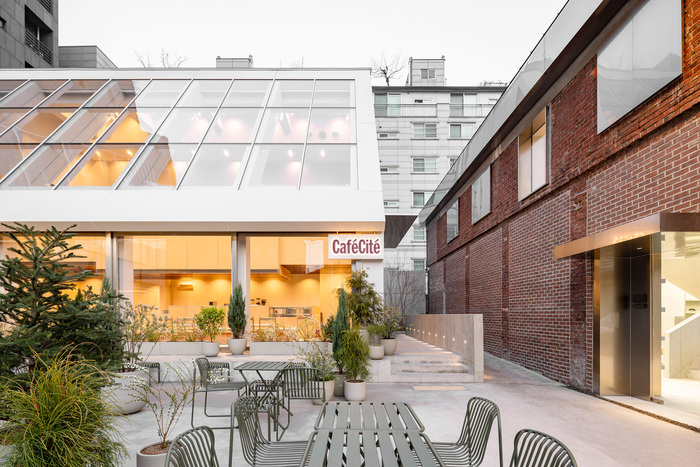
CaféCité in Seoul was envisioned as more than a café—it is a keeper of memories, a place where fragments of personal journeys are gathered, treasured, and shared. Rice translated this vision into a brand identity built on a flexible grid system, echoing drawers filled with postcards, souvenirs, and fleeting moments.
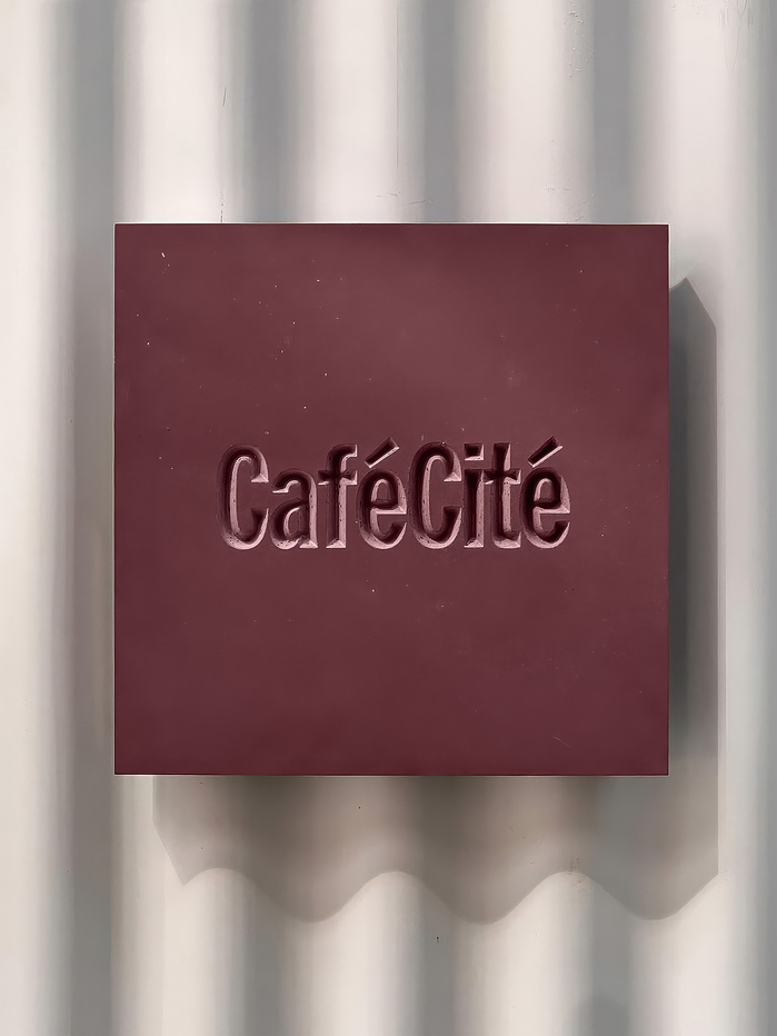
Illustrations take the form of travel mementos and postcard-like scenes, nodding to the café’s role as a meeting point for stories. A masthead-inspired logo anchors the brand with presence, while evoking the editorial voice of a city publication. HEX Franklin is our primary brand typeface. HEX Franklin is an homage to the classic Franklin Gothic type family and its lighter-weight siblings, News Gothic and Lightline Gothic. This gives the brand a unique character that stands out while remaining elegant and approachable.
Together, these elements create a framework that is both dynamic and evolving—mirroring the shifting rhythms of urban life. Through this system, CaféCité becomes more than a destination for coffee. It stands as a living archive, where the city and its people inscribe their own memories, continuously adding to a collective story still unfolding.
Rice. License: All Rights Reserved.

License: All Rights Reserved.
Rice. License: All Rights Reserved.

License: All Rights Reserved.

Rice. License: All Rights Reserved.

Rice. License: All Rights Reserved.

Rice. License: All Rights Reserved.
The Halo Beriti label uses Beatle.

Rice. License: All Rights Reserved.

Rice. License: All Rights Reserved.

Rice. License: All Rights Reserved.

Rice. License: All Rights Reserved.

Rice. License: All Rights Reserved.

Rice. License: All Rights Reserved.
This post was originally published at Fonts In Use