Brooklyn Org
Published January 12, 2026
By FontsInUse
Contributed by Aubrey Hays, Frere-Jones Type
Source: www.motherdesign.com License: All Rights Reserved.

Source: www.motherdesign.com License: All Rights Reserved.
Source: www.motherdesign.com License: All Rights Reserved.
Source: www.motherdesign.com License: All Rights Reserved.
This post was originally published at Fonts In Use
Source: www.motherdesign.com License: All Rights Reserved.
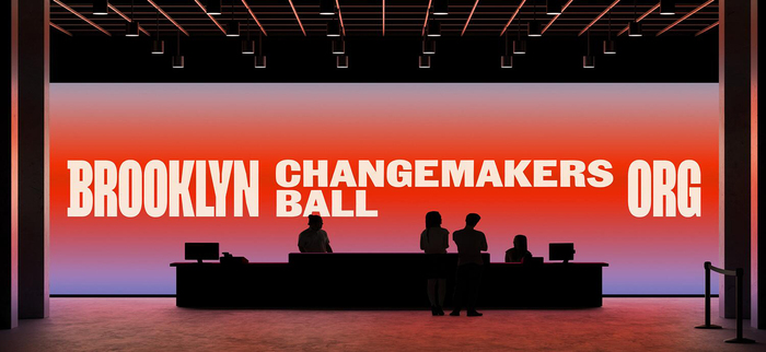
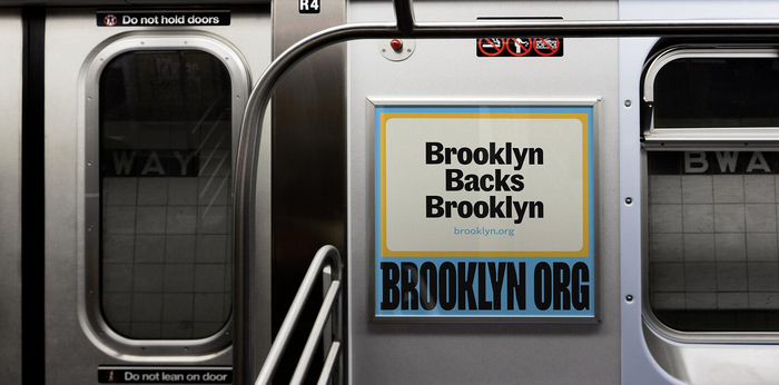
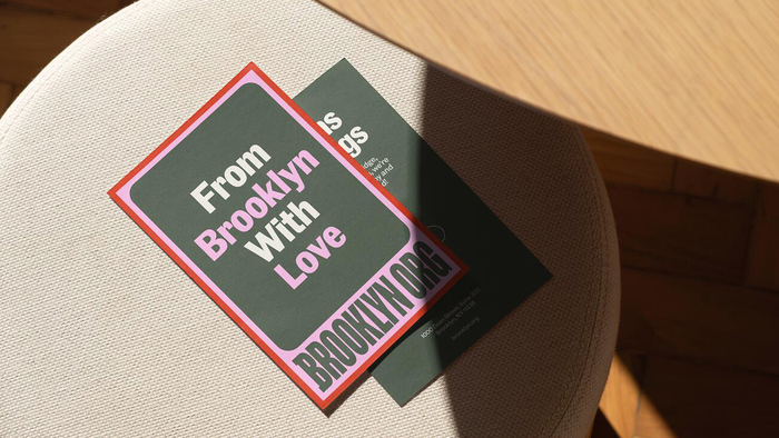
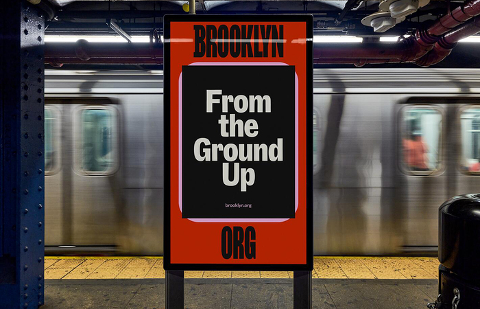
Mother Design created the new brand identity for Brooklyn Org, formerly known as Brooklyn Community Foundation, the first and only public foundation solely dedicated to Brooklyn’s charitable community. Community Gothic—a typeface created by Frere-Jones Type—was a perfect, serendipitously named fit for type, with its diverse styles and human qualities.
From Brooklyn Org:
Inspired by the density of Brooklyn, the visual direction created by Mother Design, which worked on the project pro bono, pays homage to the close-knit, diverse community that makes up the borough and feeds its sense of ambition and confidence, both at an individual and collective level.
Source: www.motherdesign.com License: All Rights Reserved.
Source: www.motherdesign.com License: All Rights Reserved.
Source: www.motherdesign.com License: All Rights Reserved.
This post was originally published at Fonts In Use
Read full story.
WRITTEN BY
FontsInUse
An independent archive of typography.
More from FontsInUse