bronchify


bronchify. License: All Rights Reserved.
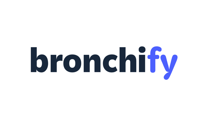
Like a good ride, it’s all in the spacing: bronchify breathes easy, Kit sets easy.
The German company that’s concerned with “all things related to your horse’s respiratory health” recently rebranded. The newly introduced logo combines Kit Sans and Kit Rounded by Darden Studio. Being cut from the same cloth, the two typeface styles naturally go together well.
The Sans is more formal and ensures the reliability expected of a medical brand. The Rounded – which, quite unusually, came first in Kit’s design process – adds a good deal of approachability. The notch in the y works as extra eye-catcher. The last two letters are additionally highlighted through color. Consequently, they stand out from the wordmark, and can also be read as addressing the customer: “fy” as in “for you”.
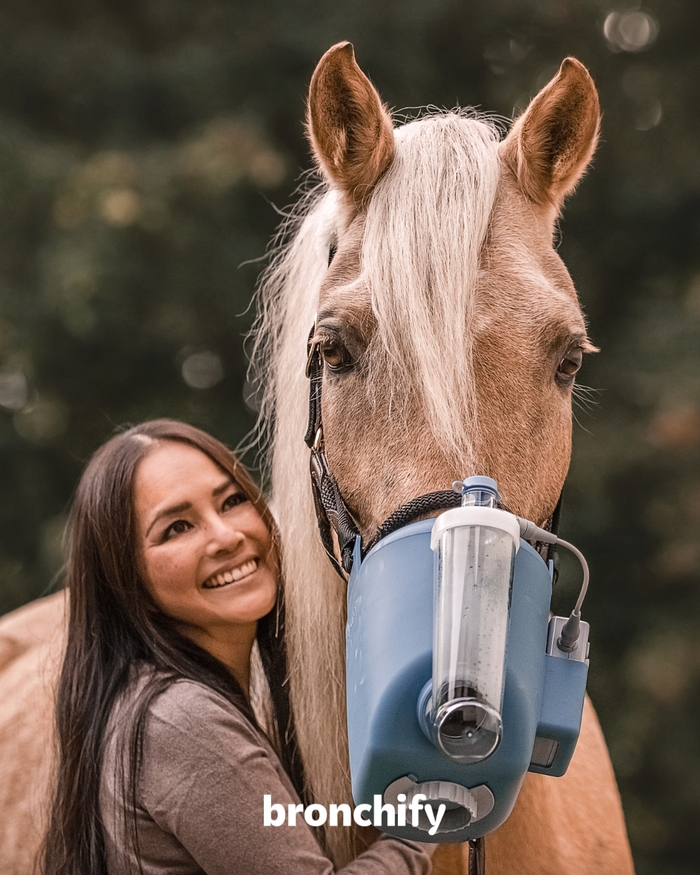

Source: shopde.bronchify.com bronchify. License: All Rights Reserved.
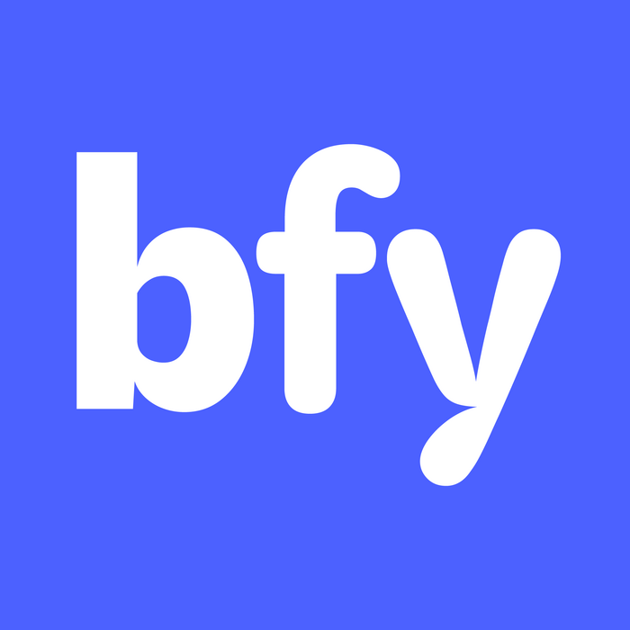
The compact version of the logo as seen for the favicon retains the combination of Kit Sans and Kit Round.
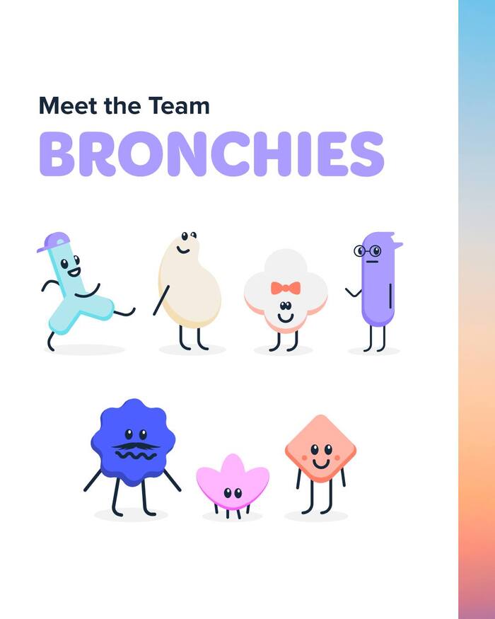
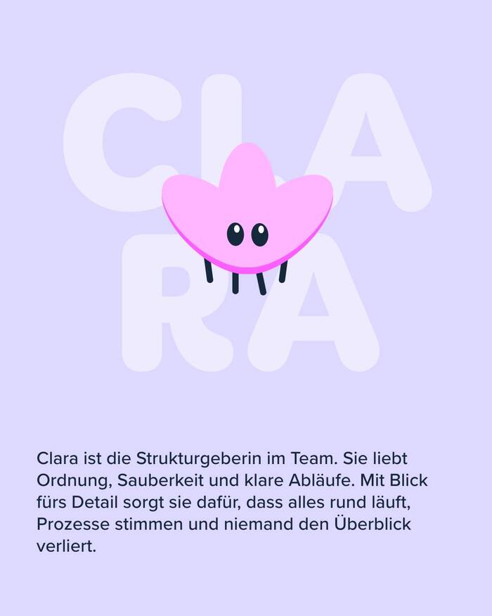
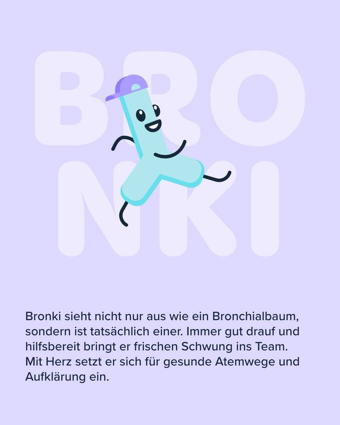
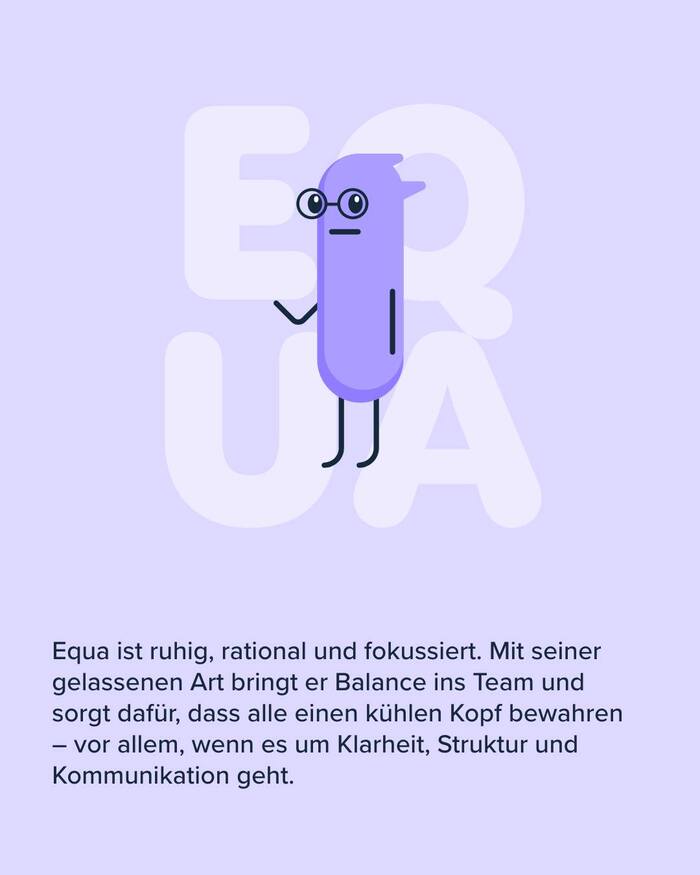
Kit is also used for other touchpoints. Shown below are the “Bronchies”, a team of brand ambassadors in the form of cute characters related to horses and their lungs. Names in bold caps from Kit Rounded are supported by copy in Proxima Nova.
This post was originally published at Fonts In Use