Bretons magazine, 2026 redesign
Source: www.instagram.com David Yven. License: All Rights Reserved.



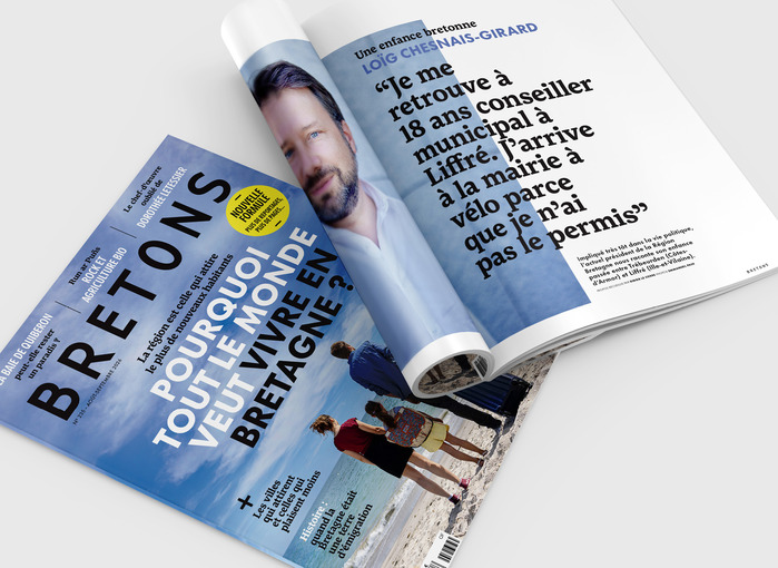
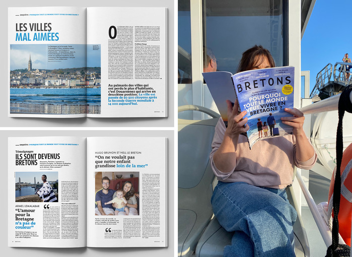
For the new formula of Bretons magazine, art director David Yven has built a typographic system around three distinct voices.
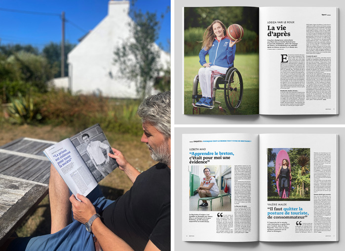
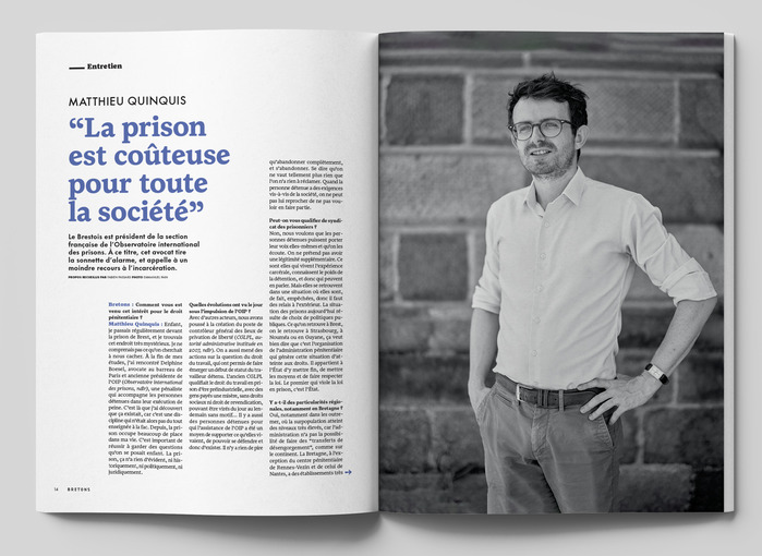
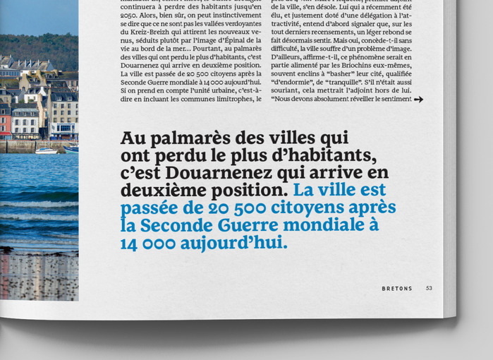
The magazine’s existing masthead, based on Base 9 Sans by Zuzana Licko, has been retained, preserving a visual continuity with previous issues. Monotype’s Futura Now, set exclusively in capitals, provides the display layer for the main headlines. Between these two poles, Bilzig handles the editorial matter and most of the intermediate levels of hierarchy.
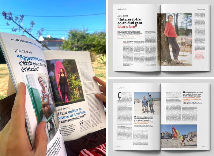
Bilzig Regular is used for running text in roman and italic. Its Bold and Black weights extend the family into the macrotypographic scale, handling subheads, standfirsts and other intermediate levels. Changes in size, weight and colour allow the hierarchy to be built largely within the same type family, rather than multiplying typefaces.
The choice of Bilzig is also functional at the character-set level. Designed with the specific requirements of Breton in mind, the typeface includes forms and glyphs that are not incidental to the language, such as the K with diagonal stroke (Ꝃ) and the N with tilde (Ñ/ñ), alongside the numerous apostrophes characteristic of Breton typography. These details become particularly visible in a publication where Breton is not treated as an ornamental layer, but as a language of everyday editorial content.
Bilzig was initiated by Brest-based type designer Jeanne Saliou during her research at the Atelier national de recherche typographique (ANRT) and developed with Skritur, where the typeface was finalised in 2025. Its design explores how a typeface can accommodate the linguistic and typographic specificities of Breton while remaining fully functional for extended reading.
In Bretons, that research is put to work in a complete editorial system: a geometric display face for headlines, a retained masthead as an identity marker, and Bilzig as the typographic infrastructure connecting the different scales of reading.
David Yven. License: All Rights Reserved.
David Yven. License: All Rights Reserved.
David Yven. License: All Rights Reserved.
David Yven. License: All Rights Reserved.
David Yven. License: All Rights Reserved.
This post was originally published at Fonts In Use