Die drei ??? und der seltsame Wecker
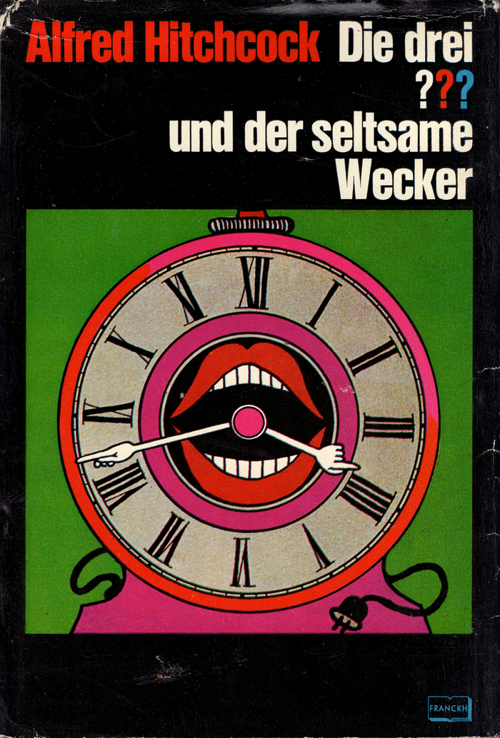
Aiga Rasch, Franckh. License: All Rights Reserved.
The juvenile detective book series The Three Investigators has a cult following in Germany, there known under the name Die drei ??? (“Die drei Fragezeichen”, literally “The Three Question Marks”). The unusual graphic design of the covers has been contributing to the success. Designer Aiga Rasch’s illustrations never show the main characters of the book.
Die drei ??? und der seltsame Wecker was written by Robert Arthur and first published in the United States in July 1968, as The Mystery of the Screaming Clock. The translation by Leonore Puschert came out in 1970 as the fourth book in the German series.
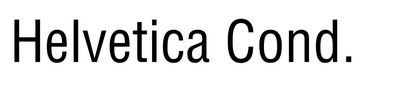
The font used on the artwork appears to be Stempel’s Helvetica schmalfett, known abroad as Extra Bold Condensed. Helvetica Inserat is pretty close, too.
The digital version looks a little different, which might have been the reason that the publishing house used Helvetica Condensed Black in the digital age, but distorted it by 128.5%. Today the series uses a custom typeface: Rocky Beach Grotesk, see the post by Büro Uebele.
This post was originally published at Fonts In Use