Breathing Tea

Source: www.instagram.com License: All Rights Reserved.


Bringing together an East Asian drink with Western European Renaissance writing might appear audacious. But in fact it turns out to be an intercultural love match where “craftsmanship” is the core value.
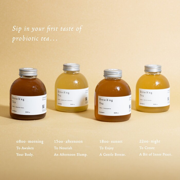
Breathing Tea is a small business based in Hong Kong that fully focusses on producing all sorts of Kombucha tea. As of fall 2024 the firm is represented in six places across Hong Kong and offers an online shop. Name and website of the brand make it clear that the purpose of the enterprise is to offer mindfully handcrafted brews, following the centuries-old tradition.
And it is here where you can see how well the chosen typeface fits in: Francesco was designed by Franck Jalleau on the basis of early Italian Renaissance printing, especially from the presses of Aldus Manutius. The typeface’s name pays tribute to Francesco Griffo who was the punchcutter of Manutius and is seen as one of the central figures in transforming Humanist calligraphy into typography.
Instead of copy-pasting recurring elements of type design, like for instance the serifs, Franck Jalleau strived to emulate the spirit of early punchcutting craftsmanship and to individually balance each letter in its own right, leading to more variation in those details.
Yet Francesco is not a mere revival, but a contemporary take on the Renaissance topic. Most noticeable are certainly the filled black counters of a and e, a characteristic that makes the typeface recognizable and therefore suitable for identity projects. Francesco comes with a variety of stylistic alternates and also provides full Greek and Cyrillic character sets. It was published by Production Type in 2017.
That same year appeared the geometric Halcyon by Jonathan Gibson, the complementary face used on the website of Breathing Tea.
Source: www.instagram.com License: All Rights Reserved.
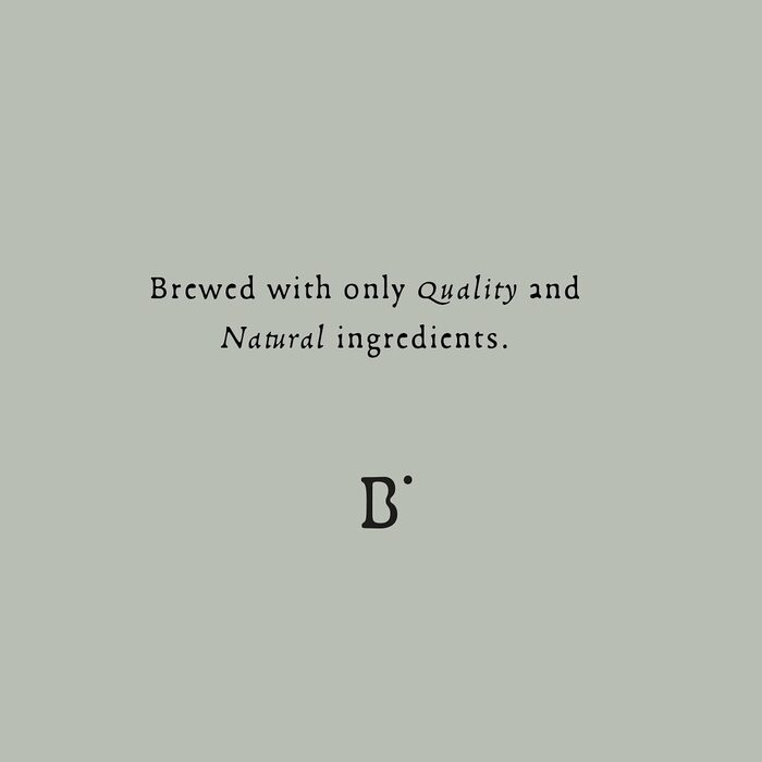
Francesco is used with ample letterspacing. In the logotype, the letter i is represented by the dot only. The compact logo version combines a single letter B (modified to have one open counter) with that floating dot.
Source: www.instagram.com License: All Rights Reserved.
Source: www.instagram.com License: All Rights Reserved.
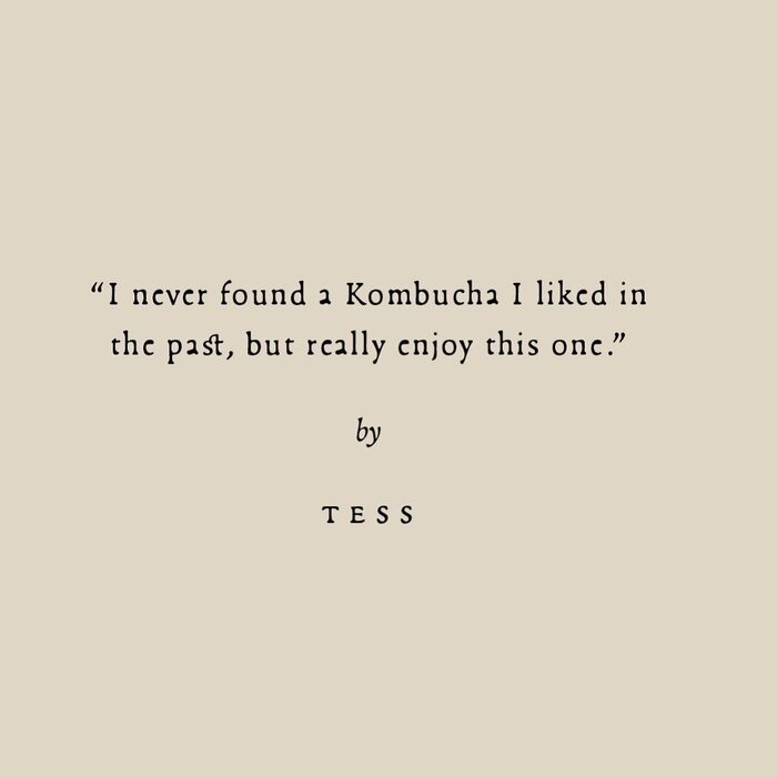
Social media typography doesn’t have to be loud or sloppy: a customer testimonial is carefully set using Francesco in roman, italic and small caps, with a discretionary st ligature and hanging punctuation

Source: www.breathingtea.com License: All Rights Reserved.
Source: www.instagram.com License: All Rights Reserved.
Box set with two bottles of tea
Source: www.breathingtea.com License: All Rights Reserved.
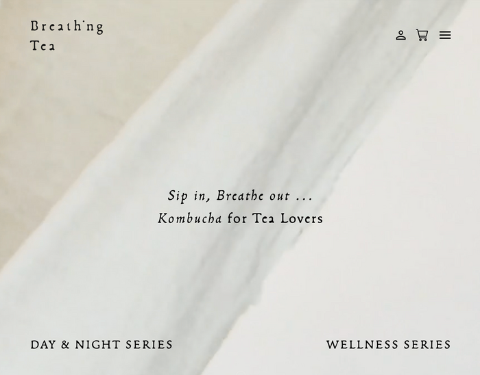
Homepage
Source: www.breathingtea.com License: All Rights Reserved.
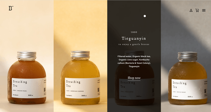
Flavor selection menu
Source: www.breathingtea.com License: All Rights Reserved.
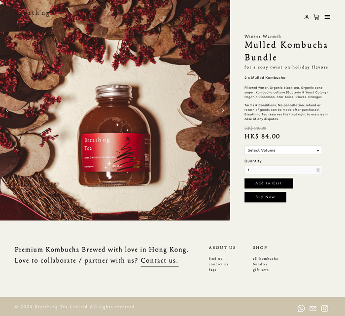
Product page
Source: www.instagram.com License: All Rights Reserved.
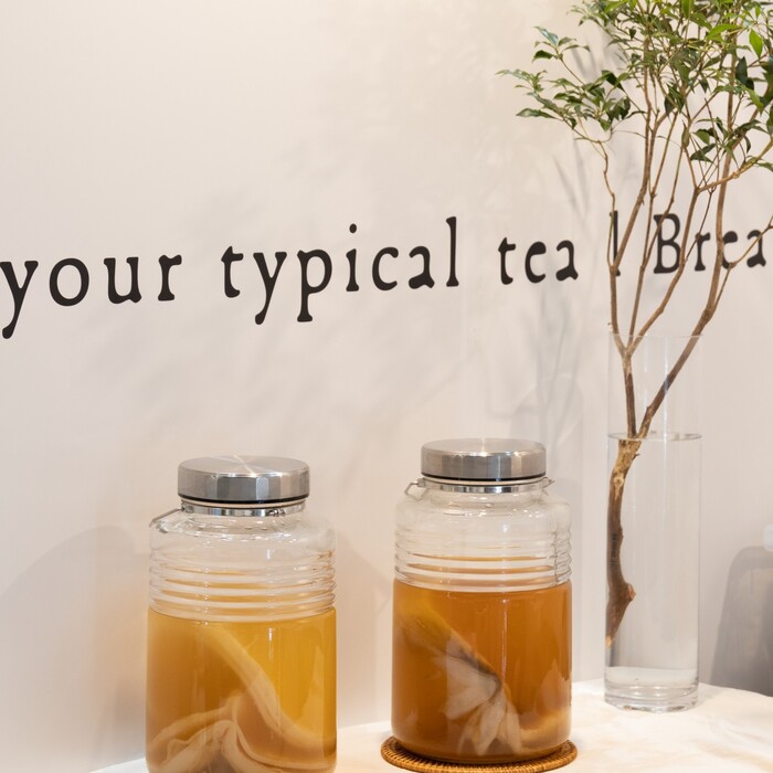
Kombucha in the making
This post was originally published at Fonts In Use