As We Are Now book jacket


One advantage that lettering has over typeset text is that the artist can always alter letterforms ad hoc, depending on the context. This allows her to make the most of the available space, to dissolve awkward pairs into pleasing combinations, or simply to enliven a design by means of variegation.
Ursula Suess was a graphic artist who designed numerous book jackets in her career. For the majority of them, she’d come up with her own letterforms. I’ll later add a selection of designs that hints at her stylistic range in the comments to this article.

Source: www.abebooks.com Between the Covers. License: All Rights Reserved.
An early jacket with italic lettering, designed by Suess for Sean O’Casey’s Sunset and Evening Star, Macmillan, 1955

Source: www.abebooks.com Between the Covers. License: All Rights Reserved.
Suess designed the jacket for The Confrontation by Lenore Marshall (W.W. Norton) in 1972, the year her Book Jacket was released. The lettering could pass as an extrabold variation.

Source: www.klingspor-museum.de Photographer unknown. License: All Rights Reserved.
An undated portrait of Ursula Suess
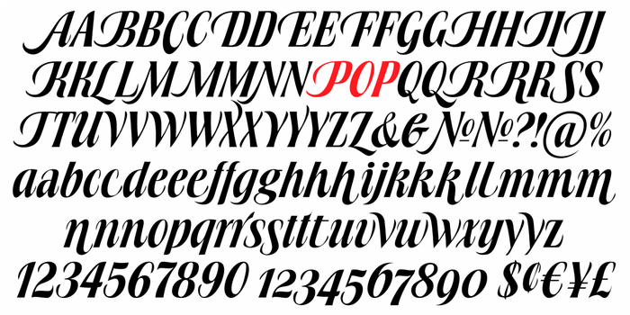
In the early 1970s, Suess set about designing a typeface. According to a 2014 article by Ellen Sussman, she was in part motivated by the fact that “most type styles at the time were too wide and didn’t fit on a jacket.” Her typeface indeed is compact, both horizontally and vertically, with condensed, tight-setting letterforms and a large x-height with short extenders. Suess didn’t want to forgo all the flexibility she was familiar with from lettering, so she drew a large set of alternates. A TGC specimen sums it up: “She used lettering similar to this in her book cover designs, where space limitations called for lettering with many swash characters that was strong and condensed, yet rich and sensuous.” The calligraphic design was released by VGC as a stand-alone italic in 1972, named Book Jacket. Whether you find the name boring or brilliant, it did clarify the intended application area.
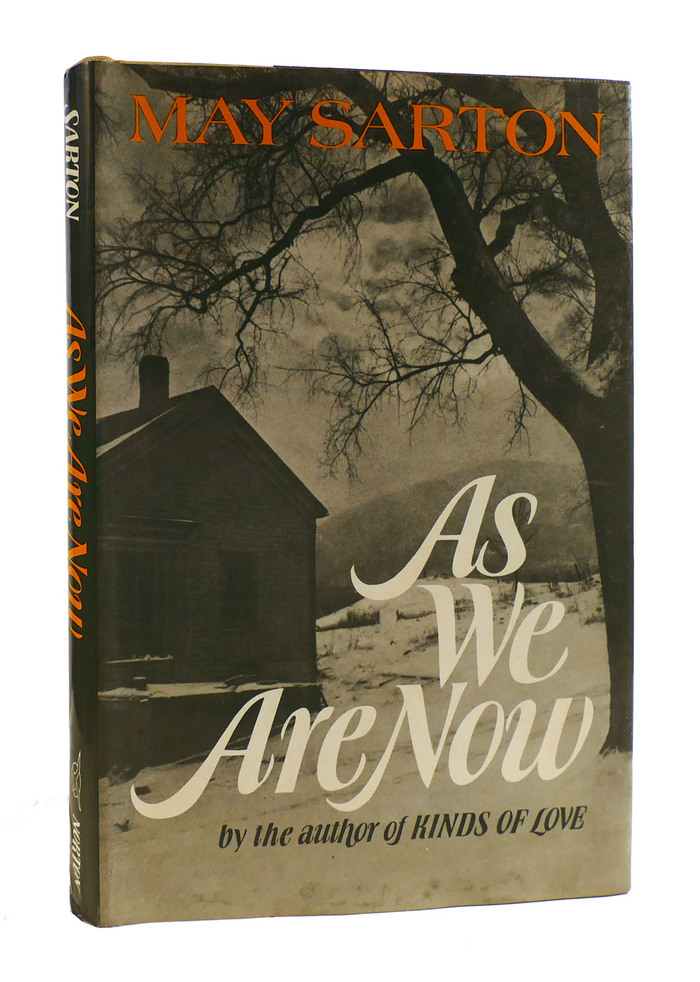
And Book Jacket indeed was used for designing book jackets. One example by Suess herself is shown here. (See Robert Halsband’s biography of Lord Hervey for a second one.) As We Are Now is a novel by Belgian-American writer May Sarton (1912–1995), published by W.W. Norton & Company in 1973. Suess used her typeface in two sizes, with the alternate swash caps for the big initials, a wider terminal form in “We”, and hardly any space between the last two words of the title. For the subline, she opted for more restrained forms overall, but inserted a descending h, a sweeping f that embraces the preceding o, and a single swash cap L in “LOVE”. The a in “author” is the double-story alternate. May Sarton’s name is set in Richard Isbell’s wide Americana.
Source: canadatype.com Canada Type. License: All Rights Reserved.
Partial glyph set of Book Jacket Pro, the digitization drawn by Patrick Griffin and released by Canada Type in 2010
Ursula Suess was born August 13, 1924 – which means it’s her 100th birthday today. Canada Type, who released a digital version of Book Jacket in 2010, provided a biographical outline:
Ursula Suess was born in 1924 to German parents in Camden, NJ, and grew up in Munich, Germany, where she attended two semesters of design school at the Academy of Fine Art before it burned down during the war [in July 1944]. She then studied calligraphy with Anna Simons for two years. She returned to America in 1946 and established herself as a graphic designer working for Oxford University Press, Macmillan Co., Harper, and other publishers. She also taught calligraphy for 20 years at the Westchester Art Workshop, and at the Cooper Union in New York City. In her 50s she learned to cut gems and eventually became an accomplished gem carver. She moved to Green Valley, AZ, in 1998, and has been applying her artistic versatility with clay, water-color and acrylics.
In Arizona, Suess became a long-time supporter of the Tubac Center of the Arts. Ellen Sussman additionally mentions paper sculpture, pottery, and collage as techniques she engaged in. Apart from Book Jacket, she is credited with at least one more typeface: Rotalic is a low-contrast italic sans featuring swash caps with ball terminals. It was also released with VGC. One of its four styles recently was digitized as BN Rascal.
Suess passed away in 2020. She left us a large number of beautiful works, including many pieces of lettering and two unique typefaces that have stood the test of time.

Source: tubacarts.org DeDe Isaacson, Tubac Center of the Arts. License: All Rights Reserved.
Ursula Suess at the Tubac Center of the Arts
This post was originally published at Fonts In Use