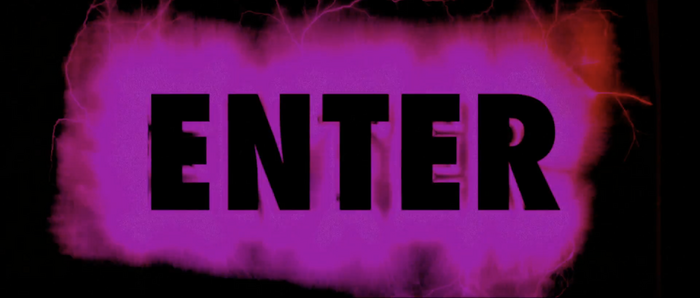
Enter the Void title sequence
Source: www.artofthetitle.com License: All Rights Reserved.


The title sequence used in Gaspar Noé’s Cannes-selected movie Enter the Void has amazed me over the years in terms of typography and graphic design, and thanks to a friend of mine, Puz, (some of) these fonts have been identified.
It was created by Tom Kan, a Japanese designer based in Paris. From Ian Albinson’s interview with Kan for Art of the Title:
The sequence is a typographer’s wet dream (or alternatively their nightmare). How were the various fonts and characters chosen?
The choice of typefaces came rather naturally. After coming up with a large selection in line with the film’s mood, we simply chose the ones that best suited the characters and the personalities of those in the team. Gaspar wanted each title to reflect the person it concerned. It was a beautiful homage and proof of his respect for the members of the team — a way to thank them.
Many typefaces and designs did not get used because the time limit was set — the sound mix was already done and it was impossible to extend. I think we used only 60% of the designs, all in all.
Every typeface used in the sequence seems to be a reference to other famous film title or poster fonts. What was the typeface you selected for your own credit and why?
We appropriated different typefaces, but we never wanted to copy the titles from other films in an obvious way since I thought that would be misleading. For my own credit, I went in many different directions: aged typefaces in metal, Kanji and Japanese calligraphy, techno typography… In the end, I let Gaspar choose and he went with the biggest, most legible type!
Watch the title sequence on YouTube, or right below (epilepsy/flashing lights warning):
Source: www.artofthetitle.com License: All Rights Reserved.
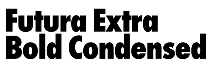
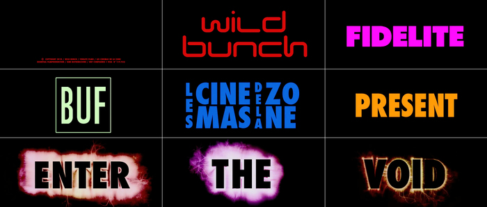
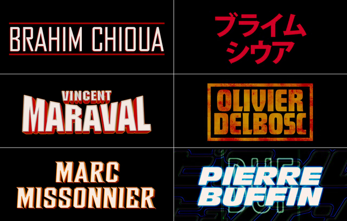
Futura Extra Bold Condensed in all caps is the primary typeface for the credits. Here it’s used in combination with Kozuka Gothic for Japanese, alongside some logos.
Source: www.artofthetitle.com License: All Rights Reserved.
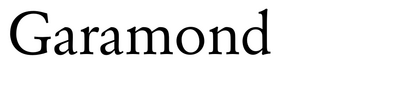
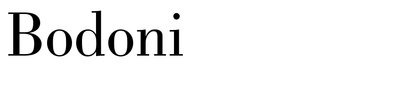
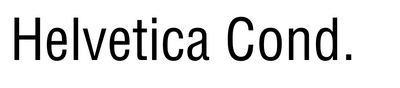
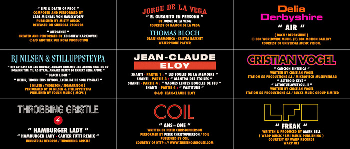
Music credits include Egyptienne Medium Condensed, Garamond, Eurostile, Bodoni Condensed, Neue Helvetica 93, Futura, and Helvetica Condensed. It’s unclear if the LFO logo uses a font (Disco Deck is similar) or whether it’s custom drawn.
Source: www.artofthetitle.com License: All Rights Reserved.
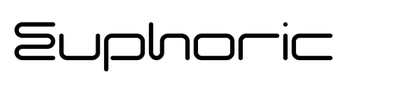
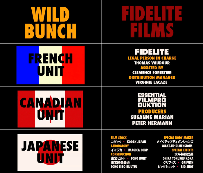
In addition to Futura Extra Bold Condensed, the logos of the production and distribution companies feature Euphoric (Wild Bunch) and Futura Extra Bold (Fidelité).
Source: www.artofthetitle.com License: All Rights Reserved.
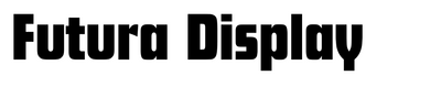
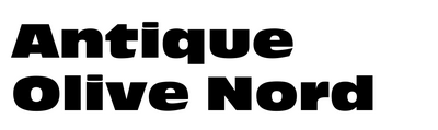
Producer credits feature FB Agency, Kozuka Gothic, ITC Machine, Futura Display, stretched and slanted Woodblock, and Antique Olive Nord
Source: www.artofthetitle.com License: All Rights Reserved.
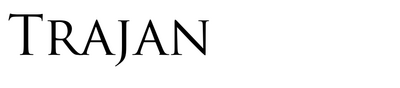
The names of the co-producers are set in Egyptienne Medium Condensed, Univers Ultra Condensed, Futura, an unidentified font similar to Crown Title, two unidentified stencil(ed) fonts, and Trajan.
Source: www.artofthetitle.com License: All Rights Reserved.
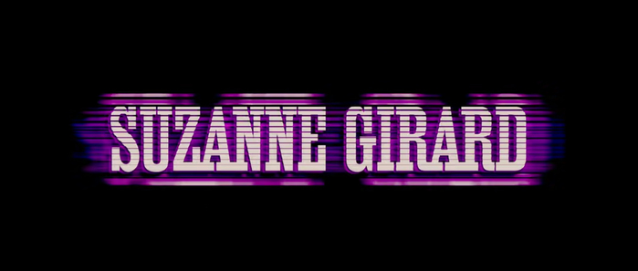
More Egyptienne Medium Condensed for Suzanne Girard
Source: www.artofthetitle.com License: All Rights Reserved.
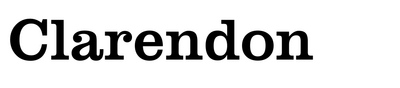
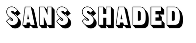
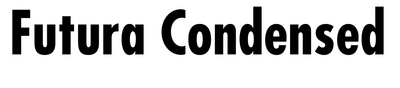
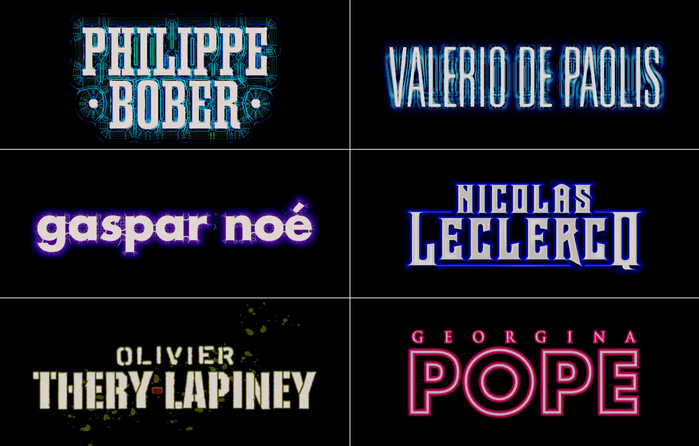
Manager credits feature Haettenschweiler, Council, Neue Helvetica Extended (?), Clarendon, Pump Triline, Fiorello, Eurostile, Thorowgood Sans Shaded, and Futura Condensed.
Source: www.artofthetitle.com License: All Rights Reserved.
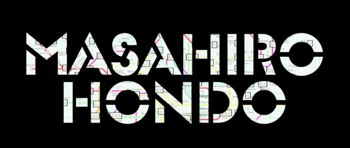
The name of location manager Masahiro Hondo in Glaser Stencil serves as a mask.
Source: www.artofthetitle.com License: All Rights Reserved.
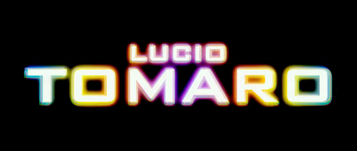
Bank Gothic with rainbow glow effect for Lucio Tomaro
Source: www.artofthetitle.com License: All Rights Reserved.
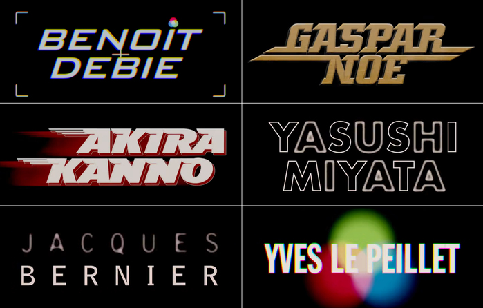
Photography credits with slanted Bank Gothic (Benoît Debie), bold italic City with added and extended top and baseline serifs (Gaspar Noé), TFAvian (Akira Kanno), outlined Futura (Yasushi Miyata), Bell Gothic (Jacques Bernier), and Franklin Gothic Extra Condensed (Yves Le Peillet)
Source: www.artofthetitle.com License: All Rights Reserved.
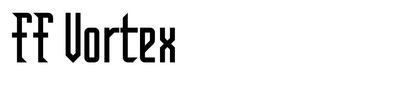
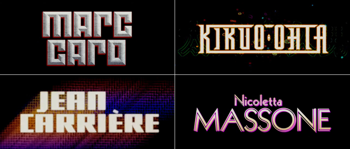
Art credits featuring an unidentified blocky unicase face with 3D bevel effect similar to Mark (Marc Caro), FF Vortex (Kikuo Ohta), another unidentified blocky sans (Jean Carrière), and Zeppelin (Nicoletta Massone)
Source: www.artofthetitle.com License: All Rights Reserved.
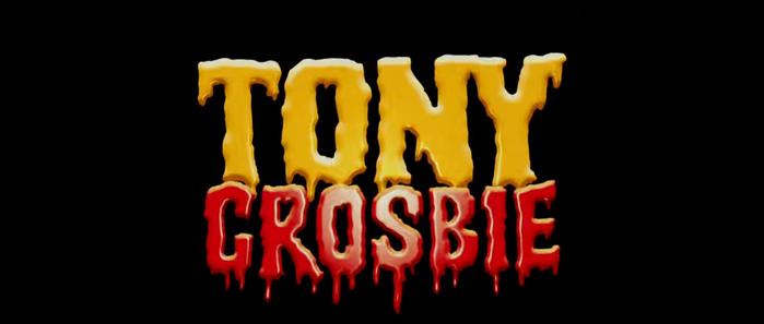
The dripping letters for Tony Crosbie appear to be custom(ized) – Shlop is a similar ready-made font.
Source: www.artofthetitle.com License: All Rights Reserved.
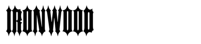
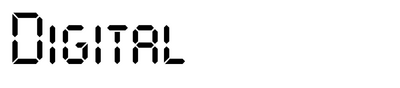
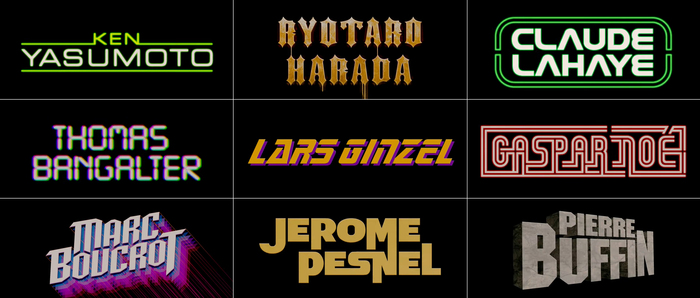
Sound and editor credits with Eurostile (Ken Yasumoto), stretched Ironwood (Ryotaro Harada), contoured Nasalization (Claude Lahaye), an upright LCD typeface, probably Digital (Thomas Bangalter), a heavily modified Sonic or another font inspired by the Star Trek TNG logo (Lars Ginzel), Galledis with hyperextended lines (Gaspar Noé), modified SF Archery Black (Marc Boucrot), Zaius, a typeface family emulating the Planet of the Apes movie series logo (Jerome Pesnel), and ITC Machine (Pierre Buffin).
Source: www.artofthetitle.com License: All Rights Reserved.
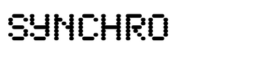
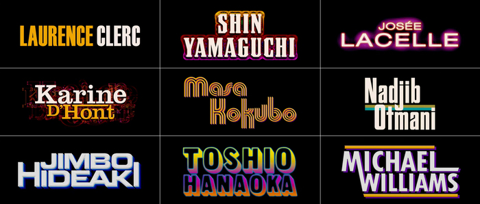
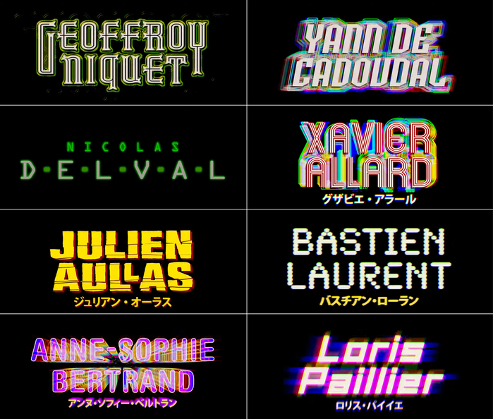
The fonts used for these cards include an unidentified inline face similar to Rubaiyat and Gothicum (Geoffroy Niquet), SF Archery Black (Yann de Cadoudal), OCR-A (Nicolas Delval), Mexcellent (Xavier Allard), fractured caps from a bold sans, possibly Compacta Black (Julien Aullas), Synchro (Bastien Laurent), Helvetica Rounded Bold Condensed (Anne-Sophie Bertrand), and an unidentified squarish sans similar to SB Carbon, Resistance Is Lowered or Apollo Rocket (Loris Paillier).
Source: www.artofthetitle.com License: All Rights Reserved.
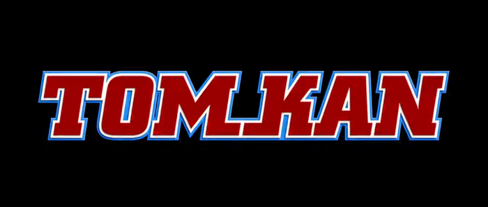
City Bold, slanted, with double contour and extended baseline serifs, for Tom Kan, Director of Typography
Source: www.artofthetitle.com License: All Rights Reserved.
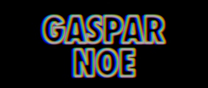
Gaspar Noé in outlined caps from Futura Extra Bold Condensed, without accent on the E
Source: www.artofthetitle.com License: All Rights Reserved.
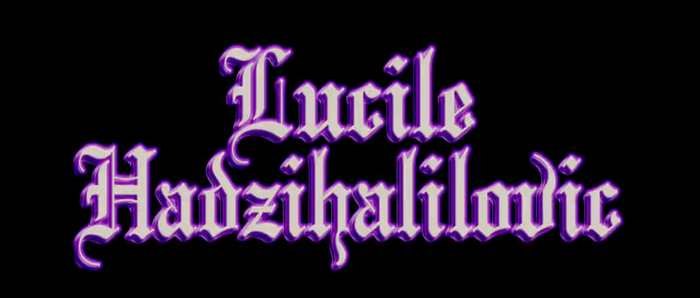
The blackletter typeface chosen for Lucile Hadžihalilović is Linotext (or Mariage, Wedding Text) with some modifications: e and c got bottom serifs and the swash in v was moved from the left to the right stem,
Source: www.artofthetitle.com License: All Rights Reserved.
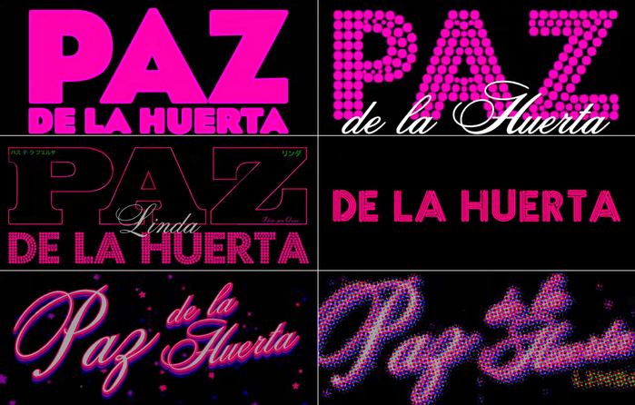
Paz de la Huerta gets various typographic treatments, including Eagle (in a weight between Bold and Black), Futura Dot with Citadel Script, outlined Egyptienne Bold Extended, and ITC Neon.
Source: www.artofthetitle.com License: All Rights Reserved.
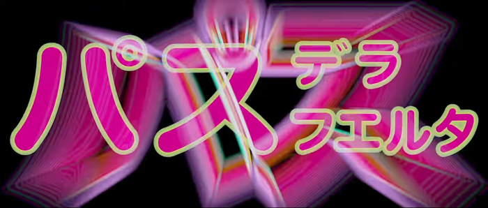
The Japanese transcription of Paz dela Huerta’s name (パス・デ・ラ・ウエルタ) appears to be Hiragino Maru Gothic or similar, with added contour.
Source: www.artofthetitle.com License: All Rights Reserved.
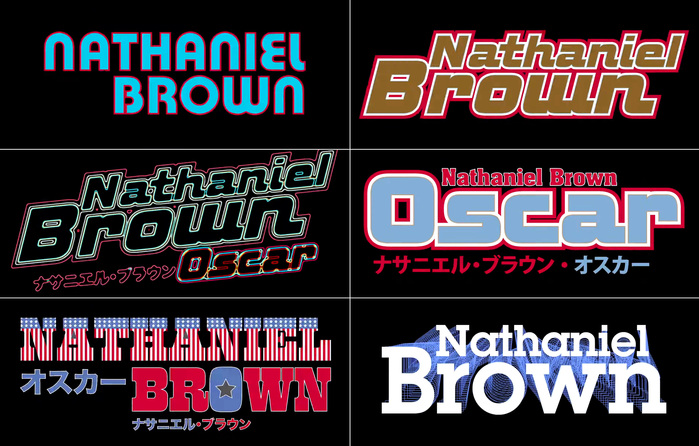
Nathaniel Brown’s name is shown in Pump, ITC Bolt, Aachen, West Barnum Block filled with stars and stripes, and ITC Lubalin Graph Demi.
Source: www.artofthetitle.com License: All Rights Reserved.
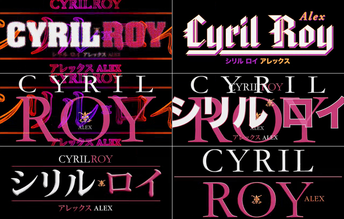
The fonts chosen for Cyril Roy include Aachen, American Text, Monotype Garamond, and at least two Japanese ones.
Source: www.artofthetitle.com License: All Rights Reserved.
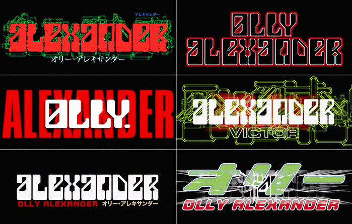
The MICR-inspired face used for Olly Alexander is yet unidentified. Other fonts include Compacta and all-caps ITC Bolt.
Source: www.artofthetitle.com License: All Rights Reserved.
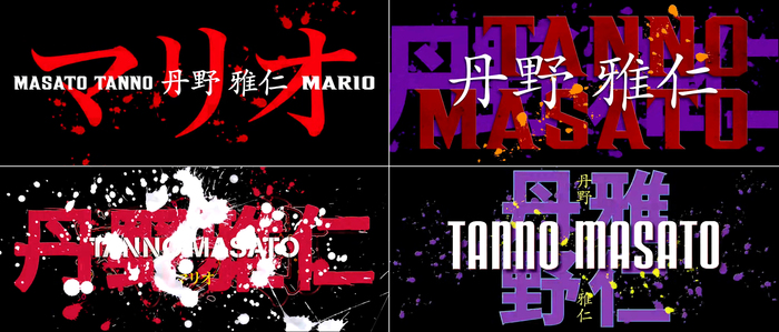
The fonts used for Masato Tanno are Akzidenz-Grotesk Stencil and Ainsdale. The others are yet unidentified.
Source: www.artofthetitle.com License: All Rights Reserved.
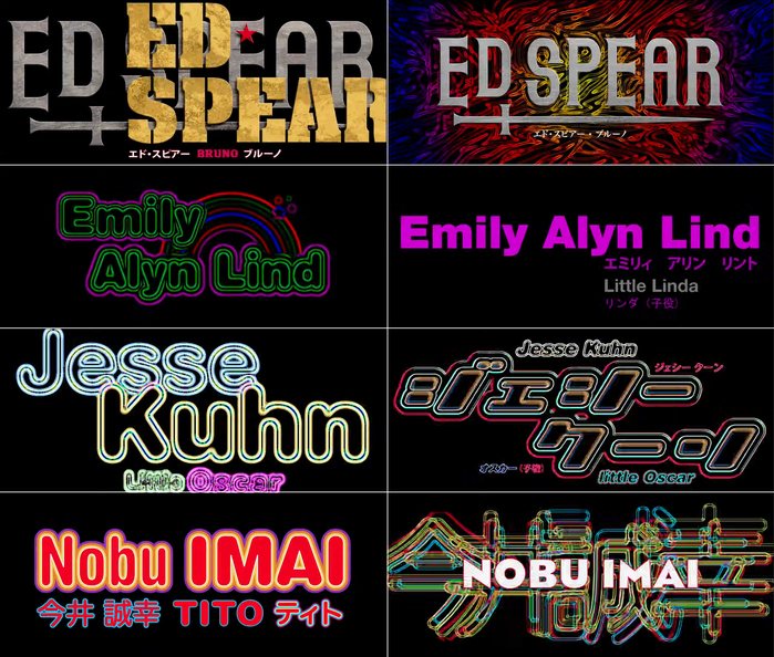
Gothicum and a (custom?) stencil version of Aachen for Ed Spear, Helvetica Rounded and Neue Helvetica 95 for Emily Alyn Lind, more Helvetica Rounded, an unidentified Japanese font, and Eagle for Jesse Kuhn and Nobu Imai
Source: www.artofthetitle.com License: All Rights Reserved.
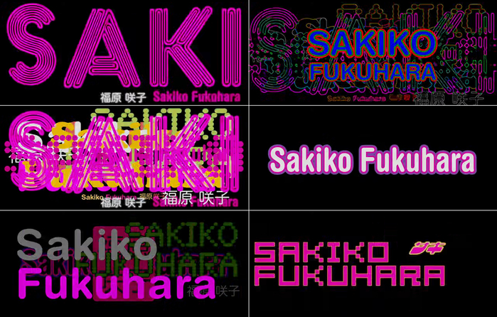
More ITC Neon and Helvetica Rounded for Sakiko Fukuhara. The bitmap font is 04b_08.

Source: www.artofthetitle.com License: All Rights Reserved.
Sarah Stockbridge is set in Impact with hyper-extended glyphs).
Source: www.artofthetitle.com License: All Rights Reserved.
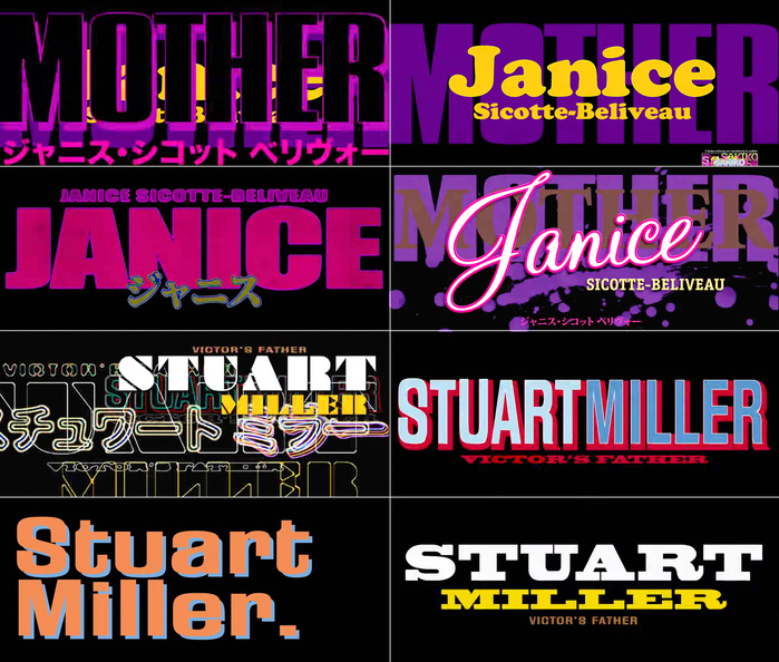
The names of Janice Sicotte-Beliveau and Stuart Miller are shown in Cooper Black, Impact Wide, Monterey and ITC Officina Serif, Braggadocio, Fiedler Gothic, and Blackoak.
Source: www.artofthetitle.com License: All Rights Reserved.
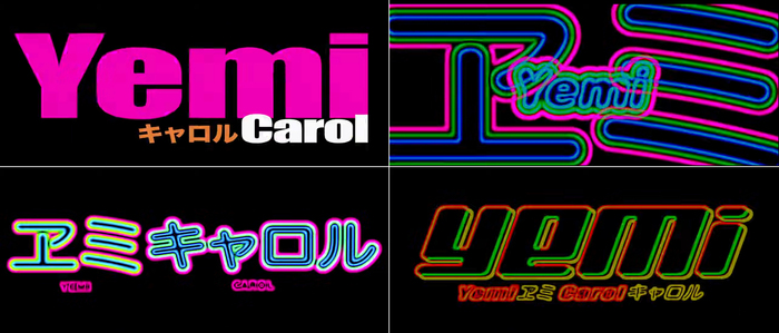
Yemi Carol is presented in Impact Wide, Helvetica Rounded, and a Japanese Maru Gothic. The font shown at the bottom right is unidentified.
Source: www.artofthetitle.com License: All Rights Reserved.
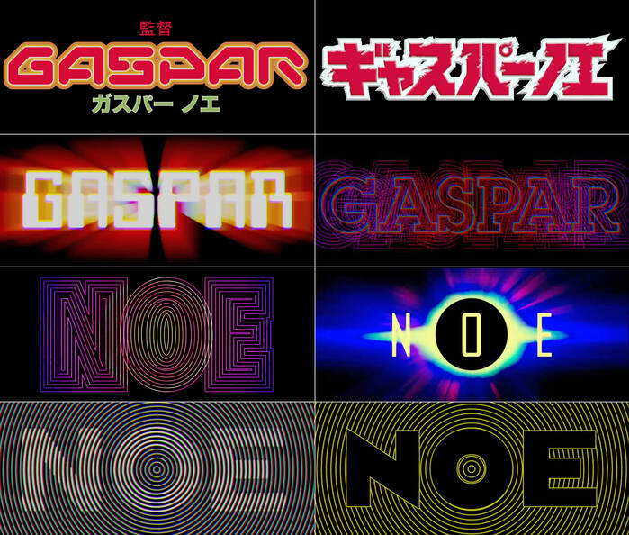
Several of the fonts used for Gaspar Noé’s name are yet unidentified. This includes alll fonts in the top row and the left one in the second row, which is similar to Moore Computer and Data 70. Other fonts include ITC Lubalin Graph, Futura Extra Bold Condensed, and Eagle.
This post was originally published at Fonts In Use