Black Sabbath – “Paranoid” / “The Wizard” German single cover
Source: www.45cat.com thatsunday / 45cat. License: All Rights Reserved.

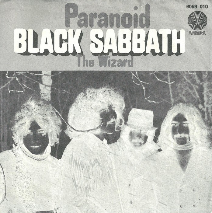
While we’re at the topic of arcane alphabets on Black Sabbath record covers, here’s the sleeve for the band’s German debut single.
Printed in black, it features a photo of the four band members that gathers eerie vibes simply by the fact that it’s inverted (cf. the original). The rounded sans goes by the name CL Blue Cornet. I know hardly anything about it, beyond the fact that it’s shown in 1970s catalogs by German typesetting company Fürst. Was it an original release by this type provider? Who made it? Is it a revival of an earlier design? And what does the “CL” stand for?
The caps and numerals are dark and blocky, while the lowercase glyphs are oddly short. They’re also amateurishly drawn: to single out one of the many issues, m is a good deal taller than n. I’ve seen a few wooden poster typefaces from the late 19th century which exhibit a similar mix of a boxy build and rounded corners – but none that is a match. It might be based on one such design. Among digital fonts, Reymund Schröder’s Tempel Softland Condensed – which takes cues from the manufacturing process of wood type – comes somewhat close, at least for the capitals.
If you have any insight into the origins of CL Blue Cornet, please leave a comment.

License: All Rights Reserved.
Glyph set for CL Blue Cornet from a c.1976 catalog by Fürst, with alternate forms for ß l t
This post was originally published at Fonts In Use