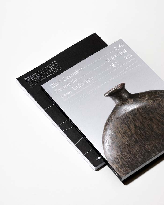
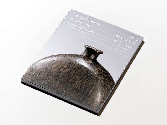
Black Ceramics: Familiar Yet Unfamiliar
Source: www.behance.net License: All Rights Reserved.


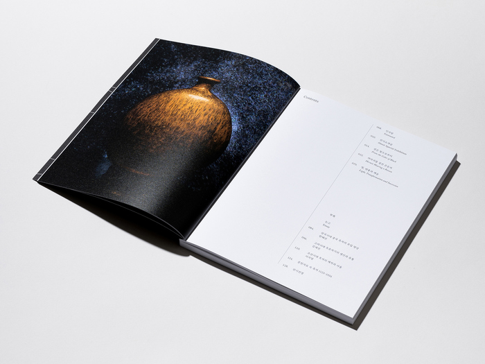
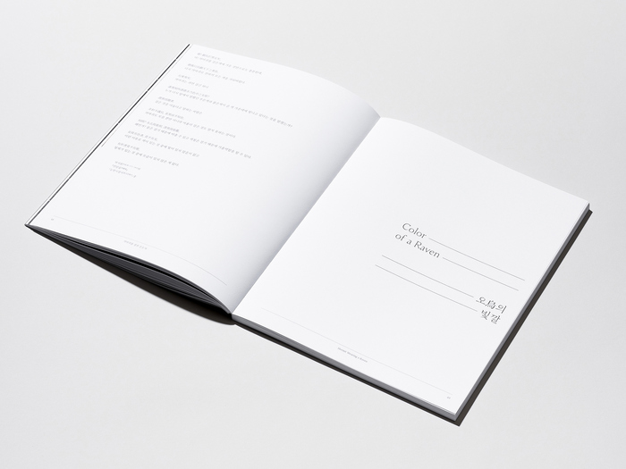
Design studio Chuigraf designed the exhibition identity and catalog of Black Ceramics: Familiar Yet Unfamiliar for the Gyeonggi Ceramic Museum. In this exhibition, which ran until March 26, 2023, you can see the charm of a mysterious black, raven-colored type of ceramics. The fonts in use are Apoc andOh Min. From the design studio’s case study:
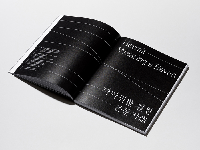
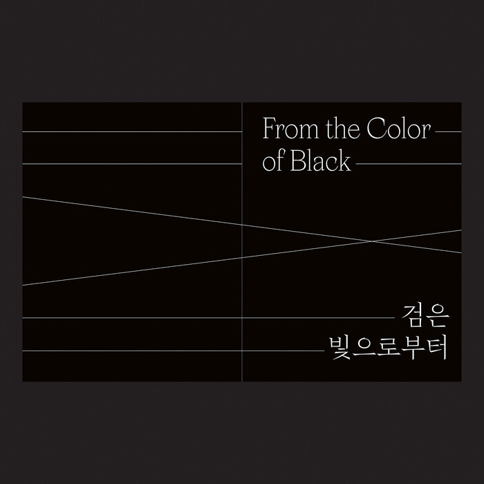
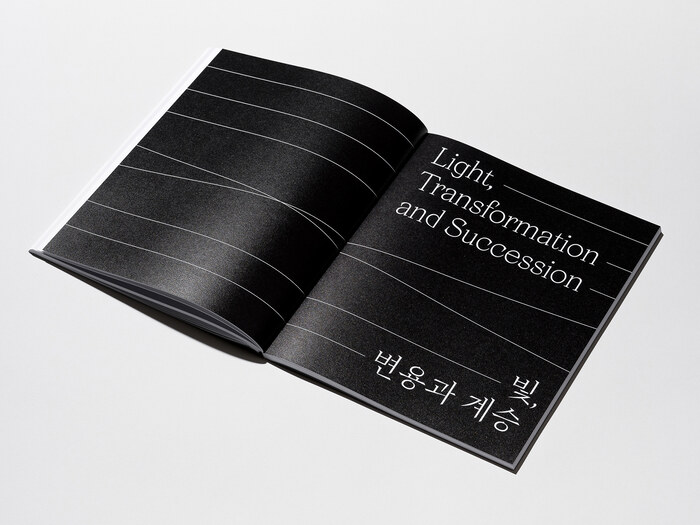
The straight-line graphic connects “Familiar” and “Unfamiliar” and simultaneously shows that the two are symmetrical concepts. Also, the lines arranged so that the two lines intersect and diverge express a broad and varied color spectrum of black ceramics. We used Blaze Type’s Apoc and Heejun Chae’s Oh Min for the title fonts of this exhibition identity and title of the catalog.

Source: www.behance.net License: All Rights Reserved.
Detail from the back cover
Source: www.behance.net License: All Rights Reserved.
Source: www.behance.net License: All Rights Reserved.
Source: www.behance.net License: All Rights Reserved.
Source: www.behance.net License: All Rights Reserved.
Source: www.behance.net License: All Rights Reserved.
Source: www.behance.net License: All Rights Reserved.
This post was originally published at Fonts In Use