The Quick and The Dead titles
Published April 15, 2023
By FontsInUse
Contributed by D Jones
Sony Pictures. License: All Rights Reserved.


Sony Pictures. License: All Rights Reserved.
Sony Pictures. License: All Rights Reserved.

Sony Pictures. License: All Rights Reserved.
Sony Pictures. License: All Rights Reserved.
This post was originally published at Fonts In Use
Sony Pictures. License: All Rights Reserved.
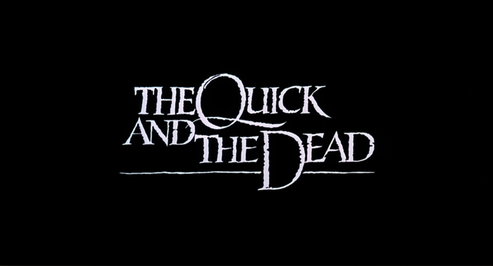
The movie title is lettering, not a font (I guess)
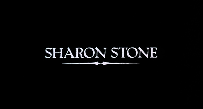
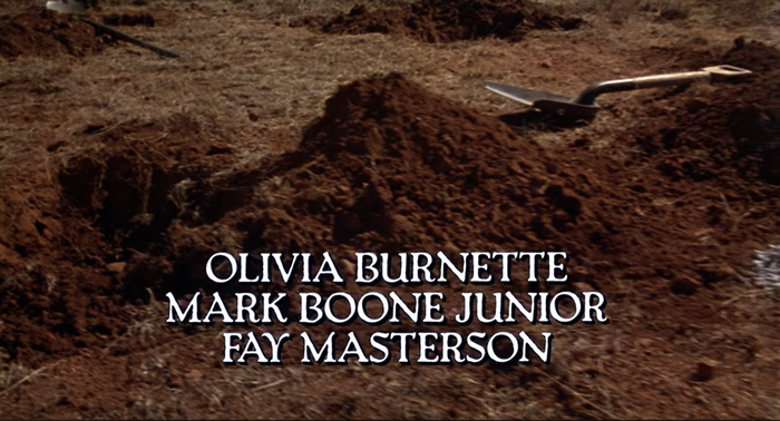
The 1995 film The Quick and The Dead opens with a black background and the worn letters of Packard introducing the production company as well as the principals Sharon Stone and Gene Hackman. The movie title itself seems to be lettering, not a font.
The movie combines traditional elements of Westerns in an unusual, somewhat revisionist, style. The story of the movie concerns a high-stakes gunslinging competition, with all the action taking place in a single town over a few days; the screenwriter (Simon Moore) clearly having paid attention to Aristotle’s Unities: the unities of action, time, and place.
Sony Pictures. License: All Rights Reserved.
Sony Pictures. License: All Rights Reserved.
Sony Pictures. License: All Rights Reserved.
Sony Pictures. License: All Rights Reserved.
This post was originally published at Fonts In Use
Read full story.
WRITTEN BY
FontsInUse
An independent archive of typography.