BIC South Africa website
Source: mea.bic.com License: All Rights Reserved.


The official South African website of the global manufacturing corporation BIC rises above and sets an example for its peer localisation sites with pristine crisp photography, pixel-perfect web layout elements, and a strong branding implementation including its typography.
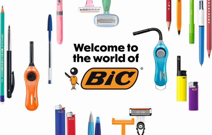
BIC South Africa’s main landing page falls on a welcoming image displaying an array of pens, stationary lighters and razors, with a BIC mascot, logo, and title message set in CJ Type’s Dunbar Tall in ExtraBold style. The sleek and sharp lettershapes of Dunbar reflect the utilitarian simplicity and efficiency of BIC’s products with a hint of quirk such as the lighter buttons or the Dunbar letter e.
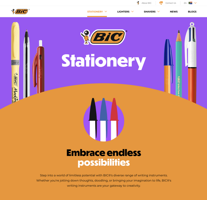
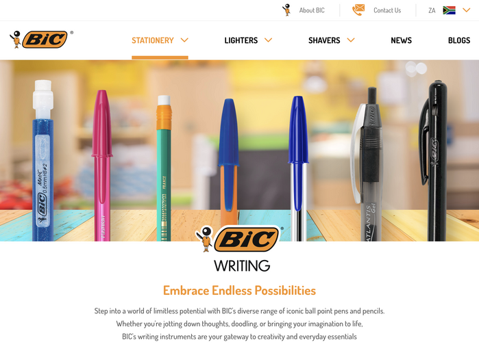
Dunbar is consistently applied through headings and product category landing page titles with the body paragraphs set in Julieta Ulanovsky’s Montserrat in a mix of its Medium and Regular weights. The website menus are set in Montserrat Regular and Bold styles.
Interestingly, upon entering the shopping pages, the website defaults all its fonts including the menus, headers and body text to Impallari Type’s Dosis typeface. Other localised sites of BIC default to Noto Sans, however several of these websites currently land on a “coming soon” page.
CJ Type’s founder shared that “they licensed Cyrillic in addition to Latin” and “they requested Kazakh glyphs”. Possibly for future localized uses on the Bulgaria, Kazakhstan, Russia, and Ukraine localised webpages.

Source: mea.bic.com License: All Rights Reserved.
Source: mea.bic.com License: All Rights Reserved.

Source: mea.bic.com License: All Rights Reserved.

Source: mea.bic.com License: All Rights Reserved.
Source: mea.bic.com License: All Rights Reserved.

Source: mea.bic.com License: All Rights Reserved.

Source: mea.bic.com License: All Rights Reserved.

Source: mea.bic.com License: All Rights Reserved.

Source: mea.bic.com License: All Rights Reserved.
CSR pen donation initiative page uses Avenir and handwriting font Journal used additionally to the Dunbar and Montserrat brand fonts
Source: mea.bic.com License: All Rights Reserved.
Shop pages maintain Dunbar in lighter weight for page title, however default to Dosis for menus, headers, buttons, and paragraphs.

Source: mea.bic.com License: All Rights Reserved.
Shop pages maintain Dunbar in lighter weight for page title, however default to Dosis for menus, headers, buttons, and paragraphs.
Source: mea.bic.com License: All Rights Reserved.
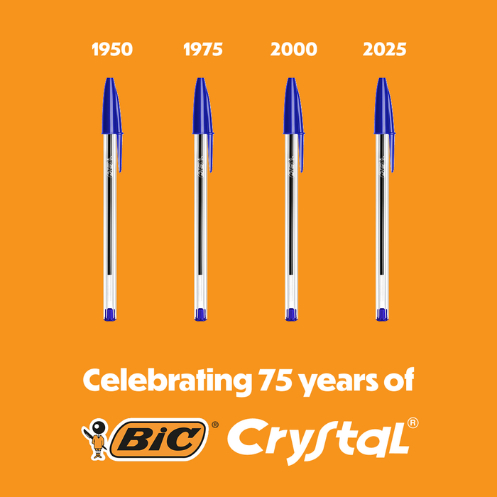
Branding from South African localised site rolled out to social media graphics
This post was originally published at Fonts In Use