Babe Original branding and packaging
Published March 28, 2023
By FontsInUse
Contributed by Analisa Sanchez
Hint Creative. License: All Rights Reserved.


Hint Creative. License: All Rights Reserved.
Hint Creative. License: All Rights Reserved.

Hint Creative. License: All Rights Reserved.
Hint Creative. License: All Rights Reserved.
Hint Creative. License: All Rights Reserved.
This post was originally published at Fonts In Use
Hint Creative. License: All Rights Reserved.
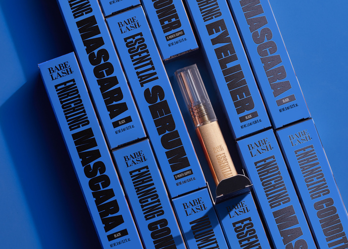
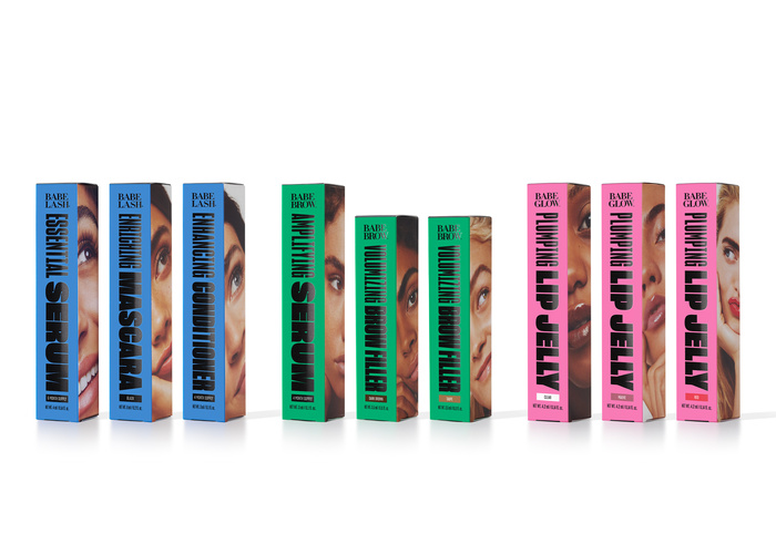
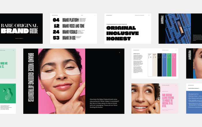
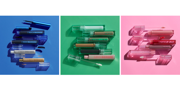
Previously known as Babe Lash, Babe Original rebranded in 2022 to encompass a wider product line. Staying true to the heritage of the cosmetics brand, Hint created a customized wordmark for Babe Original and each of its three brand families. Didot’s letterforms – with two simple ligatures for BA and IN – create a seamless, classic wordmark, while the brand’s primary type, Sharp Grotesk, introduces boldness and youth to the packaging, social, and other brand touchpoints. A system of condensed and wide weights allows for the type to be fluid in space and tone. By uniting bold typography with a bright color palette, the re-brand is simply expressive and eye-catching in both retail and digital spaces.
Hint Creative. License: All Rights Reserved.
Hint Creative. License: All Rights Reserved.
Hint Creative. License: All Rights Reserved.
Hint Creative. License: All Rights Reserved.
Hint Creative. License: All Rights Reserved.
This post was originally published at Fonts In Use
Read full story.
WRITTEN BY
FontsInUse
An independent archive of typography.
More from FontsInUse