An Autobiography of the Autobiography of Reading by Dionne Brand

Alan Brownoff / University of Alberta Press. License: All Rights Reserved.


Birra Stout and Fayon are the typefaces used for An Autobiography of the Autobiography of Reading. The latest non-fiction book by Dionne Brand, one of Canada’s most accomplished poets, was published by the University of Alberta Press in the CLC Kreisel Lecture Series.
Designed by Joshua Darden, Birra Stout is the first in Darden Studio’s Birra Flight of fonts, a continually expanding collection of stylistically heterogenous display typefaces by different designers, all available free of charge.
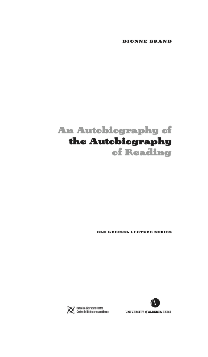
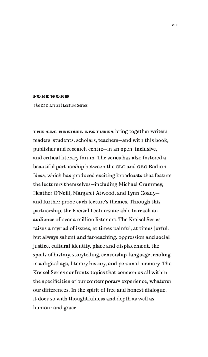
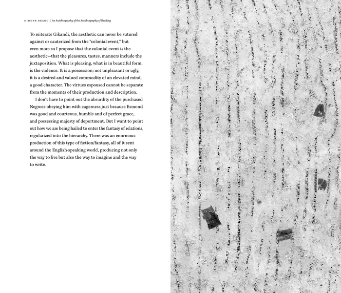
Alan Brownoff, book designer at the University of Alberta Press, used Birra Stout for the title, in three lines of alternating colors. The font also appears in tracked out caps for the author’s name, the series title, and, inside the book, for headings and lead-ins. Brownoff comments on his choice: “I wanted to show that a designer can use Birra for a serious scholarly book. There’s a lot of type out there to explore, why use the same old things?”
He paired Birra with Fayon, a contemporary serif designed by Peter Mohr, which is used in roman and italic, including small caps. Birra Stout and Fayon are very different in terms of width, weight, and, above all, personality. And yet the pairing isn’t random: there are parallels in the shape and the structure of the serifs, allowing Birra to pass as a whimsical relative of Fayon in this context. The two typefaces go along very well. Sue Hall, jury member of the AUPresses Book, Jacket, and Journal Show, agrees: “Bold, quirky display type contrasts nicely with classically readable text in an inviting an open format.”
The art featured on the cover is the work of Howardena Pindell. It’s titled Memory: Future and includes paint, confetti, and pieces of photos, among other media.

Comparison: Darden Studio. License: All Rights Reserved.
Birra Stout (top) and Fayon (bottom) exhibit similarities in the shape and the structure of some serifs, see for example the leaf-shaped terminals in J.

Alan Brownoff / University of Alberta Press. License: All Rights Reserved.
Title page

Alan Brownoff / University of Alberta Press. License: All Rights Reserved.
Foreword

Alan Brownoff / University of Alberta Press. License: All Rights Reserved.

Alan Brownoff / University of Alberta Press. License: All Rights Reserved.

Alan Brownoff / University of Alberta Press. License: All Rights Reserved.
This post was originally published at Fonts In Use