Les 5 sens dans l’art contemporain
Published January 10, 2024
By FontsInUse
Contributed by 205TF
Source: camilleguitton.fr © Camille Guitton. License: All Rights Reserved.


Source: camilleguitton.fr © Camille Guitton. License: All Rights Reserved.
Source: camilleguitton.fr © Camille Guitton. License: All Rights Reserved.
Source: camilleguitton.fr © Camille Guitton. License: All Rights Reserved.
Source: camilleguitton.fr © Camille Guitton. License: All Rights Reserved.
Source: camilleguitton.fr © Camille Guitton. License: All Rights Reserved.
Source: camilleguitton.fr © David Riou / © Rémi Blomme / © Camille Guitton. License: All Rights Reserved.
Source: camilleguitton.fr © David Riou / © Rémi Blomme / © Camille Guitton. License: All Rights Reserved.
Source: camilleguitton.fr © David Riou / © Rémi Blomme / © Camille Guitton. License: All Rights Reserved.
Source: camilleguitton.fr © David Riou / © Rémi Blomme / © Camille Guitton. License: All Rights Reserved.
Source: camilleguitton.fr © David Riou / © Rémi Blomme / © Camille Guitton. License: All Rights Reserved.
Source: camilleguitton.fr © David Riou / © Rémi Blomme / © Camille Guitton. License: All Rights Reserved.
This post was originally published at Fonts In Use

Source: camilleguitton.fr © Camille Guitton. License: All Rights Reserved.


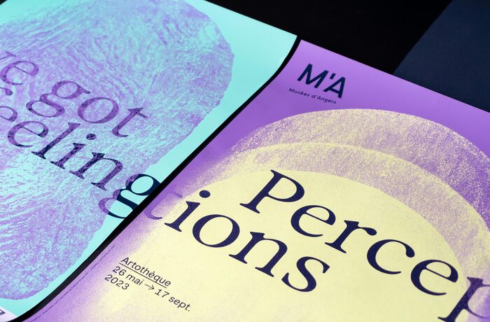
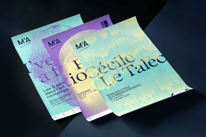
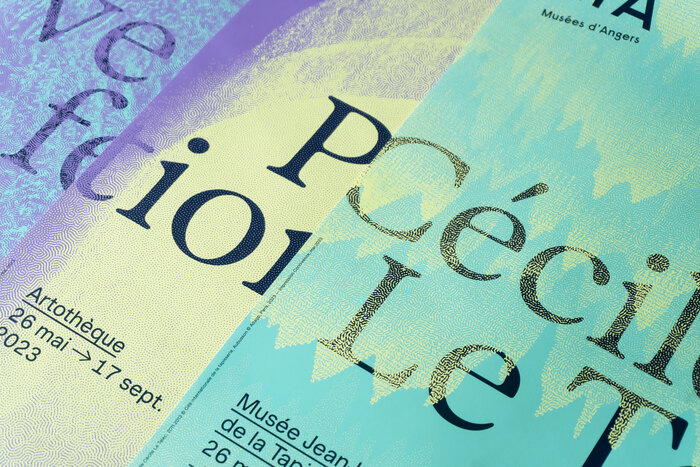
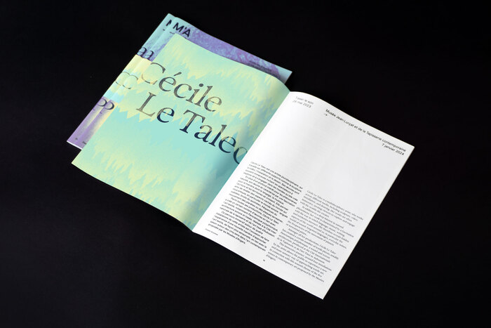
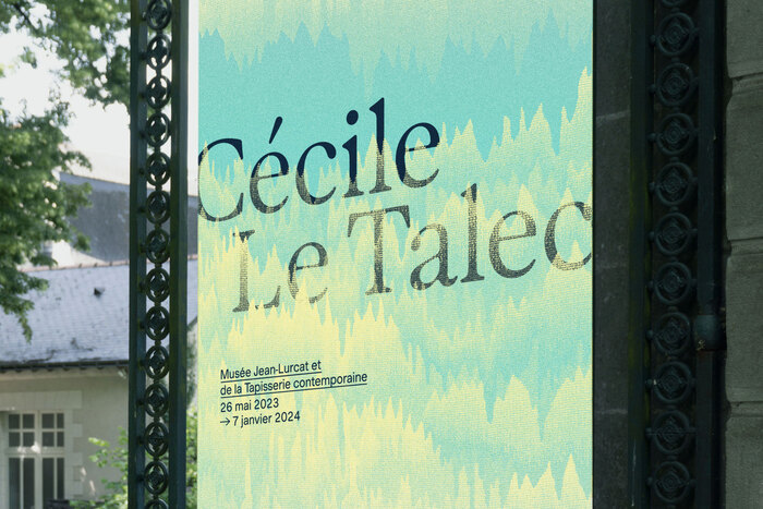
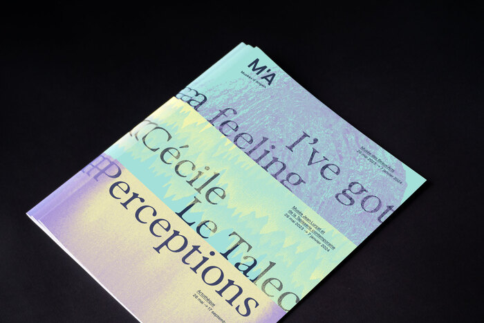
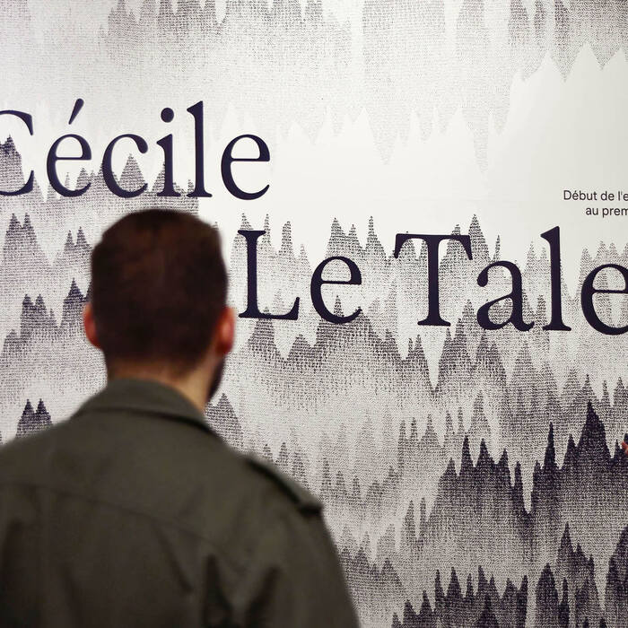
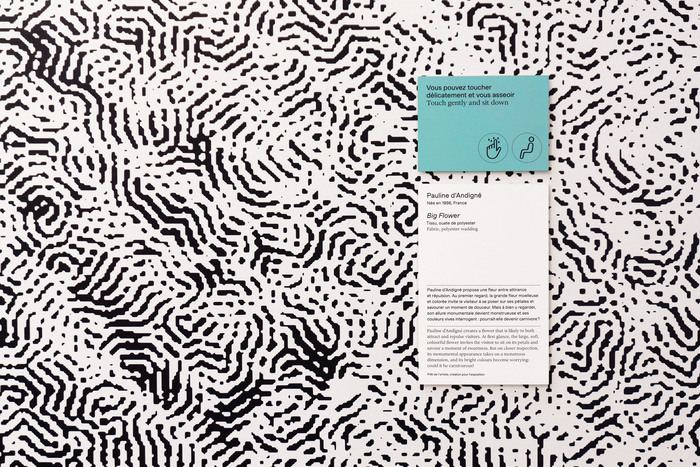
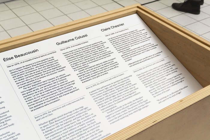
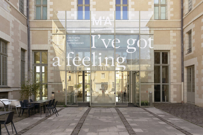
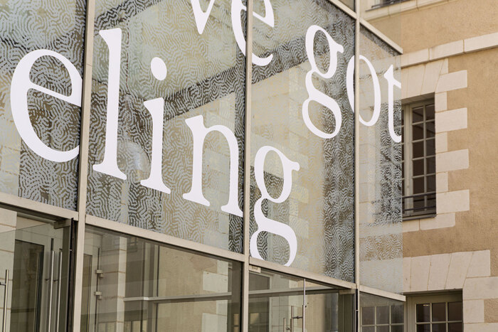
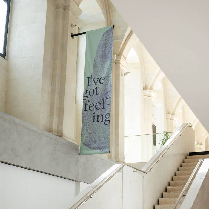
In 2023, Camille Guitton designed the visual identity for the exhibition Les 5 sens dans l’art contemporain (“The 5 Senses in Contemporary Art”), which includes posters, booklets and signage. She used two typefaces, Exposure by Federico Parra Barrios and Muoto by Matthieu Cortat both available from 205TF.
From Camille Guitton (translated):
Angers’ museums and artothèque present a season devoted to the 5 senses in contemporary art. A major theme common to all humankind, and once again the focus of attention in the wake of the Covid-19 pandemic, this theme is being deployed simultaneously at three sites: the Musée des Beaux-Arts, the Artothèque and the Musée Jean-Lurçat et de la Tapisserie contemporaine.

Source: camilleguitton.fr © Camille Guitton. License: All Rights Reserved.

Source: camilleguitton.fr © Camille Guitton. License: All Rights Reserved.

Source: camilleguitton.fr © Camille Guitton. License: All Rights Reserved.

Source: camilleguitton.fr © Camille Guitton. License: All Rights Reserved.

Source: camilleguitton.fr © Camille Guitton. License: All Rights Reserved.

Source: camilleguitton.fr © David Riou / © Rémi Blomme / © Camille Guitton. License: All Rights Reserved.

Source: camilleguitton.fr © David Riou / © Rémi Blomme / © Camille Guitton. License: All Rights Reserved.

Source: camilleguitton.fr © David Riou / © Rémi Blomme / © Camille Guitton. License: All Rights Reserved.

Source: camilleguitton.fr © David Riou / © Rémi Blomme / © Camille Guitton. License: All Rights Reserved.

Source: camilleguitton.fr © David Riou / © Rémi Blomme / © Camille Guitton. License: All Rights Reserved.

Source: camilleguitton.fr © David Riou / © Rémi Blomme / © Camille Guitton. License: All Rights Reserved.
This post was originally published at Fonts In Use
Read full story.
WRITTEN BY
FontsInUse
An independent archive of typography.
More from FontsInUse