Attenda

Source: www.limberbrands.co License: All Rights Reserved.

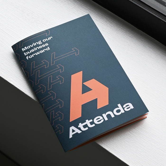
Presenting Attenda. A new name and brand for a technology company helping payments get from A to B, as simply as possible.
The old company, Suresite, are a family technology business supporting the fuel and forecourts world with payments and logistics. But the move away from fossil fuels means the decline of the petrol forecourt, and how we pay is changing with the rise of unattended contactless transactions.
So they are pivoting to being laser-focused on payments facilitation for any industry, positioned firmly as a fintech. This required a new name to signal radical change, alongside a story and brand that would engage new customers without alienating current ones.
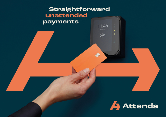
The new name, Attenda, alludes to their tech helping along attended and unattended payments, and also attending to customer needs (they are known for great service).
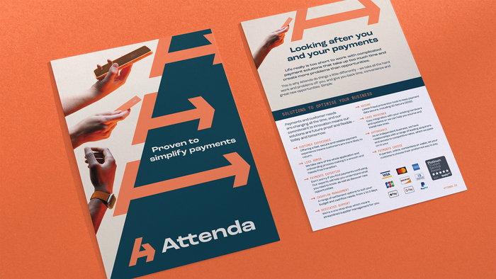
The visual identity by Limber Brands revolves around a simple, memorable symbol based around the movement of money. Payments, when using Attenda, go from buyer to seller as directly as possible. So the symbol combines a straightforward horizontal arrow and the letter A, leaning into the future.
The identity uses Roc Grotesk as the primary typeface, with its horizontal emphasis reflecting the general horizontal-ness elsewhere in the brand. Supporting in contrast is GT Pressura Mono, a nod to monospaced credit card text.
Source: www.limberbrands.co License: All Rights Reserved.
Source: www.limberbrands.co License: All Rights Reserved.
Source: www.limberbrands.co License: All Rights Reserved.
Source: www.limberbrands.co License: All Rights Reserved.
This post was originally published at Fonts In Use