ASOM Collection identity and website
A Practice for Everyday Life. License: All Rights Reserved.

ASOM Collection – an acronym for Abstract State of Mind – explores connections between the European avant-garde and American post-war abstraction movements, holding works from such artists as Pierre Soulages, Roman Opalka, Lee Krasner and Joan Mitchell.
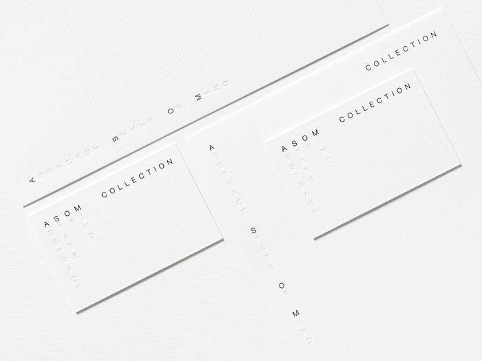
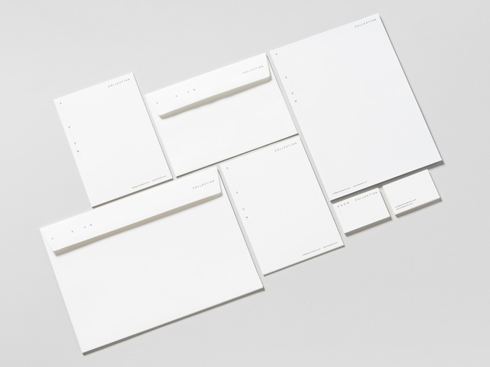
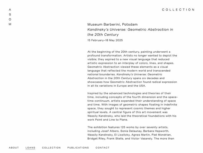
The collection's identity focuses on minimal and clear typographic principles. Characterful but clear, the logotype and typographic scheme uses the APFEL Type Foundry’s neo-grotesque sans serif typeface Friedel. The design plays with the concept of the ASOM acronym where – through a flexible logotype capable of multiple iterations – the spacing between words and letters shifts and expands. A suite of printed stationery utilises an inkless deboss for selected letters within the expanded ASOM acronym, creating a sense of tactility that is accentuated by white laid paper.
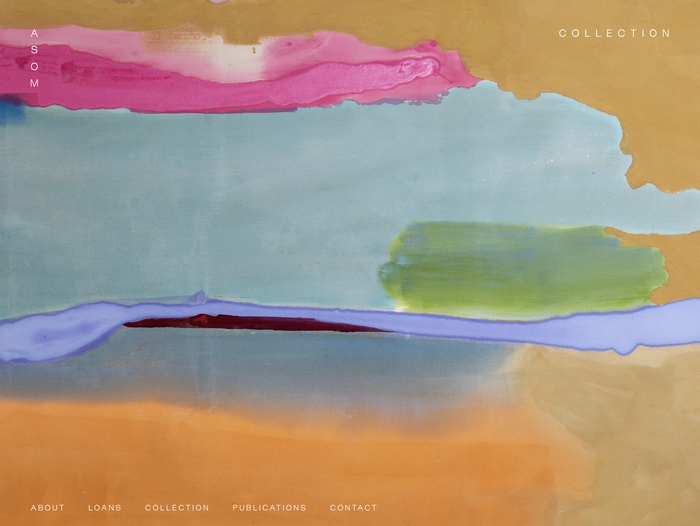
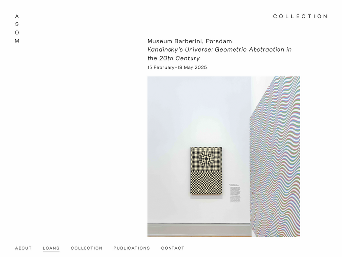
The website for the ASOM Collection translates the minimal approach of the identity into a digital context, documenting its active loans and grant programmes, alongside an extensive archive of the works held in the collection for curators and academics.
Web development by Cliff Studio.
A Practice for Everyday Life. License: All Rights Reserved.
Source: asomcollection.com A Practice for Everyday Life. License: All Rights Reserved.
Source: asomcollection.com A Practice for Everyday Life. License: All Rights Reserved.
Source: asomcollection.com A Practice for Everyday Life. License: All Rights Reserved.
This post was originally published at Fonts In Use