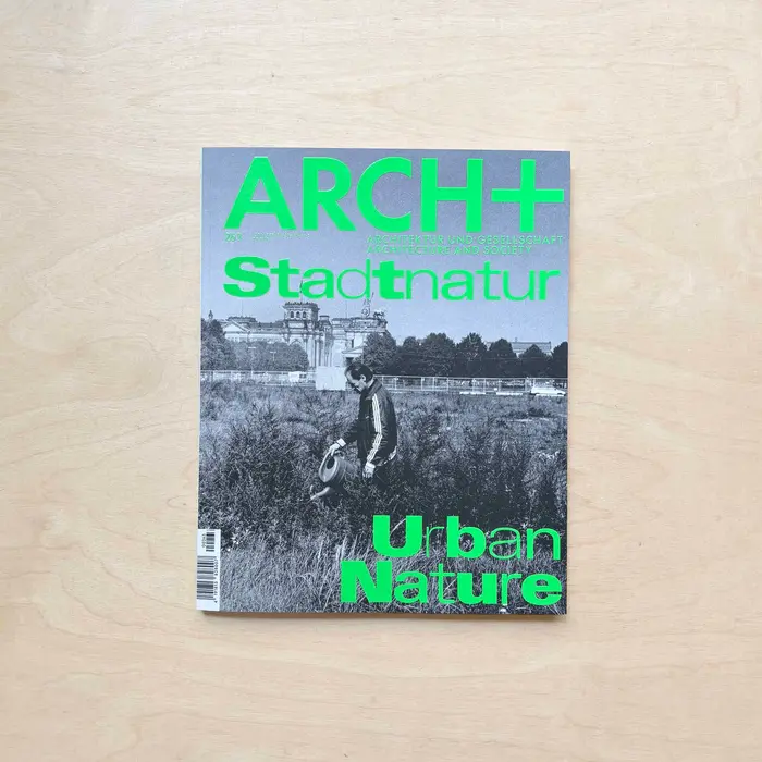
ARCH+ 263, “Stadtnatur”
Source: doyoureadme.de License: All Rights Reserved.



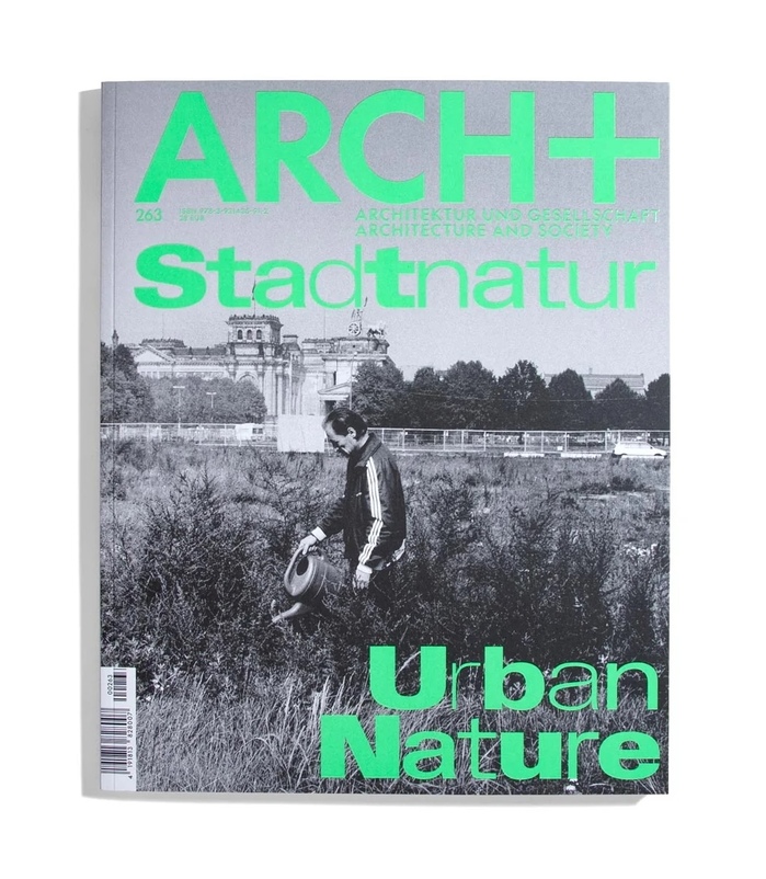
No. 263, “Urban Nature” is the third issue of the architecture magazine ARCH+ that was designed by Dan Solbach. Challenging the traditional opposition between city and nature, it addresses questions of ecological justice, land use, and the role of landscape architecture in the context of the Anthropocene. Urban nature is presented not as a corrective to the city's shortcomings, but as an integral component of the city itself, at the heart of its ecological, social, and political transformations to come.
AL Sigla by Alex Lescieux is combined with Display Grotesk by Chi-Long Trieu alongside Futura by Paul Renner, which has been part of the magazine since its very first issue in 1968, thus extending the magazine's graphic identity.
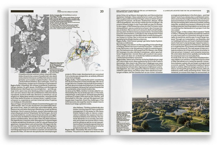
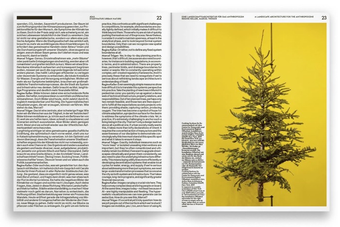
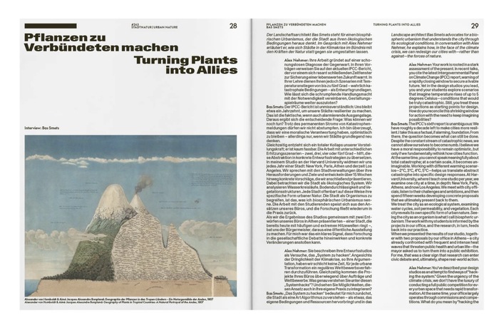
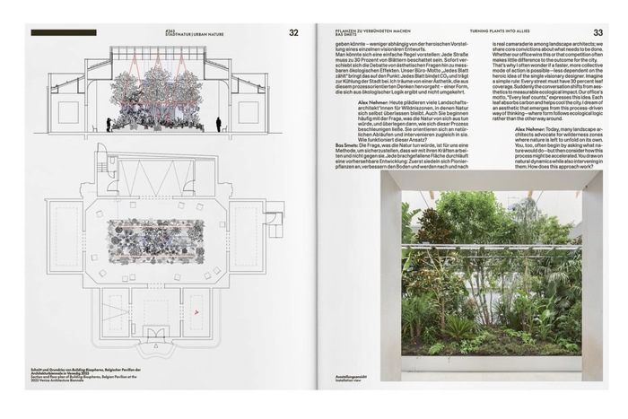
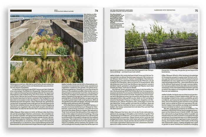
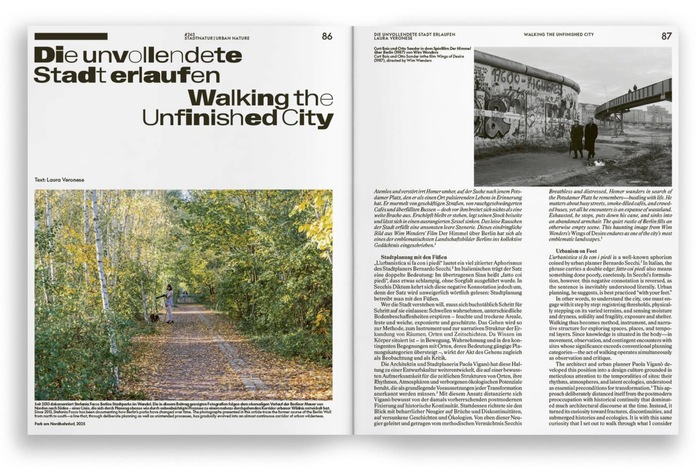
Through a fluid and open typographic system, the interviews are introduced using a bold Extended version of Display Grotesk, while its Regular counterpart composes the texts of these exchanges. Futura, meanwhile, is used for the names of the participants. The articles, in turn, set their body text in AL Sigla Neretta, while the different weights of the Extended version of Display Grotesk, all sharing a common skeleton, animate the headlines, creating a typographic interplay that is both structured and organic.
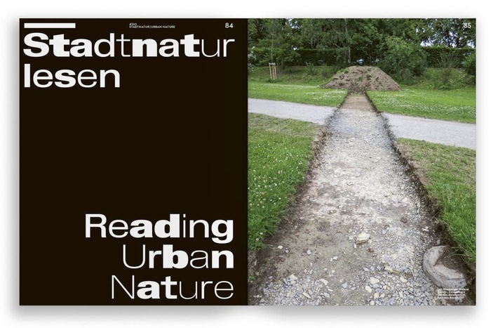
This issue pushes typographic flexibility even further, through the use of different weights of the same typeface from one letter to the next within headlines. Once again, the intention of making each issue unique while maintaining the same structural layout is a particularly interesting example of what a typographic system can be in graphic design.
Source: archplus.net ARCH+. License: All Rights Reserved.
Source: archplus.net ARCH+. License: All Rights Reserved.
Source: archplus.net ARCH+. License: All Rights Reserved.
Source: archplus.net ARCH+. License: All Rights Reserved.
Source: archplus.net ARCH+. License: All Rights Reserved.
Source: archplus.net ARCH+. License: All Rights Reserved.
Source: archplus.net ARCH+. License: All Rights Reserved.
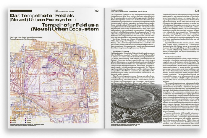
Source: archplus.net ARCH+. License: All Rights Reserved.
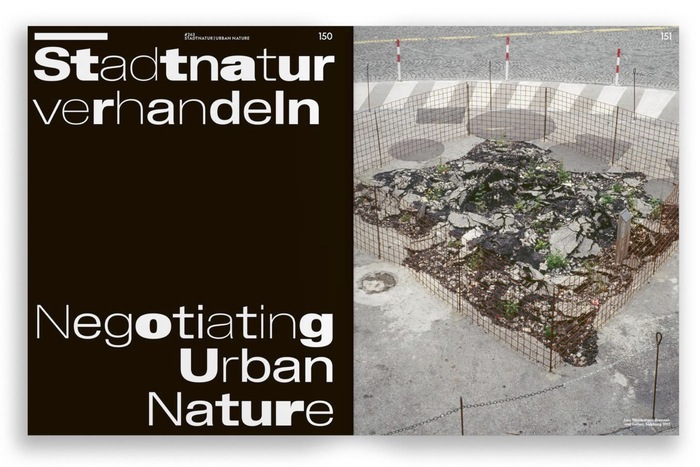
Source: archplus.net ARCH+. License: All Rights Reserved.
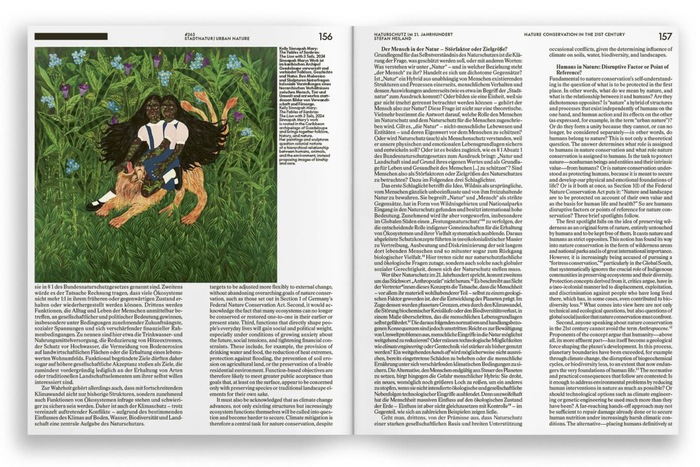
Source: archplus.net ARCH+. License: All Rights Reserved.
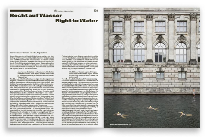
Source: archplus.net ARCH+. License: All Rights Reserved.
Source: zabriskie.de License: All Rights Reserved.
This post was originally published at Fonts In Use