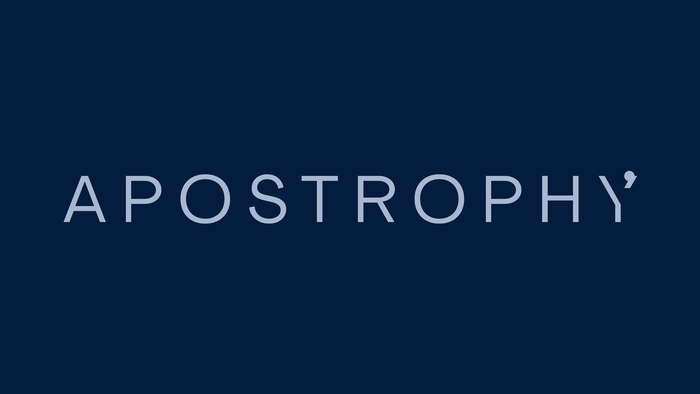
Apostrophy brand identity
Source: againstti.me Against Time. License: All Rights Reserved.


Rosie Lee Group has a longstanding relationship working with innovative design-led brand Punkt. They approached us to create a brand identity for their new operating software, Apostrophy.
Apostrophy recognises the major human issues at play as a result of the global homogenisation of technology solutions. We are driven but understand that the best way to tackle these problems starts with human interaction and ends with considered solutions.
To understand any brand, we look at their core values and what archetypes they align with.
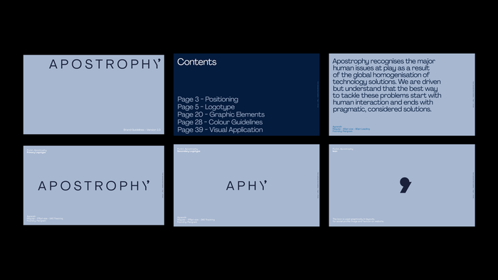
This approach helps us to build a strong foundation of principles, direction and mood from which the identity can follow. Using this strategic work we then developed three directional stylescapes to assume a visual foundation for the Apostrophy branding work.
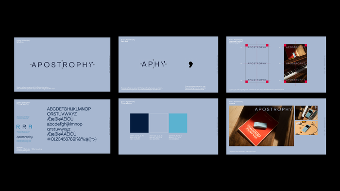
Leaning into the outlaw and innocent brand archetypes we developed an identity that feels sophisticated yet humble. By creating a refined, pared back visual identity we were able to help communicate Apostrophy’s core values and their desire to provide simple solutions for modern day living.
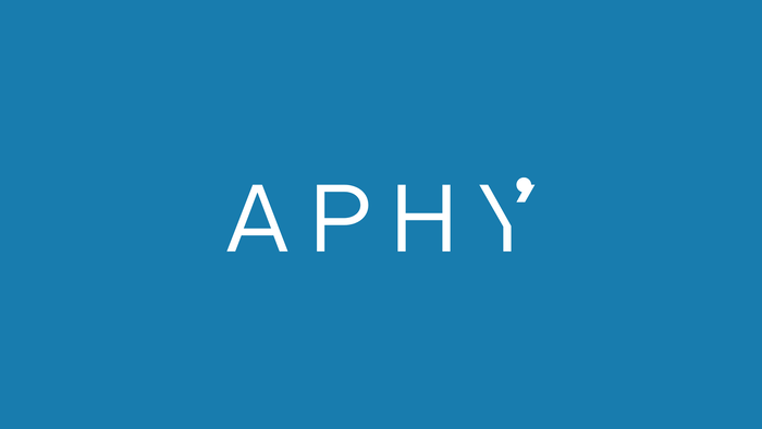
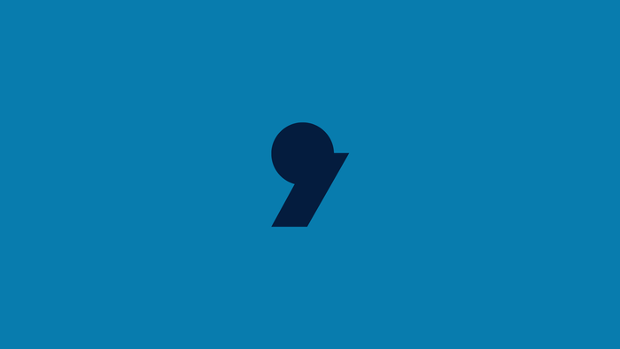
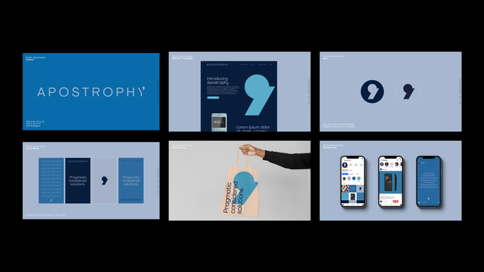
Combining the minimalistic icon and wordmark with a cool, calming colour palette we were able to evoke the brand’s human centric approach to technology with a refined, fresh perspective.
Source: againstti.me Against Time. License: All Rights Reserved.
Source: againstti.me Against Time. License: All Rights Reserved.
Source: againstti.me Against Time. License: All Rights Reserved.
Source: againstti.me Against Time. License: All Rights Reserved.
Source: againstti.me Against Time. License: All Rights Reserved.
This post was originally published at Fonts In Use