Anna’s
Published July 23, 2023
By FontsInUse
Contributed by Anna's
Source: annas.works Photo: Anna's. License: All Rights Reserved.


Source: annas.works License: All Rights Reserved.

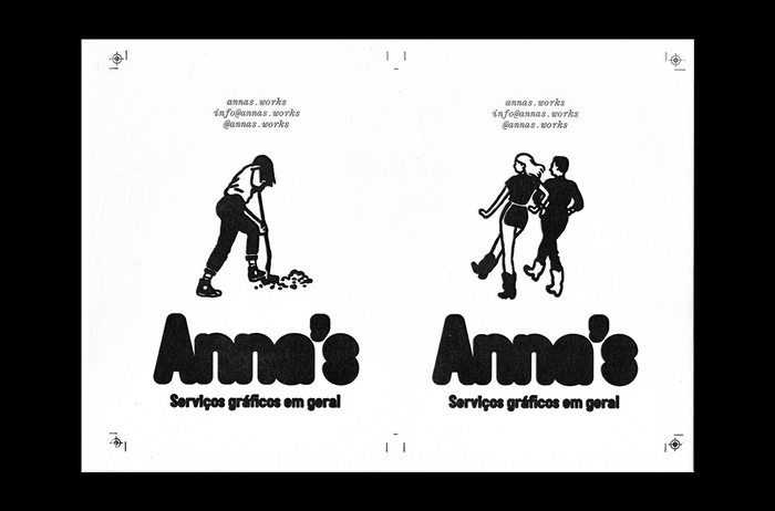
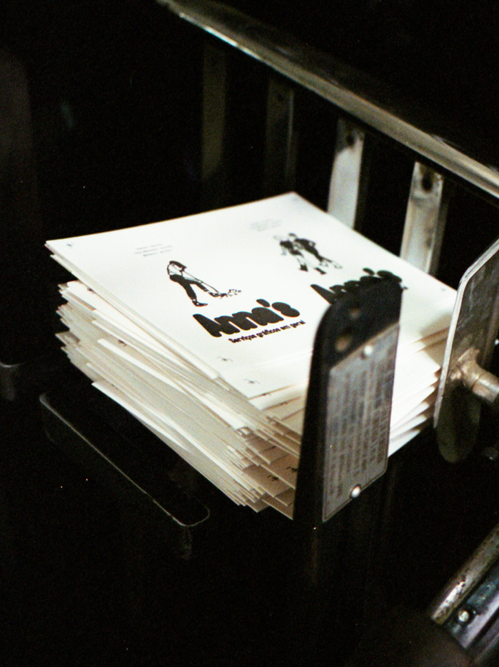
Source: annas.works Photo: Anna's. Printing by Carimbo Letterpress. License: All Rights Reserved.

Source: annas.works License: All Rights Reserved.
Source: annas.works Printing by Carimbo Letterpress. License: All Rights Reserved.
This post was originally published at Fonts In Use
Source: annas.works Photo: Anna's. License: All Rights Reserved.
Anna’s is a São Paulo-based studio dedicated to graphic design and experimentation. Our visual identity features a concise black and white palette to make our vivid projects come to life, creating a clean result but with an edgy approach, featuring illustrations by Mateus Acioli.
For the logo and headings, we used a stylized version of Guida Pro, simulating a stamp/ink blot effect, very bold and great to make big statements on the website. For body text, we wanted to balance a nostalgic typography with a contemporary and elegant one. Montiac Italic and Post Grotesk made the perfect pairing, complementing the boldness of the logo really well.
Source: annas.works License: All Rights Reserved.
Source: annas.works Photo: Anna's. Printing by Carimbo Letterpress. License: All Rights Reserved.
Source: annas.works License: All Rights Reserved.
Source: annas.works Printing by Carimbo Letterpress. License: All Rights Reserved.
This post was originally published at Fonts In Use
Read full story.
WRITTEN BY
FontsInUse
An independent archive of typography.
More from FontsInUse