Dean Martin’s Greatest Hits! Vol. 1 and 2 album art
Source: www.flickr.com Uploaded to Flickr by Bart Solenthaler and tagged with “tempo”. License: All Rights Reserved.
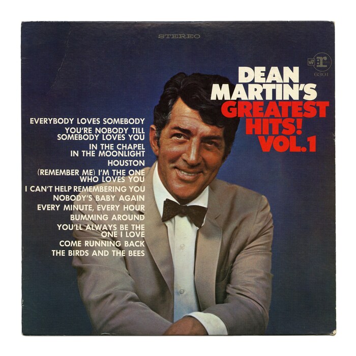
Vol. 1, May 1968 [More info on Discogs]


In 1968, Reprise Records released a two-volume compilation of greatest hits by Dean Martin (1917–1995). For the first volume, art director Ed Thrasher specified Tempo Black for the title, paired with Futura for the song names. Tempo was Ludlow’s response to Bauer’s Futura. Its Black weight is even heavier than Intertype’s Futura Extra Bold.
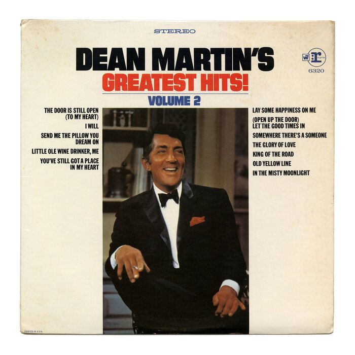
For Volume 2, which followed half a year later, he didn’t rehash the design, but came up with a variation: this time the titling face is Filmotype Gem, an extrabold sans with straight-sided rounds. The track list is shown to the left and right of Martin’s portrait, set in Franklin Gothic Extra Condensed.
What unites the two cover designs are the photographic portraits of smiling Dean Martin with his signature bow tie, the color palette with red white and blue, and a typography that uses two sans serifs in all caps.
Source: www.flickr.com Uploaded to Flickr by Bart Solenthaler and tagged with “filmotypegem”. License: All Rights Reserved.
Vol. 2, Aug. 1968 [More info on Discogs]
This post was originally published at Fonts In Use