Anatomy of a Fall title sequence
Published April 14, 2024
By FontsInUse
Contributed by Laurence Penney
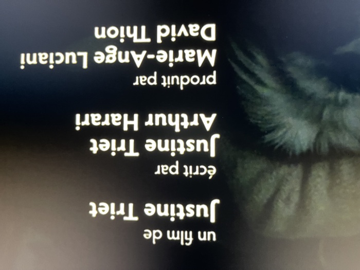
Photo: Laurence Penney. License: All Rights Reserved.


Photo: Laurence Penney. License: All Rights Reserved.
Photo: Laurence Penney. License: All Rights Reserved.
This post was originally published at Fonts In Use
Photo: Laurence Penney. License: All Rights Reserved.
Very good use of Hypatia Sans for the titles of Anatomy of a Fall. The typeface deserves much more usage.
Photo: Laurence Penney. License: All Rights Reserved.
Photo: Laurence Penney. License: All Rights Reserved.
This post was originally published at Fonts In Use
Read full story.
WRITTEN BY
FontsInUse
An independent archive of typography.
More from FontsInUse