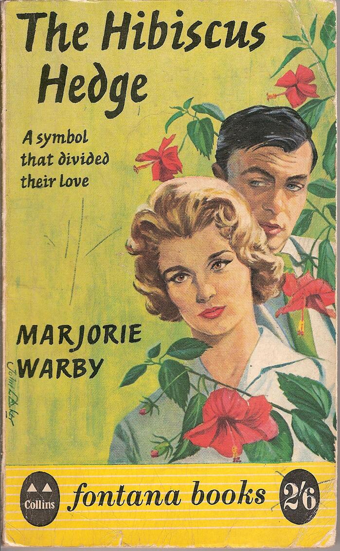
The Hibiscus Hedge by Marjorie Warby
Source: www.flickr.com Uploaded to Flickr by Richard. License: All Rights Reserved.


Ashley Script was issued by British Monotype in 1955 as series 574. The informal bold italic is based on the handwriting of Ashley Havinden (1903–1973), a Scottish-born commercial artist who worked at the W.S. Crawford ad agency in London for forty-five years, from 1922 to 1967. Compare the typeface as shown in a Monotype specimen to Havinden’s actual handwriting: characteristic details like the stemless d and the bolt-like s are present in both. At least in that 1956 sample, the letterforms are connected.
When cover artist John L. Baker (or an unnamed colleague) worked on Marjorie Warby’s The Hibiscus Hedge, he didn’t make direct use of the typeface, but rather drew the letterforms manually, as one can see from the irregularities between repeating characters. I love it when things come full circle: a typeface based on handwriting, rendered by hand. The author’s name shows one of the strengths of Ashley Script: it also performs well when set in all caps.
The book was issued in 1961 by Fontana Books, then an imprint of Scottish publisher Collins. The Fontana Books logo is based on Bodoni Bold Italic, and thus also a case of lettering derived from typeface.
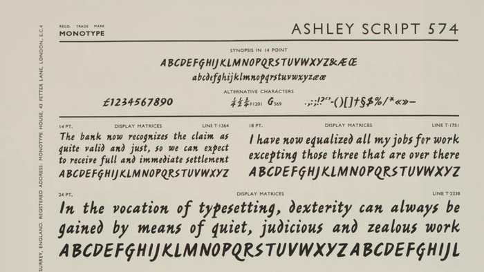
Source: collection.sciencemuseumgroup.org.uk Scan courtesy of Science Museum Group. License: All Rights Reserved.
Detail from a page from Specimen Book of ‘Monotype’ Printing Types Volume One, displaying samples of Ashley Script (series number: 574) in various font size from 14pt up to 42pt. Produced and distributed by The Monotype Corporation Limited, Salford, Redhill, UK.
The Centre for Printing History and Culture (CPHC) is currently conducting a survey on the future of the Type Archive in London – where this specimen is preserved – which shut down and is now under the Science Museum Group. Consider taking part if you can spare five minutes.
This post was originally published at Fonts In Use