Against Infinity by Gregory Benford (New English Library)
Source: www.reddit.com License: All Rights Reserved.


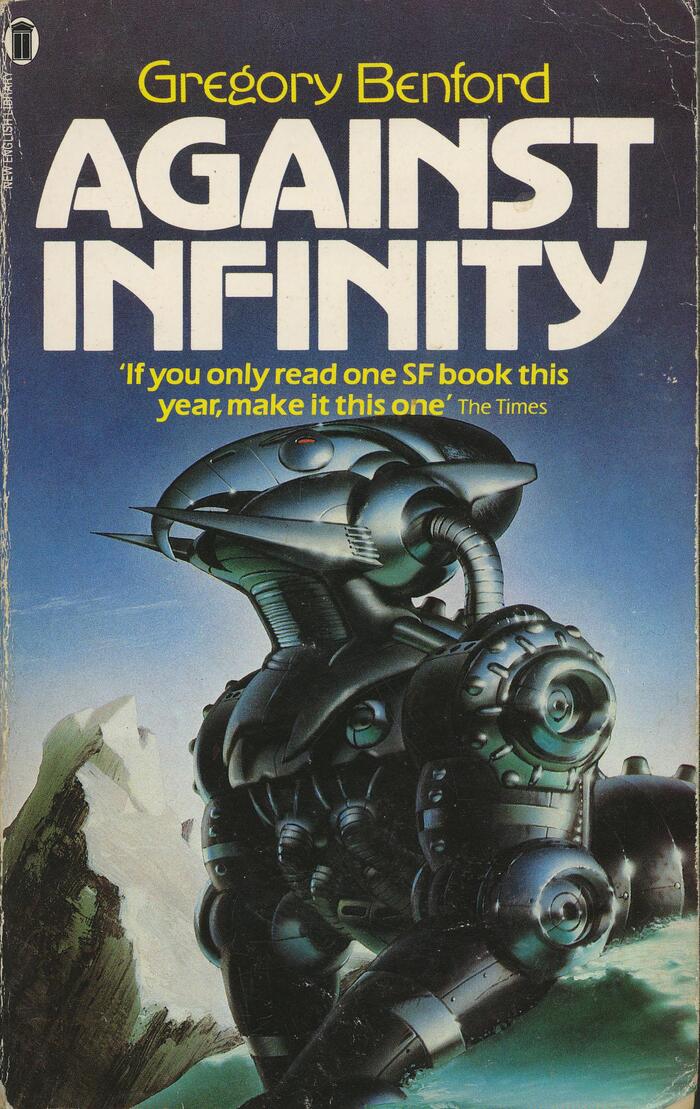
New English Library’s 1984 paperback edition of Gregory Benford’s follow-up to his Jupiter Project, first published in 1983 in Amazing Science Fiction, here with cover art by Chris Moore.
The title uses caps from Advertisers Gothic, designed by Robert Wiebking in 1917 for Western Type Foundry. The author’s name above is added in a light weight that wasn’t part of the original foundry series. It’s shown in Phil’s Photo’s catalog from 1980, without credits. Phil Martin’s Legothic is another phototype adaptation that extends Wiebking’s design to several weights – but that’s not what’s used on this cover.
There are numerous digitizations of Advertisers Gothic, including one of the Light, by Monotype (inaccurately crediting Wiebking). Nick Curtis made an even thinner monolinear variation, known as both Stringline Gothic and Perisphere. Quite recently, Jamie Chang of Manic Type launched a new interpretation. It’s named AdGothic and comes in variable font format with a width axis, or four static widths (but no light weight).
The blurb is added in two weights of Eras.
This post was originally published at Fonts In Use