Accident(s) book fair
Published April 13, 2023
By FontsInUse
Contributed by Oudin Romain

Source: choquelegoff.com License: All Rights Reserved.


Source: choquelegoff.com License: All Rights Reserved.

Source: choquelegoff.com License: All Rights Reserved.
Source: choquelegoff.com License: All Rights Reserved.

Source: www.instagram.com License: All Rights Reserved.
This post was originally published at Fonts In Use
Source: choquelegoff.com License: All Rights Reserved.
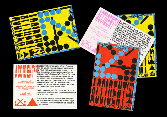
Accident(s) is an independent book fair. The visual identity of the event’s 2021 edition was designed by Atelier Choque Le Goff. The visuals pair two very expressive typefaces: Vroum Gti (from lift-type) and Maria (from Threedotstype). Risograph printed by Quintal Atelier. From the Accident(s) website:
Accident(s) is a place where there will be no untimely encounters, where one should not be afraid of shocks: it is a collision of genres! A desire to present the heterogeneity of independent publishing and to regroup it in one place.
From micro-edition to artist's books, from the most experimental to the unclassifiable, we will see atypical publications in the field of photography and graphic arts.
Source: choquelegoff.com License: All Rights Reserved.
Source: choquelegoff.com License: All Rights Reserved.
Source: choquelegoff.com License: All Rights Reserved.
Source: www.instagram.com License: All Rights Reserved.
This post was originally published at Fonts In Use
Read full story.
WRITTEN BY
FontsInUse
An independent archive of typography.